

Key Takeaways
Complete guide to designing stunning digital hall of fame touchscreen displays. Learn layout strategies, user experience principles, and visual storytelling techniques for school recognition walls.
Understanding the Purpose and Audience of Your Display
Before diving into layout specifics, clarifying your display’s core purpose and primary audiences shapes every subsequent design decision.
Defining Your Recognition Goals
Different organizations prioritize different recognition objectives, and your layout should reflect these priorities clearly.
Achievement Celebration vs. Historical Preservation: Some displays primarily celebrate recent achievements—this year’s championship teams, current honor roll students, or recent alumni milestones. Others focus on comprehensive historical preservation spanning decades or even centuries. Achievement-focused displays benefit from dynamic home screens highlighting recent inductees, rotating featured content showcasing current accomplishments, and prominent “recent additions” sections. Historical preservation displays require robust search and filtering capabilities, chronological navigation enabling decade-by-decade exploration, and comprehensive archival organization by era, category, and milestone.
Many successful displays balance both priorities, but understanding your primary emphasis helps allocate screen real estate and navigation hierarchy appropriately. Solutions like Rocket Alumni Solutions provide flexible frameworks accommodating both achievement celebration and historical depth within cohesive designs.
Inspiration vs. Information: Consider whether your display primarily inspires current members or informs visitors. Inspirational displays emphasize visual impact with large, high-quality photos, video content showcasing achievements in action, emotional storytelling through personal narratives, and prominent display of honors and accomplishments. Information-focused displays prioritize comprehensive statistical data and records, detailed biographical information, historical context and institutional background, and extensive searchability enabling specific information retrieval.
Most effective displays incorporate both elements, but your primary focus influences visual hierarchy, content depth, and interaction design.
Identifying Your Primary User Personas
Different audiences interact with recognition displays differently, and design should accommodate diverse user needs and behaviors.
Current Students and Members: Young users typically exhibit shorter attention spans requiring immediate visual engagement, high comfort with touch interfaces but lower patience for complex navigation, interest in discovering connections to current programs or teams, and preference for visual and video content over text-heavy presentations. Design for this audience by creating bold, visually striking home screens that grab attention immediately, intuitive navigation requiring minimal instruction, quick-access shortcuts to popular categories, and prominent multimedia content including photos and videos.
Alumni and Former Members: Returning alumni often seek personal connections and nostalgia. They want to find themselves, classmates, teammates, or family members quickly, reminisce about their era and shared experiences, share discoveries with companions or on social media, and verify that their contributions are appropriately recognized. Accommodate these users with powerful search functionality enabling name-based discovery, era-based browsing (by decade or specific years), social sharing features enabling easy photo and profile sharing, and comprehensive historical content spanning their entire affiliation period.
Parents and Family Members: Family visitors take pride in discovering relatives’ achievements. They seek loved ones’ recognition and accomplishments, family legacy connections across generations, opportunities to capture photos for sharing, and content appropriate for showing young children. Design considerations include prominent search features for quick family member location, multi-generational family connection displays, photo-friendly viewing angles and lighting, and age-appropriate content presentation.
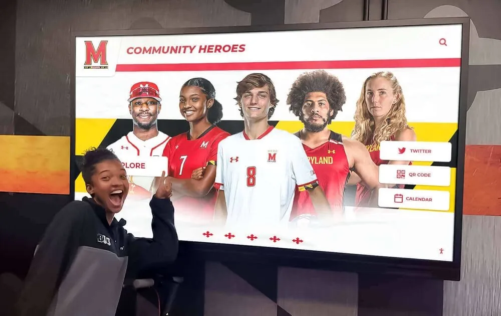
Prospective Members and Visitors: First-time visitors form critical impressions about your organization’s culture and values. They assess institutional prestige and achievement caliber, evaluate community culture and priorities, determine whether they can envision themselves as part of the community, and form overall impression of professionalism and quality. Create positive first impressions through professionally designed home screens reflecting institutional identity, prominent display of prestigious achievements and notable alumni, diverse representation showing inclusive community culture, and polished visual design demonstrating attention to quality and detail.
Understanding these personas helps prioritize features and design elements that serve your specific community most effectively.
Essential Layout Design Principles for Touchscreen Displays
Effective touchscreen layouts balance aesthetic appeal with functional usability, following proven design principles that enhance rather than hinder user experience.
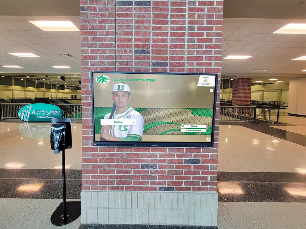
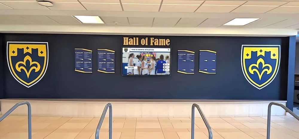
The Home Screen: Your Critical First Impression
Users form opinions about your display within seconds of first interaction, making home screen design absolutely critical to overall success.
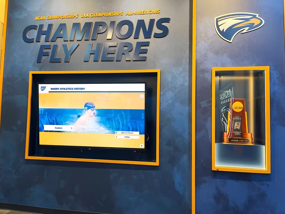
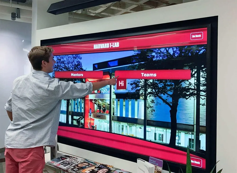
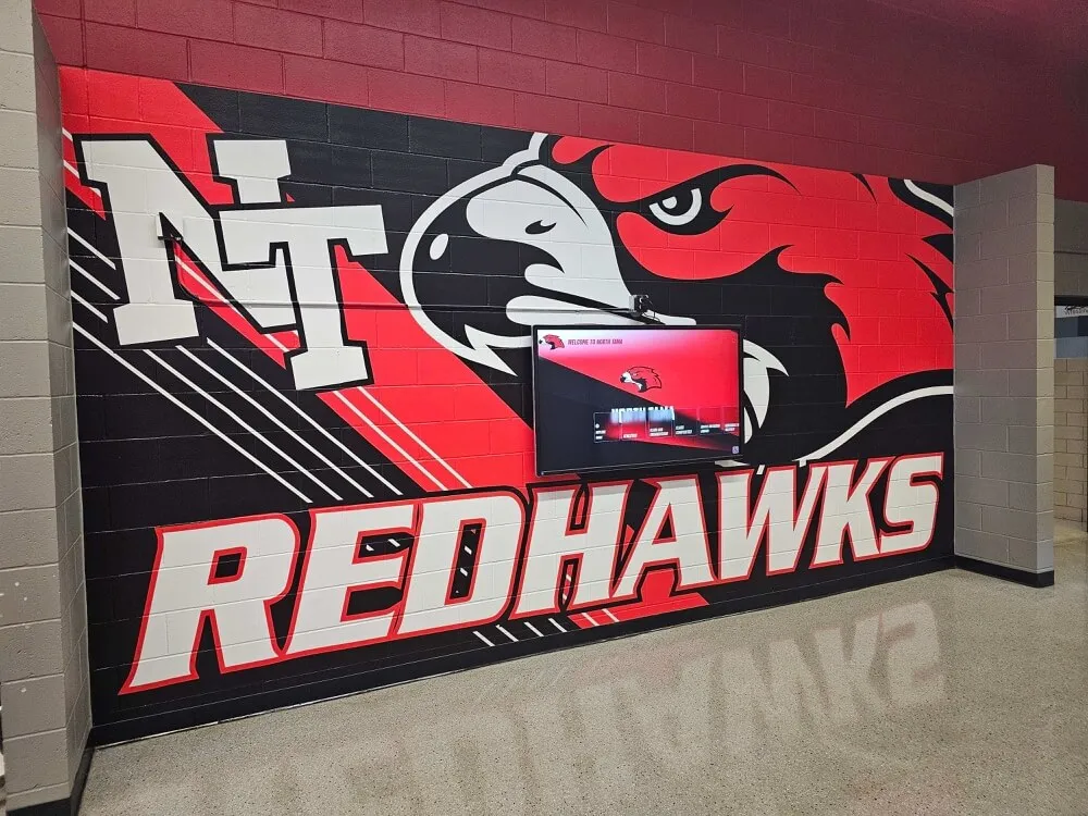
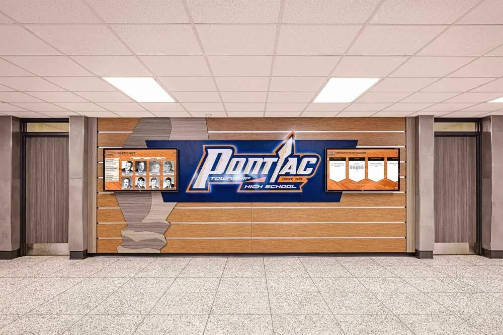
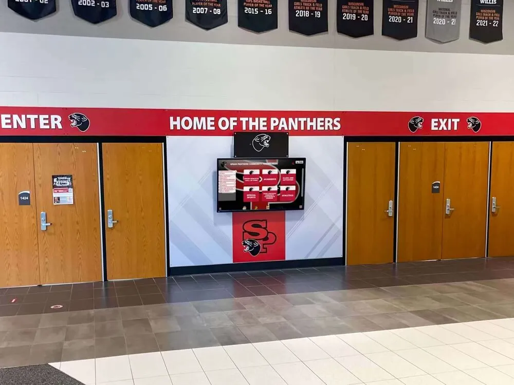
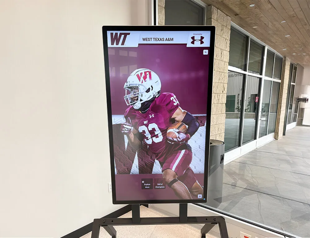
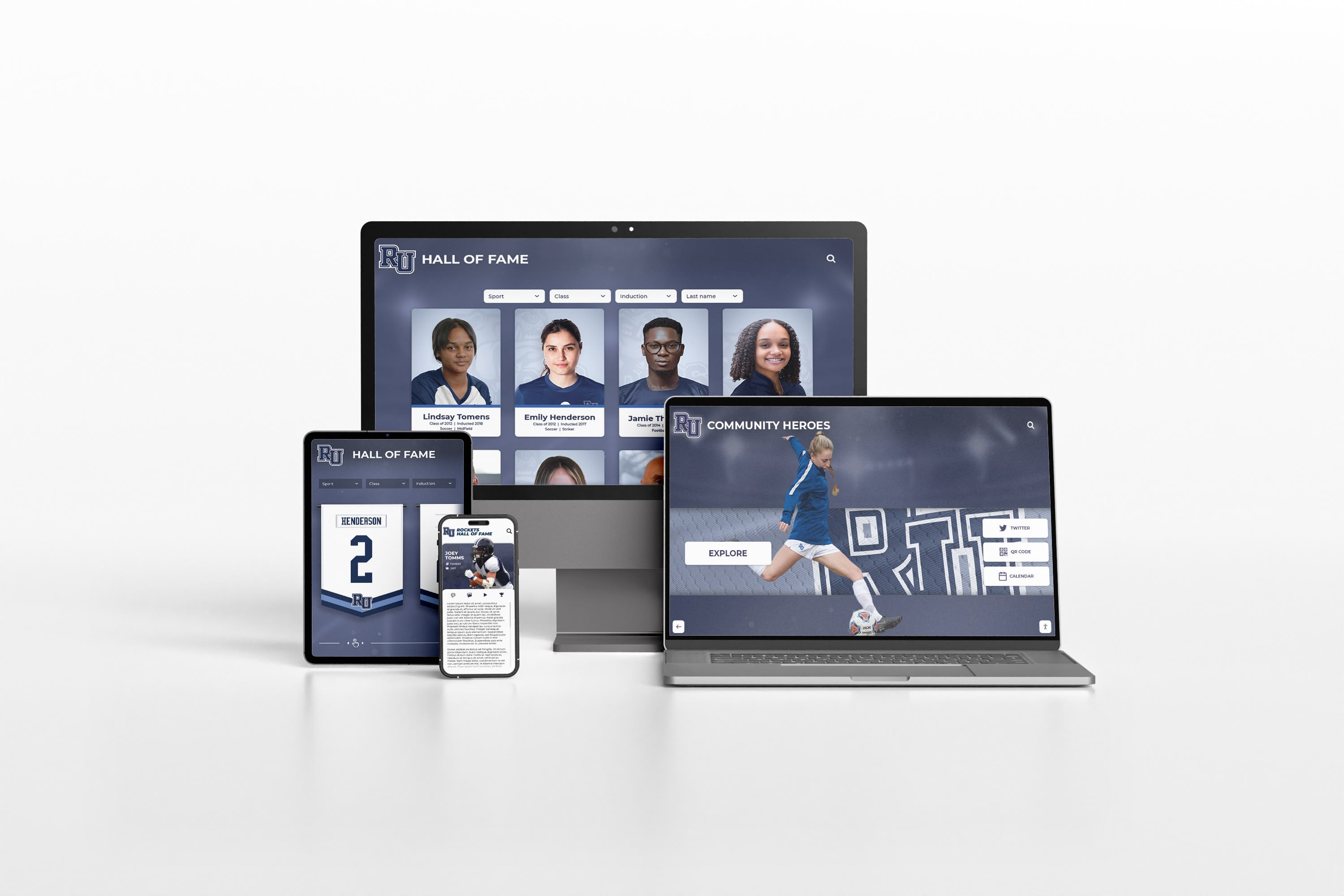
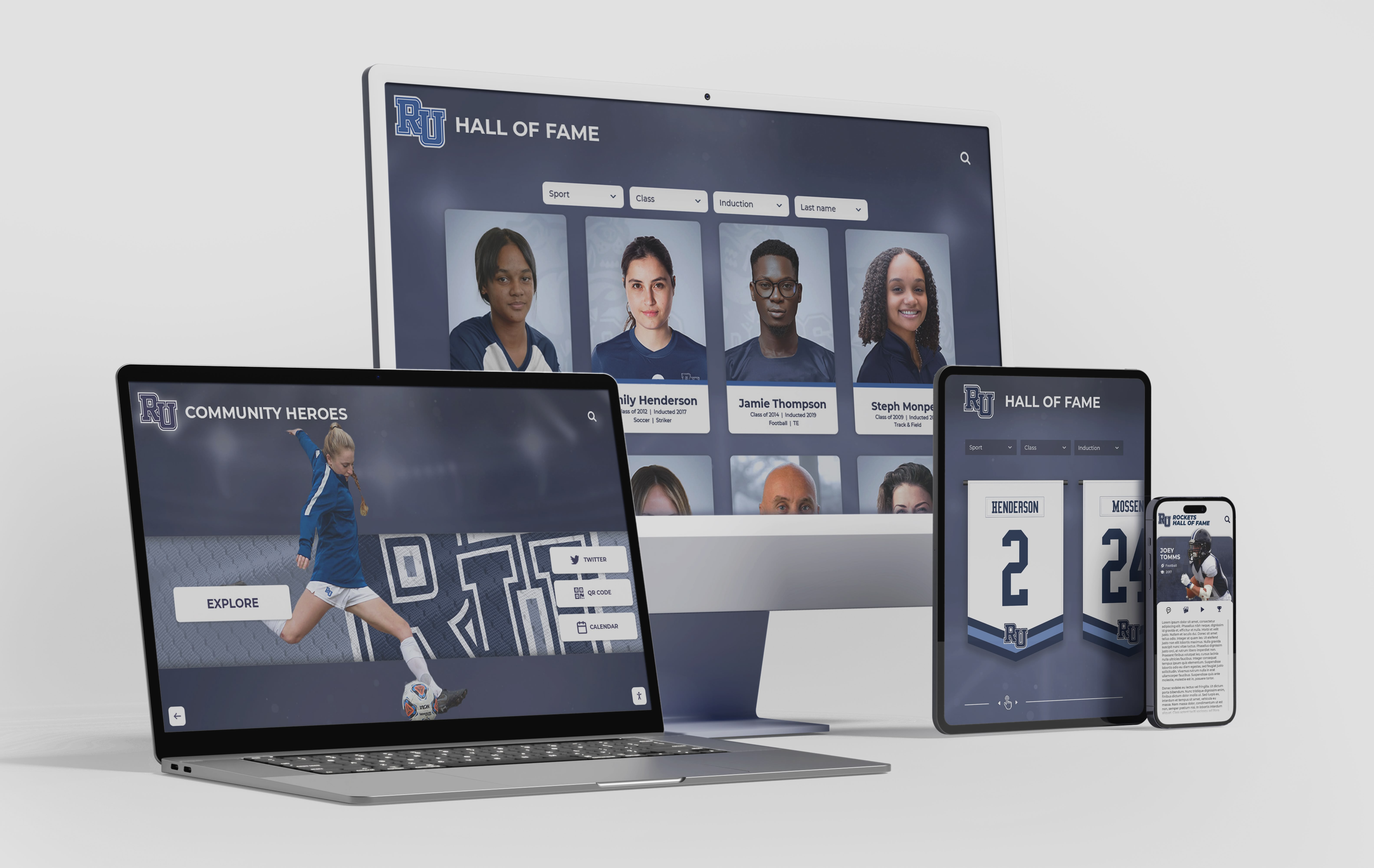
Creating Visual Hierarchy: The most important content should command attention immediately through strategic use of size, placement, color, and motion. Effective home screens employ large hero images or video backgrounds showcasing compelling recognition moments, prominent institutional branding establishing immediate identity, clear call-to-action buttons guiding users toward exploration, and strategic white space preventing overwhelming clutter. The hero section should occupy roughly 60-70% of screen real estate, with navigation elements positioned consistently in locations users expect based on common interface conventions.
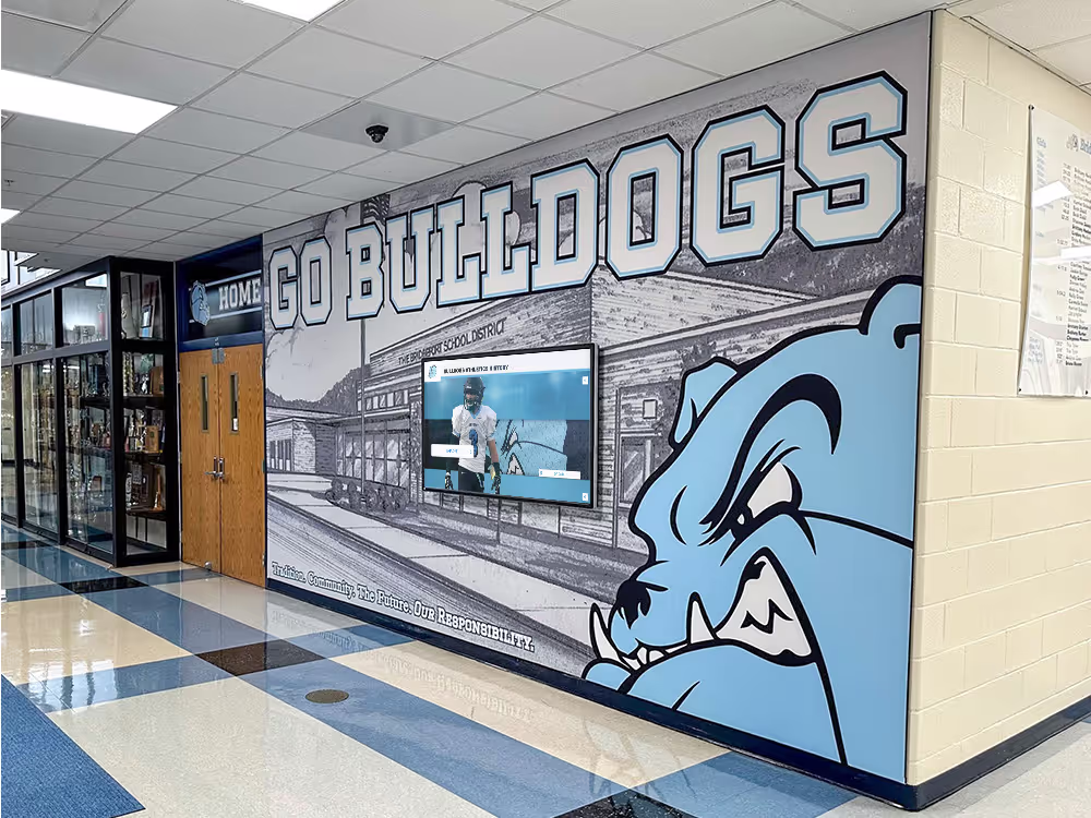
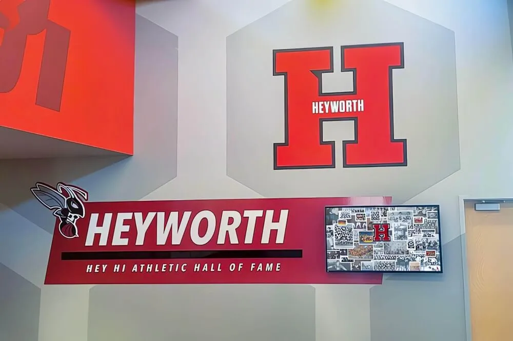
Balancing Brand Identity with Functionality: Your display should feel like a natural extension of your organization while remaining highly functional. Incorporate school or organization colors as primary design elements, logo placement that’s visible but not dominating, typography consistent with institutional branding materials, and visual style aligned with other digital properties. However, avoid compromising usability for aesthetic preferences—navigation clarity always takes priority over decorative elements.
Motion and Animation Considerations: Subtle motion attracts attention and adds polish, but excessive animation creates distraction and accessibility problems. Best practices include background video or subtle photo transitions on hero sections, smooth transitions between screens rather than jarring jumps, loading animations providing feedback during content retrieval, and accessibility options to pause or reduce motion for users with sensitivity. Never use auto-advancing carousels that change content while users are reading—this creates frustration and accessibility barriers. Similar principles apply across interactive touchscreen display implementations.
Navigation Architecture: Making Content Discoverable
Even the most comprehensive content collection provides no value if users cannot find what they seek. Navigation architecture determines whether your display frustrates or delights users.
Shallow vs. Deep Navigation Structures: Touchscreen interfaces work best with shallow navigation hierarchies—users should reach any content within 3-4 taps maximum. Avoid deep menu structures requiring numerous decisions before accessing actual content. Instead, present broad category options on the home screen (Athletics, Academics, Arts, Community Service), provide sub-category filtering on secondary screens (Athletics → Sport Selection → Team Year), and display actual content by the third screen level.
Deep hierarchies requiring 5-6+ navigation levels exhaust patience and increase abandonment rates. If your content requires deep organization, implement robust search and filtering instead of forcing users through numerous menu screens.
Multiple Access Paths to Content: Users conceptualize information differently, so provide multiple navigation paths to the same content. Someone seeking a 1985 basketball championship might navigate by year (1985 → Basketball), by sport (Basketball → 1985), or by achievement type (Championships → 1985 Basketball). Design should accommodate all approaches through flexible navigation including category-based browsing, chronological timeline navigation, search functionality enabling direct access, featured content highlighting popular or important selections, and related content suggestions showing contextual connections.
This flexibility ensures diverse users with different mental models can successfully find content regardless of how they conceptualize information organization.
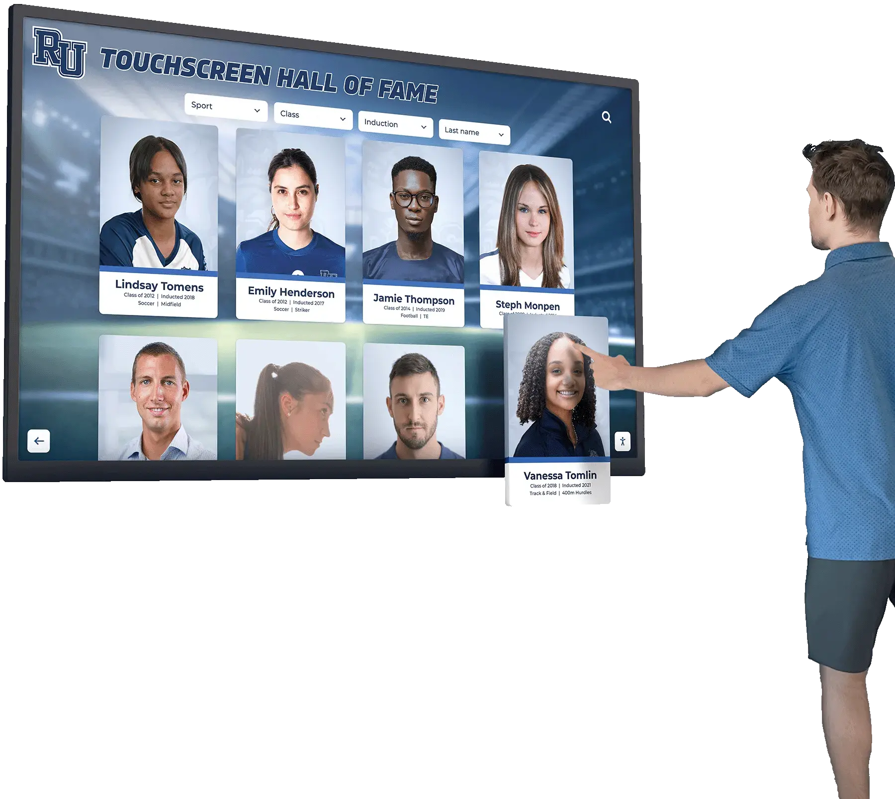
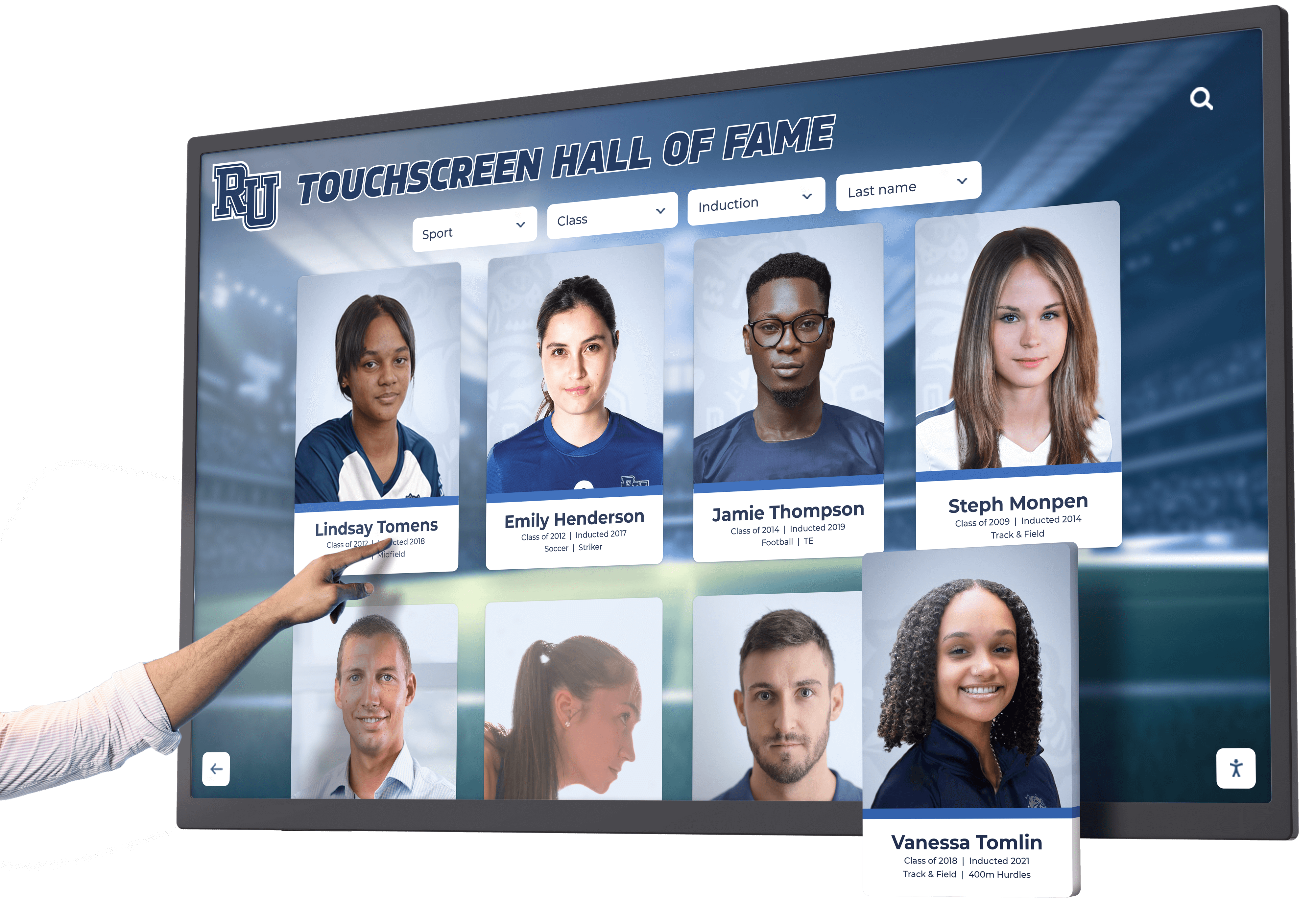
Search Functionality as Primary Navigation: For displays containing hundreds or thousands of individuals, search becomes essential rather than optional. Effective search implementations include prominent search field placement (ideally persistent header), autocomplete suggestions appearing after 2-3 characters, fuzzy matching accommodating misspellings, filtered search enabling category or year constraints, and recent search suggestions for quick re-access. Many users bypass browsing entirely, heading straight to search for name-based discovery—your design should embrace rather than discourage this behavior. The touchscreen software capabilities you select significantly impact search functionality quality.
Touch Target Sizing and Spacing
Touchscreen interfaces require different design considerations than mouse-driven desktop interfaces, particularly regarding interactive element sizing.
Minimum Touch Target Dimensions: Human fingers lack mouse cursor precision. Touch targets (buttons, links, tiles) must be large enough for accurate selection without frustration. Industry best practices recommend minimum 44x44 pixel targets for small screens, 60x60 pixels for comfortable tapping on larger displays, even larger targets (80x80 pixels) for elderly users or accessibility, and adequate spacing (8-12 pixels minimum) between adjacent targets preventing accidental selection.
Small text links appropriate for mouse clicking create terrible touchscreen experiences. Convert all interactive elements into appropriately sized buttons or touch targets.
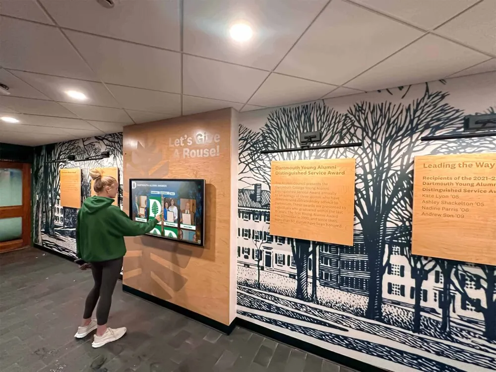
Accounting for Various User Heights: Public touchscreen displays serve users ranging from children to tall adults. Consider mounting height carefully—typically 42-48 inches from floor to screen center works for most audiences, lower mounting (36-40 inches) for elementary schools with younger children, wheelchair-accessible positioning ensuring reach for all users, and angled mounting (slight upward tilt) reducing glare and improving viewing angles.
Additionally, place most critical navigation elements in the central two-thirds of screen space where all users can comfortably reach, avoiding corners and extreme edges that require stretching or repositioning.
Content Organization Strategies for Maximum Engagement
How you structure and present content dramatically impacts whether users engage deeply or bounce after cursory exploration.
Category Structure: Finding the Right Balance
Category organization should feel intuitive to your specific audience while accommodating your content’s natural structure.
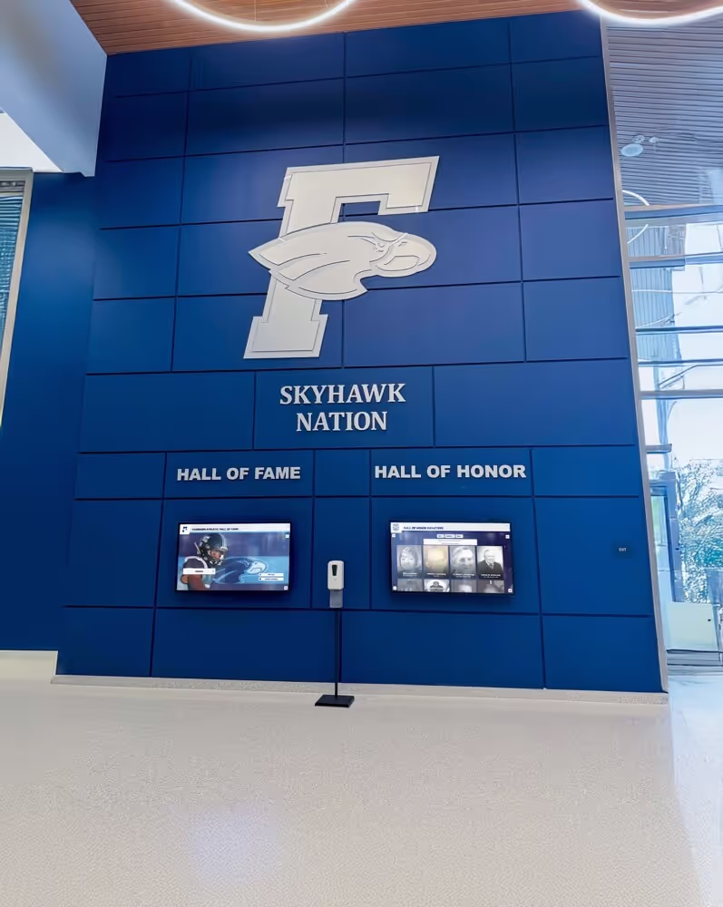
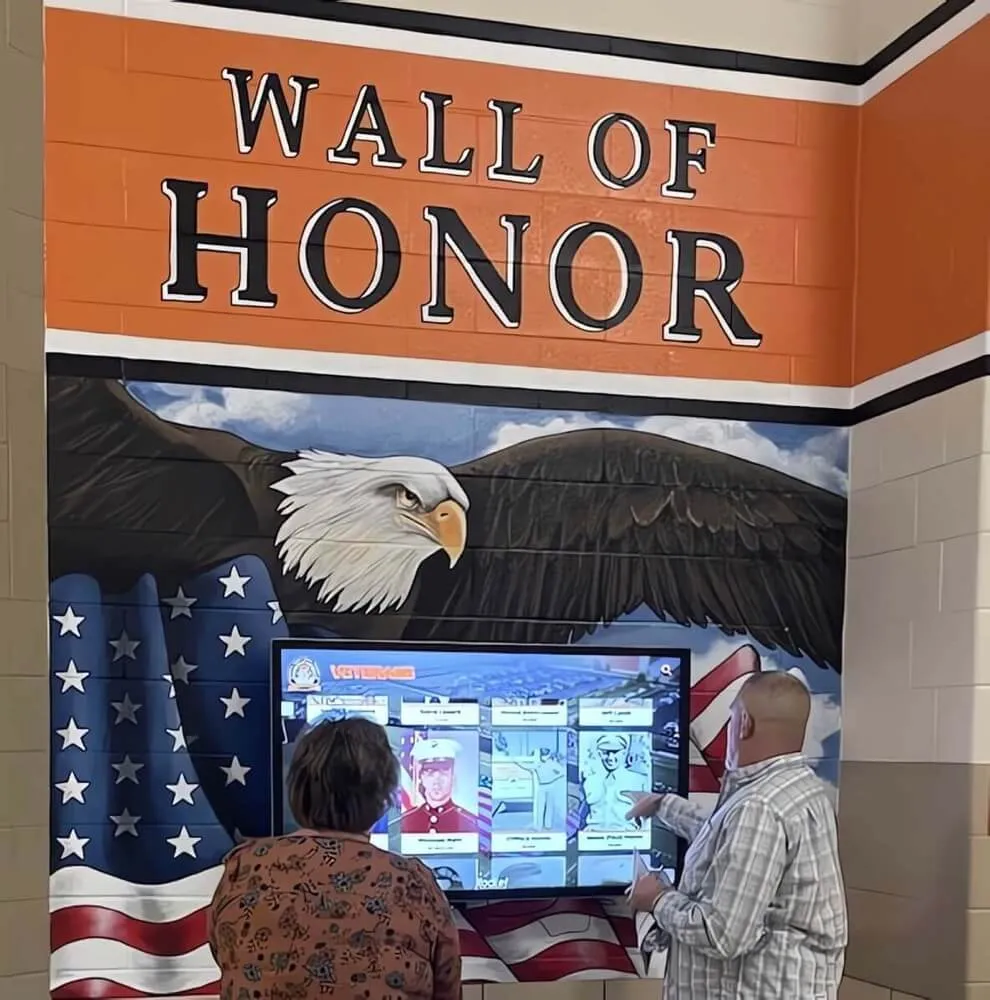
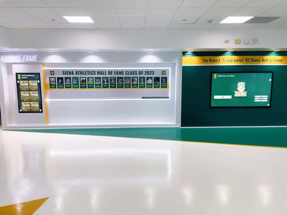
Common Recognition Categories: Most institutions organize recognition content around several primary categories. Academic recognition encompasses honor roll and academic achievement awards, scholarships and academic competitions, valedictorians and distinguished scholars, and research or academic program accomplishments. Athletic recognition includes hall of fame inductees and letter winners, championship teams and record holders, all-conference and all-state athletes, and coaching legends and contributor recognition. Arts and activities recognition features performing arts achievements, visual arts awards, debate and forensics accomplishments, and student government and leadership recognition. Community service and impact recognition highlights volunteer service leaders, community partnerships and social impact, humanitarian awards, and mission or service trip participation.
Adapt these standard categories to your institution’s priorities and culture. A performing arts school might elevate arts above athletics, while a military academy might emphasize leadership and service. Your category structure communicates organizational values—design accordingly.
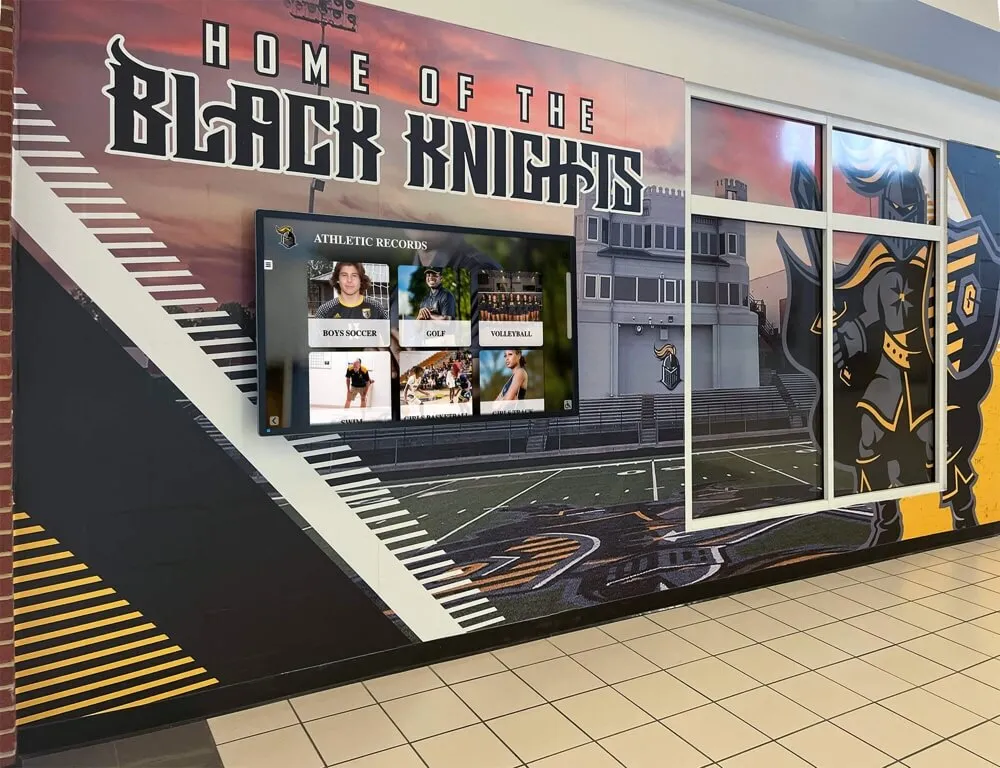
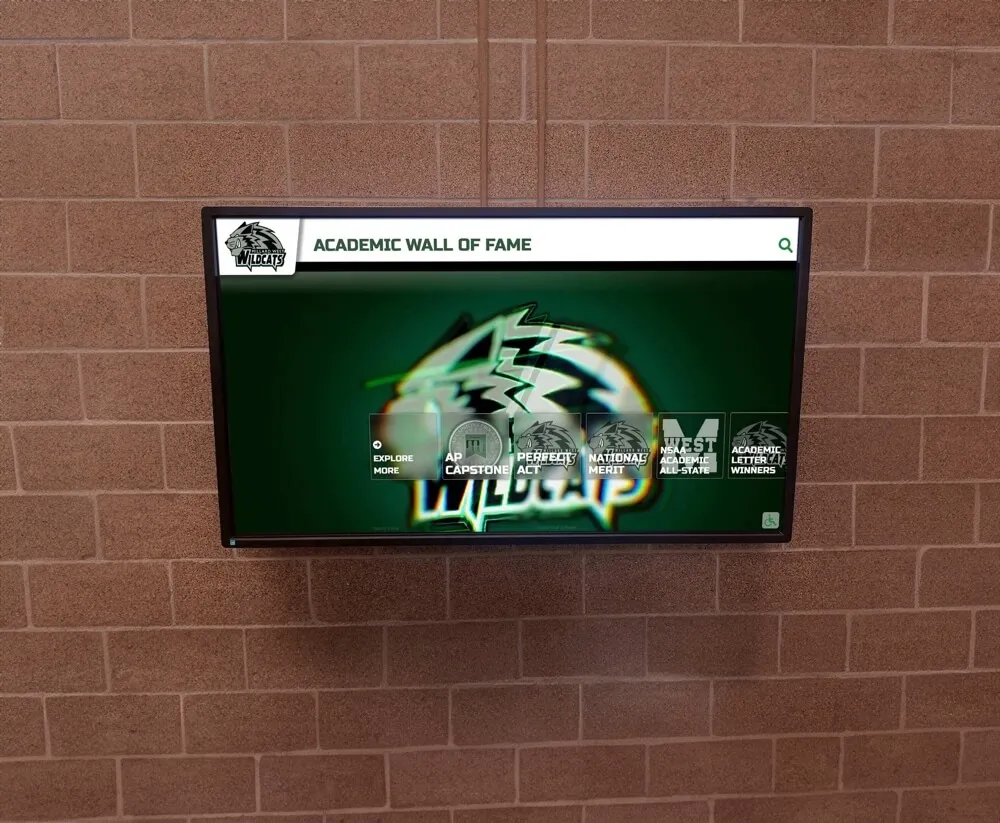
Avoiding Category Overload: While comprehensive recognition matters, presenting 15-20 category buttons on the home screen overwhelms users and dilutes focus. Limit primary categories to 4-8 options, grouping related subcategories together. For example, rather than separate “Basketball,” “Football,” “Soccer,” and other sport buttons, use a primary “Athletics” category with sport selection on the next screen level.
This progressive disclosure approach prevents overwhelming initial choices while maintaining comprehensive access to all content through logical navigation paths.
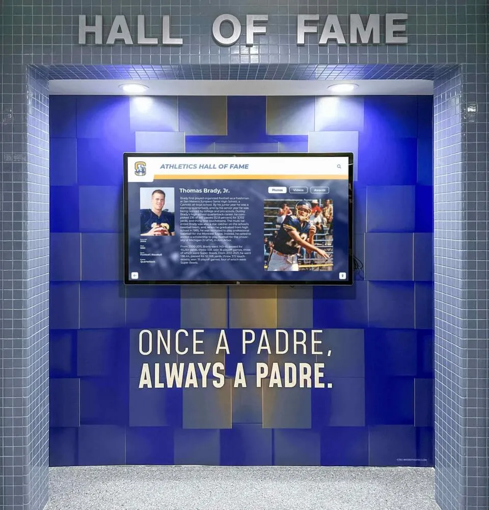
Profile Page Layout: Showcasing Individual Achievement
Individual profile pages represent the payoff for user exploration—the actual recognition content honoring specific achievements.
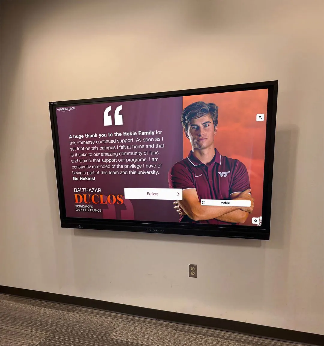
Essential Profile Components: Effective individual profiles balance visual impact with informational depth. Include large, high-quality primary photo (professional headshot or action shot), name and recognition headline (class year, achievement, position), key accomplishments and honors in scannable format, career statistics or achievement metrics when relevant, biographical narrative providing personal context, supporting photos beyond the primary image, video content when available, and connections to related content (teammates, classmates, similar achievers).
Organize these elements with visual hierarchy placing most important information—photo and name—at top, followed by key achievements and honors, with detailed biography and statistics accessible through scrolling or expandable sections.
Balancing Text with Visual Content: Touchscreen audiences prefer visual content over lengthy text blocks. Design profiles emphasizing large photos and videos, using concise bullet points rather than paragraphs for accomplishments, providing infographics or visual representations of statistics, and placing lengthy biographical text in expandable “read more” sections. Users should grasp the essence of recognition within 5-10 seconds, with optional depth available for those wanting more information.
Multi-Photo Galleries and Slideshows: Single static photos rarely capture the full story of achievement. Include photo galleries allowing users to browse multiple images from different eras or contexts, before-and-after comparisons showing progression, action shots complementing formal portraits, and candid moments humanizing achieved individuals. Interactive galleries with swipeable or tappable navigation engage users while providing richer recognition than single images alone can deliver.
List Views vs. Grid Views: Optimizing Content Display
When presenting multiple individuals or teams, your display format significantly impacts browsing experience and engagement.
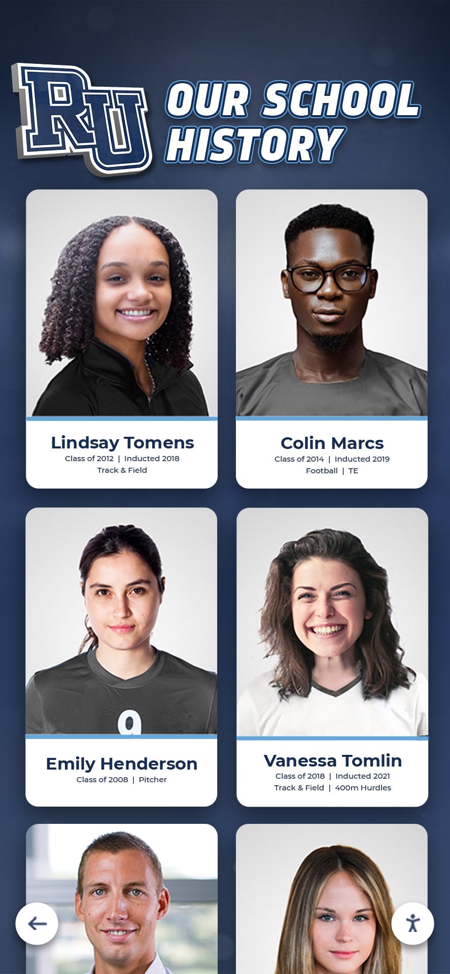
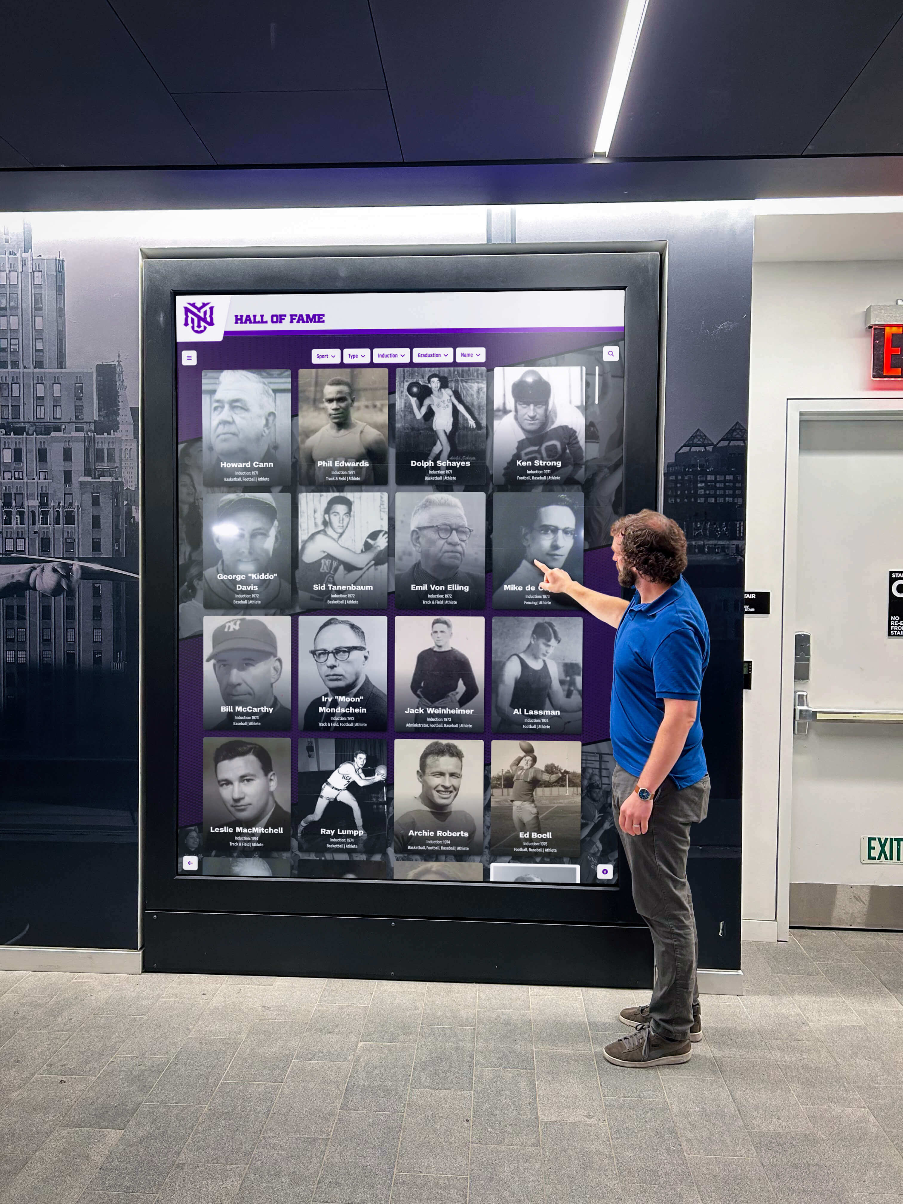
Grid Layouts for Visual Browsing: Grid displays showing multiple items simultaneously work well for visual recognition. Users can scan numerous faces or images quickly, identify interesting individuals based on photos, appreciate visual diversity of community, and make rapid selections based on visual appeal. Grid layouts work particularly well for recent inductees or featured content, alumni directories where photo recognition matters, team rosters where users seek familiar faces, and photo-heavy content where images tell the story.
Design grids with adequately sized thumbnails (at minimum 150x150 pixels), clear name labels beneath each image, 3-4 column layouts on horizontal displays, and consistent aspect ratios preventing awkward cropping.
List Layouts for Information-Dense Content: List views presenting one item per row accommodate more text and supporting information. They work well for comprehensive statistics or records, chronological timelines with dates and context, achievement listings with multiple data points, and searchable directories where users read sequentially. Lists support alternative sorting options (alphabetical, chronological, by achievement level), easier scanning of text-based information, and clearer hierarchy with primary and secondary information.
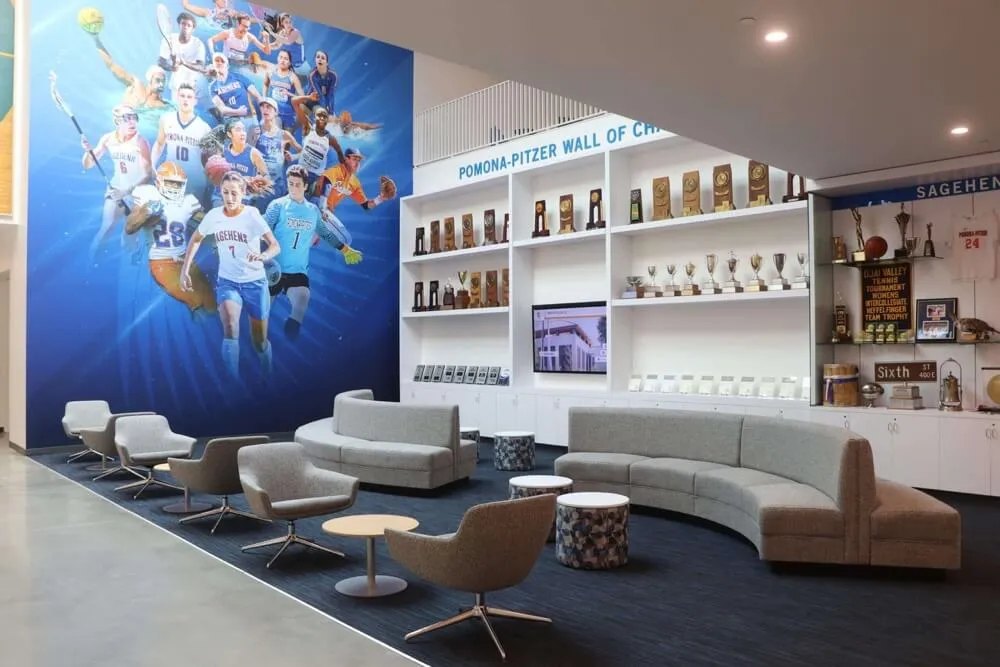
Hybrid Approaches: Many successful designs combine grid and list approaches strategically. For example, a home screen might feature a 3x3 photo grid of recently inducted hall of fame members (visual browsing) with a list of “all inductees” accessible through a button leading to a searchable, sortable list view providing comprehensive access.
Visual Design Elements That Elevate Recognition Displays
Strategic visual design transforms functional displays into stunning recognition experiences that reflect positively on your entire organization.
Color Psychology and Branding Integration
Color choices communicate emotion, establish atmosphere, and reinforce institutional identity.
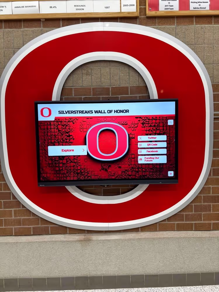
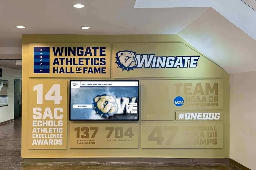
Aligning with Institutional Colors: Your display should feel like an extension of your organization’s visual identity. Use primary institutional colors for major interface elements (headers, buttons, accent elements), incorporate secondary colors for variety and visual interest, select neutral backgrounds (white, light gray) that don’t compete with institutional colors, and maintain sufficient contrast between background and text for readability.
However, avoid overwhelming users with color—just because your school colors are bright orange and purple doesn’t mean every pixel should scream with saturated color. Use institutional colors strategically as accents while maintaining professional, readable design with ample white space.
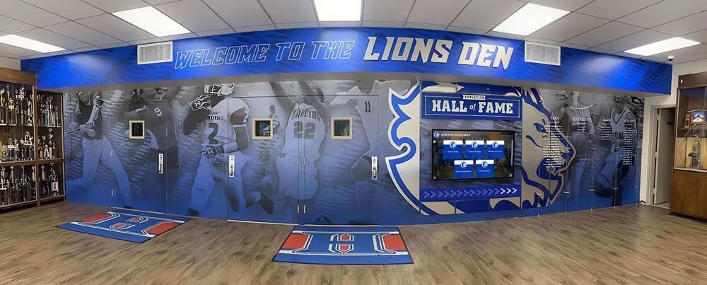
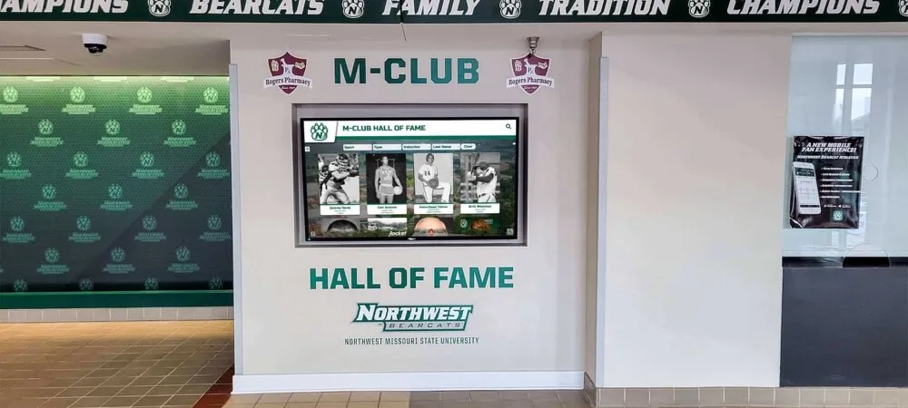
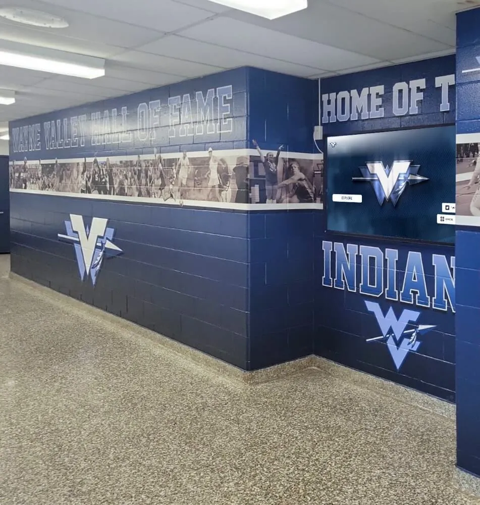
Creating Visual Consistency Across Sections: Even if your display covers diverse content categories, maintain visual consistency through consistent header styling across all screens, unified button and interactive element design, standardized typography systems, and coordinated color usage. Visual consistency reduces cognitive load—users intuitively understand navigation because interface elements behave predictably across sections. Approaches used in school hallway display design demonstrate effective visual consistency principles.
Typography: Readability at Distance and Touch
Text must remain readable both for users standing directly at the touchscreen and visitors viewing from several feet away.
Font Selection Guidelines: Choose fonts prioritizing legibility over decorative appeal. Sans-serif fonts generally read better on screens than serif fonts (though quality serif fonts work for body text), avoid script, handwritten, or highly decorative fonts except for minimal decorative use, ensure selected fonts include complete character sets supporting names from diverse cultures, and limit font family variety—2-3 font families maximum across entire display.
Google Fonts provides excellent free options with clean, modern aesthetics suitable for recognition displays—fonts like Roboto, Open Sans, Lato, and Montserrat all work well.
Size and Hierarchy: Establish clear typographic hierarchy enabling users to scan and navigate efficiently. Headers should use large sizes (48-72 pixels) readable from distance, subheaders at medium sizes (24-36 pixels) establishing secondary hierarchy, body text at comfortable reading sizes (18-24 pixels)—larger than typical web text since users may stand farther from screen, and critical information (names, key achievements) emphasized through size, weight, or color contrast.
Test readability from various distances during design—what looks fine on your laptop may become illegible on an actual touchscreen from 3-4 feet away.
Photo Quality and Treatment Standards
Recognition displays are fundamentally visual experiences—photo quality makes or breaks overall impression.
Establishing Minimum Quality Standards: Inconsistent photo quality creates unprofessional appearance and undermines recognition impact. Establish clear standards including minimum resolution (at least 1920x1080 for full-screen display), consistent lighting (neither overexposed nor underexposed), appropriate cropping (consistent framing and composition), and basic retouching removing obvious flaws or distractions.
For historical photos where high-resolution originals don’t exist, clearly distinguish archival content through sepia toning, border treatments, or “historical” labels. This contextualizes quality differences as authentic historical character rather than careless inconsistency.
Consistency vs. Authenticity: Strive for visual consistency while honoring authentic historical representation. Modern inductees can provide professional-quality current photos with consistent styling, formal poses with neutral backgrounds, and standardized composition and framing. Historical inductees may require archival photos with period-appropriate quality, casual snapshots without professional staging, and obvious era indicators through clothing, hairstyles, and photo treatment.
Rather than forcing artificial consistency that erases historical authenticity, embrace thoughtful approaches that honor both modern professionalism and historical preservation. The digital storytelling approaches used in athletic programs provide useful frameworks.
Video Content Integration
Video brings recognition to life in ways static images cannot match, but integration requires thoughtful implementation.
Effective Video Use Cases: Video works particularly well for highlight reels showcasing athletic achievements, performance recordings from arts events, ceremony footage from inductions or award presentations, interview testimonials from inductees sharing stories, historical footage providing period context, and leadership messages from administrators or notable alumni. However, avoid using video simply because you can—every video should serve clear purpose enhancing recognition or storytelling.
Technical Considerations: Video content creates implementation challenges requiring attention. Ensure adequate bandwidth and content delivery for smooth playback without buffering, provide user-initiated playback rather than auto-play (which creates accessibility issues), include captions and transcripts for accessibility, optimize file sizes balancing quality with performance, and design graceful fallbacks if video fails to load. Poor video implementation (endless buffering, choppy playback, broken links) damages credibility more than no video at all.
User Experience Design for Intuitive Interaction
Technical capabilities and attractive visuals mean nothing if users cannot intuitively navigate and engage with your display.
Reducing Cognitive Load
Every design decision should minimize mental effort required to understand and use the interface.
Progressive Disclosure: Don’t present every piece of information or every option simultaneously. Instead, reveal information progressively as users indicate interest. Initial screens present high-level categories and featured content, secondary screens offer category-specific filtering and browsing, detail pages provide comprehensive information with expandable sections, and related content suggestions appear contextually based on current viewing.
This layered approach prevents overwhelming users while ensuring depth remains accessible to those seeking it. Libraries and educational institutions have applied similar approaches effectively in library touchscreen displays.
Clear Affordances and Signifiers: Users should instantly recognize what elements are interactive and what actions they perform. Use obvious button styling differentiating interactive from static elements, consistent hover or pressed states providing feedback, clear icons paired with text labels reducing ambiguity, and familiar interaction patterns users recognize from other digital experiences (swipe, tap, pinch).
Avoid “mystery meat navigation” where users must guess what elements do—every interactive element should clearly signal its purpose through visual design and labeling.

Providing Feedback and Confirmation
Responsive interfaces acknowledge user actions immediately, creating satisfying interaction experiences.
Immediate Visual Feedback: Every touch interaction should trigger immediate visual response confirming registration. Button press states showing visual change on touch, loading indicators appearing immediately during content retrieval, smooth transitions between screens rather than sudden jumps, and error messages appearing promptly if actions fail all contribute to responsive feel.
Delayed or absent feedback creates uncertainty—users repeat actions thinking their initial touch didn’t register, leading to frustration and accidental double-selections.
Navigation Breadcrumbs and Orientation: Users should always understand where they are within information architecture and how to return to previous locations. Provide persistent header showing current location, breadcrumb trails showing navigation path, prominent home button enabling instant return to start, and back button returning to previous screen. These orientation cues prevent users from feeling lost within deep content structures.
Accessibility Considerations
Inclusive design ensures your recognition display serves all community members regardless of ability.
Physical Accessibility: Mount displays at heights accessible to wheelchair users, provide clear floor space for approach, ensure sufficient contrast for visibility in various lighting, design for one-handed operation without requiring multi-touch gestures, and consider ambient noise levels affecting audio content in public spaces.
Digital Accessibility: Follow WCAG guidelines for digital accessibility including sufficient color contrast ratios (minimum 4.5:1 for text), alternative text for images supporting screen readers, keyboard or sequential navigation options for users unable to use touch, captions and transcripts for video and audio content, and options to pause or disable animations for users with motion sensitivity.
Accessibility benefits everyone—high contrast improves visibility in bright environments, captions help in noisy spaces, and clear navigation serves users of all abilities.
Software Platform Selection and Technical Considerations
Beautiful design requires capable technology platforms that support your creative vision while remaining manageable long-term.
Essential Software Features for Recognition Displays
Not all digital signage or touchscreen software serves recognition needs equally well. Look for platforms specifically designed for hall of fame and recognition applications.
Content Management Capabilities: Your selected platform should enable user-friendly content creation and updates without requiring technical expertise, bulk upload functionality for adding numerous profiles efficiently, template systems ensuring consistent design across profiles, scheduled publishing for timed content releases, media library management organizing photos and videos, and revision history and draft management supporting collaborative workflows.
Platforms like Rocket Alumni Solutions design content management specifically for non-technical users, enabling volunteers or staff to maintain displays without ongoing technical support requirements. Evaluating available touchscreen software options helps identify solutions matching your specific needs.
Flexible Design Customization: Generic digital signage platforms often impose rigid templates that limit customization. Recognition-specific platforms should provide customizable color schemes matching institutional branding, flexible layout options accommodating different content types, control over navigation structure and organization, ability to feature or spotlight specific content, and integration of institutional logos and visual identity elements.
However, balance customization with consistency—too many design options lead to inconsistent, unprofessional results. The best platforms provide enough flexibility for institutional branding while maintaining professional design guardrails.
Hardware Integration and Display Specifications
Software design must account for physical display hardware capabilities and constraints.
Display Resolution and Aspect Ratio: Modern touchscreen displays come in various sizes and proportions. Design should adapt to standard HD resolution (1920x1080) as minimum baseline, 4K resolution (3840x2160) increasingly common for larger displays, portrait orientation (vertical) or landscape orientation (horizontal) depending on mounting location, and ultra-wide displays requiring adapted layouts.
Create responsive designs that adapt gracefully across these specifications rather than designing only for one specific screen size that may change during hardware upgrades or multi-location deployments.
Touch Technology Considerations: Different touch technologies provide different user experiences. Capacitive touchscreens (like smartphones) offer precise, responsive touch with multi-touch gesture support, but work poorly with gloves and require direct skin contact. Infrared touchscreens work with any touch input including gloved hands, but may suffer reduced precision with very small touch targets. Projected capacitive film provides good balance of responsiveness and durability.
Design should accommodate the least precise technology you might deploy, ensuring touch targets remain large enough and gesture requirements remain simple enough for reliable interaction across technologies.
Online and Mobile Extensions
Physical touchscreen displays represent just one component of comprehensive recognition programs—online and mobile access extend impact significantly.
Responsive Web Versions: Many recognition platforms provide web-based versions of touchscreen content accessible on computers and mobile devices. These extensions enable alumni browsing from anywhere globally, easy social sharing across networks, family members exploring content together at home, and prospective members researching institutional culture. Ensure web versions maintain consistent visual design with physical displays, adapt appropriately to different screen sizes, provide full search and navigation functionality, and include easy social sharing options.
Mobile Apps vs. Mobile Web: Dedicated mobile apps provide enhanced functionality but require ongoing maintenance and app store approval processes. For most institutions, mobile-responsive web interfaces provide adequate mobile experience without app development costs. However, if your community has critical mass of engaged users, apps can provide offline access to content, push notifications for new additions, enhanced multimedia experiences, and native device features like photo capture for user contributions.
Testing and Iteration: Refining Your Display Design
Even expertly designed displays benefit from user testing and iterative refinement based on actual usage patterns.
Pre-Launch User Testing
Before public launch, test your display with representative users from primary audience segments.
Usability Testing Protocols: Recruit 5-8 users representing different personas (current students, alumni, parents, visitors) and observe them completing specific tasks including finding a specific individual by name, browsing within a category of interest, exploring features without specific goals, and sharing discoveries with others. Watch where users hesitate, get confused, or express frustration, noting problematic navigation elements, confusing labels or categories, and features users don’t discover or understand.
Often designers become so familiar with their own systems that they miss obvious usability issues immediately apparent to fresh users. Usability testing surfaces these problems before public launch when fixes are easier.
Content Quality Review: Before launch, systematically review all content for consistency of photo quality and formatting, accuracy of facts, dates, and statistics, completeness across categories and eras, spelling and grammar in biographical text, and appropriate permission and privacy compliance. Launching with incomplete, inconsistent, or error-filled content undermines credibility and diminishes recognition impact.
Post-Launch Analytics and Refinement
After launch, monitor usage patterns to identify improvement opportunities and validate design decisions.
Key Metrics to Track: Modern touchscreen platforms provide analytics about user behavior. Monitor total interactions and session duration as engagement indicators, most-accessed content identifying popular areas, search queries revealing what users seek, navigation paths showing how users move through content, and abandonment points where users disengage. These metrics reveal what’s working and what needs improvement.
Iterative Design Improvements: Based on usage data and ongoing feedback, make incremental improvements including refining navigation based on observed behavior patterns, featuring popular content more prominently, improving search functionality based on query analysis, adding requested categories or content types, and updating visual design to address usability issues.
Recognition displays should evolve continuously rather than remaining static after launch. Regular content updates, periodic design refreshments, and ongoing feature enhancements keep displays engaging and relevant.
Content Strategy for Sustained Engagement
Stunning initial design means nothing if content becomes stale or outdated. Ongoing content strategy sustains long-term engagement.
Establishing Content Update Workflows
Systematic processes ensure content remains current without requiring constant crisis management.
Regular Update Schedules: Establish predictable rhythms for content additions including seasonal updates at semester or year end, event-based updates following major competitions or ceremonies, periodic historical content additions filling archival gaps, and anniversary or milestone recognition commemorating significant dates. Regular schedules prevent content from languishing months or years without updates while making maintenance manageable rather than overwhelming.
Distributed Content Contribution: Engaging multiple stakeholders in content creation distributes workload and improves quality. Consider enabling coaches or advisors to submit award recipients for their programs, alumni relations staff contributing alumni updates and stories, development office providing donor recognition content, historical committees researching and contributing archival content, and student leaders identifying peers for recognition programs.
This collaborative approach distributes effort while increasing community investment in recognition program success. Reference best practices for school achievement showcasing provides useful frameworks for organizing collaborative content development.
Featured Content and Storytelling
Rather than treating all content equally, curate featured selections that engage users and tell compelling stories.
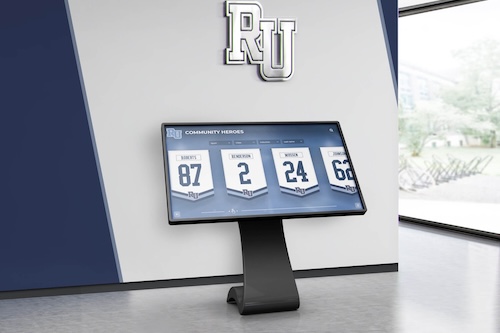
Rotating Spotlight Features: Home screens should highlight timely or notable content including new inductees or recent achievements, alumni milestones and accomplishments, historical anniversaries and commemorations, thematic collections exploring specific topics, and seasonal relevance connecting to current activities. Featured content provides variety encouraging repeat visits while directing attention to content that might otherwise go undiscovered.
Narrative-Driven Content Curation: Beyond individual profiles, create curated collections telling broader stories including dynasty teams dominating their eras, multigenerational family legacies, pioneering figures breaking barriers, turning point moments changing institutional history, and thematic explorations of values or traditions. These narrative collections provide context that individual profiles alone cannot deliver, helping users understand achievements within broader institutional stories. Historical institutions have successfully applied these approaches in developing institutional history timelines.
Budget Planning and Implementation Phases
Understanding realistic costs and phasing options helps organizations implement recognition displays that match both vision and resources.
Typical Cost Components
Recognition display investments include several distinct cost categories.
Hardware Costs: Physical touchscreen displays range from entry-level consumer displays for modest applications to commercial-grade professional installations for high-traffic institutional settings. Basic touchscreen displays (43-55 inches) suitable for modest installations typically range from $1,500-4,000, commercial-grade displays (55-75 inches) designed for continuous public use cost approximately $3,000-8,000, custom mounting, enclosures, and installation add $500-2,500, and protective features like tempered glass or security enclosures increase costs further.
Hardware represents one-time capital costs with 5-7 year typical lifecycles before replacement or upgrade.
Software and Content Platform: Recognition software ranges from generic digital signage solutions requiring significant customization to specialized recognition platforms providing purpose-built functionality. Generic digital signage platforms may cost $30-100 monthly per display but require extensive setup and customization, purpose-built recognition platforms (like Rocket Alumni Solutions) typically range from $100-400 monthly depending on features and scale, while enterprise solutions for large institutions with multiple locations may cost more with custom pricing.
Software costs recur monthly or annually but include ongoing updates, support, and feature enhancements.
Content Development: Initial content population represents significant effort often underestimated during planning. Consider content research and data collection time investment, photo acquisition, scanning, and editing, video production if creating original content, biographical writing and fact verification, and data entry and profile creation. Organizations can complete content development with internal staff time (essentially free but requiring significant hours), hire temporary help or interns for data entry and content creation (typical $15-25/hour), or contract with specialized services for comprehensive content development ($5,000-20,000+ depending on scope).
Phased Implementation Approaches
Organizations with limited budgets can implement recognition displays in manageable phases rather than requiring full investment upfront.
Phase 1: Core Categories with Recent Content: Begin with single display featuring 2-3 primary recognition categories and recent inductees or achievers (past 5-10 years). This approach delivers immediate recognition value with manageable content scope, demonstrates display value and usage patterns informing future expansion, and costs significantly less than comprehensive implementation. Once initial phase proves successful, expand to additional categories and historical depth.
Phase 2: Historical Depth and Additional Categories: With successful initial implementation, add comprehensive historical content spanning decades or centuries, additional recognition categories based on usage patterns and feedback, enhanced multimedia content including video and audio, and potentially additional display locations in secondary buildings. Historical content research can proceed gradually without disrupting ongoing current content updates.
Phase 3: Network and Online Extensions: Mature implementations expand beyond single displays to include multiple displays across campus or facilities, web-based access extending recognition globally, mobile-responsive interfaces for smartphone access, social media integration enabling viral sharing, and advanced features like virtual reality or augmented reality. Approaching implementation in phases allows organizations to match spending with budget availability while building demonstrated value supporting continued investment.
Common Design Mistakes to Avoid
Learning from others’ mistakes accelerates your success and prevents costly design missteps.
Navigation and Usability Pitfalls
Several common mistakes consistently undermine otherwise well-designed displays.
Overly Complex Navigation: The most frequent design mistake involves creating navigation structures requiring too many decisions before users reach actual content. Avoid deep menu hierarchies with 5+ levels before content access, numerous category choices overwhelming users with options, inconsistent navigation patterns varying across sections, and hidden or unclear path back to home screen.
Keep navigation shallow—users should reach content within 2-3 taps maximum from the home screen.
Insufficient Search Functionality: For displays containing substantial content, inadequate search creates major usability problems. Don’t omit search entirely from content-rich displays, hide search behind menu options rather than making it prominent, implement search that doesn’t support partial matches or misspellings, or fail to provide search filtering by category, year, or content type.
Search should be prominent and powerful for any display containing more than 50-100 individuals or multiple years of content. The comprehensive athletic hall of fame creation process emphasizes robust search as non-negotiable for successful implementation.
Neglecting User Feedback: When users tap buttons or scroll content, interfaces should respond immediately. Avoid delays between touch and response creating uncertainty, absence of loading indicators during content retrieval, no visual change on button press or selection, and silent failures when actions don’t complete. Responsive feedback makes interfaces feel alive and controllable rather than sluggish and unpredictable.
Content and Visual Design Errors
Design quality matters as much as navigation structure and functionality.
Inconsistent Visual Quality: Nothing undermines professional appearance faster than inconsistent content quality. Avoid mixing high-resolution professional photos with low-quality snapshots, inconsistent photo cropping and framing across profiles, varying typography and layout across similar content types, and mismatched color schemes between different sections. Establish clear standards and enforce them consistently across all content.
Information Overload: Enthusiasm for comprehensive recognition sometimes leads to presenting excessive information simultaneously. Don’t cram multiple photos, videos, statistics, and long text onto single screens, use small fonts to fit more content, eliminate white space in attempt to maximize content density, or present dozens of button options on primary screens.
Remember that effective design emphasizes what matters through strategic information hierarchy, not by presenting everything equally and simultaneously.
Neglecting Mobile and Web Extensions: Organizations that focus exclusively on physical touchscreen displays miss opportunities for broader reach. Modern recognition programs should extend beyond physical displays through mobile-responsive web access enabling global reach, social sharing features creating viral engagement, downloadable or printable content users can save, and online submission forms enabling community contributions.
Physical displays should be centerpieces of recognition programs, not isolated implementations. The donor recognition wall design approaches increasingly emphasize multi-channel recognition extending beyond physical installations.
Conclusion: Creating Recognition Displays That Inspire
Designing stunning digital hall of fame touchscreen displays requires balancing aesthetic beauty with functional usability, comprehensive content with focused presentation, and institutional priorities with user needs. The most successful recognition displays don’t simply list names and achievements—they tell compelling stories that honor the past while inspiring future generations of achievement.
By following the design principles, user experience strategies, and implementation approaches outlined in this guide, you can create recognition displays that become beloved community gathering points rather than underutilized technology investments. Whether you’re honoring athletes, scholars, artists, donors, or community leaders, thoughtful display design ensures their achievements receive the prominence and respect they deserve.
The journey from concept to completed recognition display involves numerous decisions about layout, navigation, content organization, visual design, and technical implementation. While the process can seem overwhelming, breaking it into manageable phases and focusing on core principles of user-centered design ensures success. Remember that your display should evolve continuously—launch with excellent core content and design, then refine based on usage patterns, community feedback, and changing recognition needs.
Ready to transform your recognition program with a stunning touchscreen display? Solutions like Rocket Alumni Solutions provide specialized platforms designed specifically for schools and organizations implementing digital halls of fame, combining beautiful design templates with powerful content management tools that make ongoing maintenance manageable without requiring technical expertise.
The achievements, dedication, and contributions of your community members deserve recognition systems reflecting their significance. By investing in thoughtfully designed digital touchscreen displays that balance beauty with usability, comprehensive content with intuitive navigation, and institutional pride with accessible storytelling, you create lasting tributes that honor the past, celebrate the present, and inspire future generations to add their own chapters to your community’s ongoing story of excellence.