


Key Takeaways
Complete guide to disabling pinch-to-zoom on touchscreen kiosks using CSS, HTML, and JavaScript. Learn viewport meta tags, touch event handling, and best practices for kiosk software.
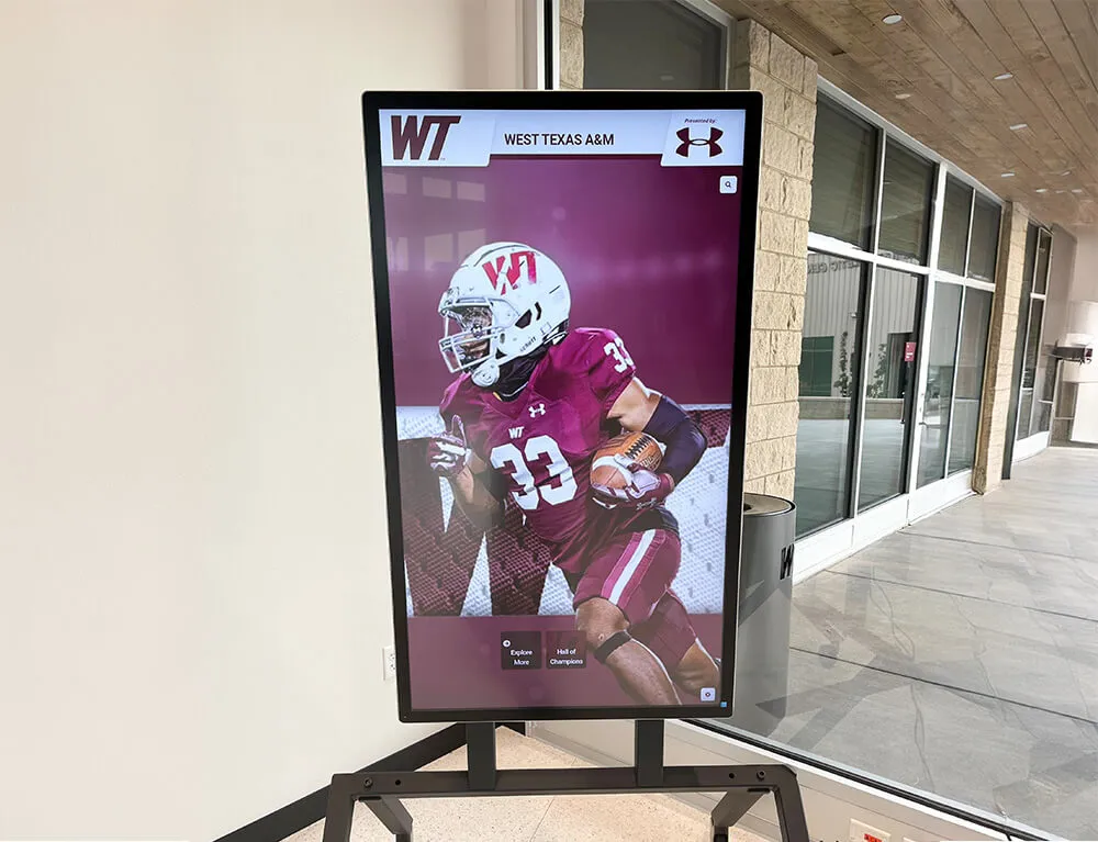
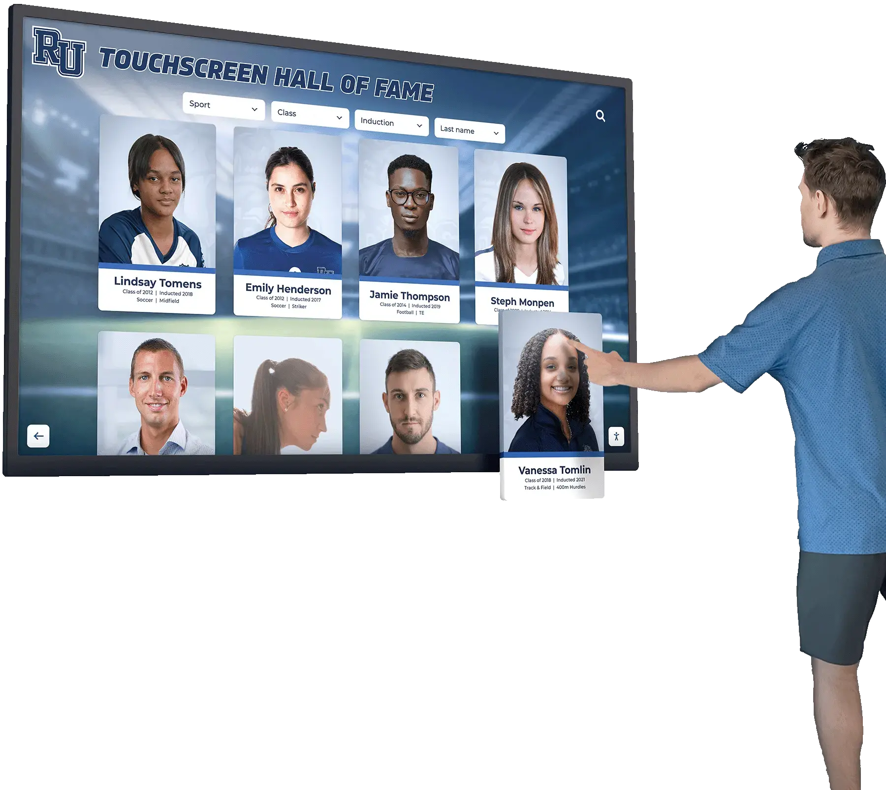
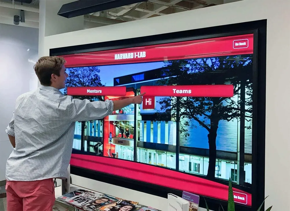
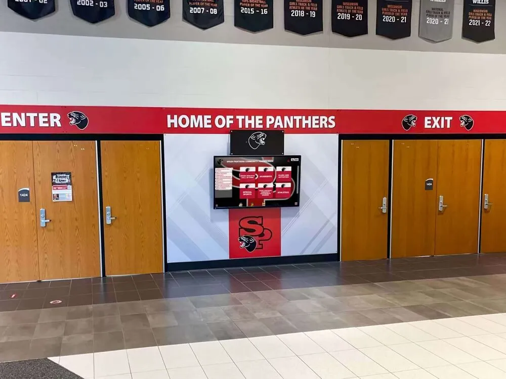
When deploying touchscreen kiosks for public spaces, museums, schools, or retail environments, one critical requirement is preventing unintended user interactions—particularly pinch-to-zoom gestures. Whether you’re building a wayfinding kiosk, a digital hall of fame, or an interactive display, maintaining a controlled user experience is essential. This comprehensive guide covers every method to disable pinch-to-zoom functionality using CSS, HTML, and JavaScript for kiosk software applications.
Why Disable Pinch-to-Zoom on Kiosk Displays?
Before diving into implementation, understanding the rationale is important. In public kiosk environments:
- Consistent User Experience: Prevents users from breaking the intended layout or navigation flow
- Design Integrity: Maintains your carefully crafted interface at the correct scale
- Accessibility: Ensures all interactive elements remain accessible and properly positioned
- Security: Prevents users from zooming to explore underlying page structure or hidden elements
- Professional Appearance: Keeps the interface looking polished and intentional
Solutions like Rocket Alumni Solutions handle these challenges automatically in their kiosk software platforms, but understanding the underlying techniques is valuable for custom implementations.
Method 1: HTML Viewport Meta Tag (Primary Method)
The most effective and widely supported approach is using the HTML viewport meta tag. This method works across all modern browsers and mobile devices.
Basic Implementation
Add this meta tag to the <head> section of your HTML:
<meta name="viewport" content="width=device-width, initial-scale=1, maximum-scale=1, user-scalable=no">
Understanding Each Attribute
- width=device-width: Sets the viewport width to match the device’s screen width
- initial-scale=1: Sets the initial zoom level to 100%
- maximum-scale=1: Prevents zooming beyond 100%
- user-scalable=no: Explicitly disables user scaling gestures
iOS 10+ Specific Considerations
Apple removed support for user-scalable=no in iOS 10 to improve accessibility. For iOS devices, you’ll need additional JavaScript solutions (covered in Method 3).
<!-- Enhanced meta tag for broader compatibility -->
<meta name="viewport" content="width=device-width, initial-scale=1.0, maximum-scale=1.0, minimum-scale=1.0, user-scalable=no, shrink-to-fit=no">
Method 2: CSS Touch Action Property
The CSS touch-action property provides granular control over touch gestures. This method is particularly effective for modern browsers and works well alongside the viewport meta tag.
Implementation
/* Apply to body or specific elements */
body {
  touch-action: pan-x pan-y;
  -ms-touch-action: pan-x pan-y;
}

/* Or disable all touch manipulation */
.kiosk-container {
  touch-action: manipulation;
}

/* Prevent all gestures except single-finger panning */
.interactive-display {
  touch-action: pan-x pan-y pinch-zoom;
}
Touch Action Values Explained
- none: Disables all touch behaviors including scrolling and zooming
- manipulation: Enables panning and pinch-zoom but disables double-tap-to-zoom
- pan-x pan-y: Allows horizontal and vertical panning only
- pinch-zoom: Enables pinch gestures (use with caution in kiosks)
Browser Support
The touch-action property has excellent support in modern browsers:
- Chrome 36+
- Firefox 52+
- Safari 13+
- Edge 12+
Many interactive kiosk software solutions implement these CSS properties automatically as part of their kiosk mode features.
Method 3: JavaScript Touch Event Prevention
For maximum control and compatibility—especially on iOS 10+ devices—JavaScript provides the most reliable solution.
Basic Event Listener Approach
// Prevent pinch-to-zoom gesture
document.addEventListener('touchmove', function(event) {
  if (event.scale !== 1) {
    event.preventDefault();
  }
}, { passive: false });

// Prevent double-tap zoom
let lastTouchEnd = 0;
document.addEventListener('touchend', function(event) {
  const now = (new Date()).getTime();
  if (now - lastTouchEnd <= 300) {
    event.preventDefault();
  }
  lastTouchEnd = now;
}, false);
Advanced Multi-Touch Detection
// Comprehensive touch gesture blocking
(function() {
  // Track number of active touches
  let touchCount = 0;

  document.addEventListener('touchstart', function(e) {
    touchCount = e.touches.length;

    // Block multi-touch gestures
    if (touchCount > 1) {
      e.preventDefault();
    }
  }, { passive: false });

  document.addEventListener('touchmove', function(e) {
    // Prevent pinch-to-zoom
    if (e.scale !== 1 || touchCount > 1) {
      e.preventDefault();
    }
  }, { passive: false });

  document.addEventListener('touchend', function(e) {
    touchCount = e.touches.length;
  }, { passive: false });

  // Prevent gesture events
  document.addEventListener('gesturestart', function(e) {
    e.preventDefault();
  }, { passive: false });
})();
Passive Event Listeners Consideration
Note the { passive: false } parameter. Modern browsers default to passive event listeners for scroll performance, but to use preventDefault(), you must explicitly set passive to false.
Method 4: Window Resize Prevention
Some browsers allow zooming via programmatic or gesture-based window resizing. Prevent this with:
// Lock window size and prevent resize-based zoom
window.addEventListener('resize', function() {
  const viewport = document.querySelector('meta[name=viewport]');
  viewport.setAttribute('content',
    'width=device-width, initial-scale=1, maximum-scale=1, user-scalable=no');
});

// Prevent Ctrl/Cmd + Plus/Minus keyboard zoom
document.addEventListener('keydown', function(e) {
  if ((e.ctrlKey || e.metaKey) &&
      (e.key === '+' || e.key === '-' || e.key === '=')) {
    e.preventDefault();
  }
}, false);

// Prevent Ctrl/Cmd + mousewheel zoom
document.addEventListener('wheel', function(e) {
  if (e.ctrlKey || e.metaKey) {
    e.preventDefault();
  }
}, { passive: false });

Method 5: CSS Transform Scale Lock
For applications using CSS transforms, lock the scale property:
/* Prevent scale transformations */
.kiosk-content {
  transform: scale(1);
  transform-origin: center center;
  will-change: transform;
}

/* Lock viewport using CSS variables */
:root {
  --viewport-scale: 1;
}

body {
  transform: scale(var(--viewport-scale));
  transform-origin: 0 0;
}
Complete Implementation Example
Here’s a production-ready implementation combining all methods:
<!DOCTYPE html>
<html lang="en">
<head>
  <meta charset="UTF-8">
  <meta name="viewport" content="width=device-width, initial-scale=1.0, maximum-scale=1.0, user-scalable=no, shrink-to-fit=no">
  <title>Kiosk Display - Zoom Disabled</title>

  <style>
    * {
      -webkit-user-select: none;
      -moz-user-select: none;
      -ms-user-select: none;
      user-select: none;
    }

    html, body {
      margin: 0;
      padding: 0;
      width: 100%;
      height: 100%;
      overflow: hidden;
      touch-action: pan-x pan-y;
      -ms-touch-action: pan-x pan-y;
      position: fixed;
    }

    .kiosk-container {
      width: 100vw;
      height: 100vh;
      touch-action: manipulation;
      overscroll-behavior: none;
    }
  </style>
</head>
<body>
  <div class="kiosk-container">
    <!-- Your kiosk content here -->
    <h1>Interactive Kiosk Display</h1>
  </div>

  <script>
    (function() {
      'use strict';

      // Prevent pinch-to-zoom
      document.addEventListener('touchmove', function(e) {
        if (e.scale !== 1) e.preventDefault();
      }, { passive: false });

      // Prevent double-tap zoom
      let lastTouchEnd = 0;
      document.addEventListener('touchend', function(e) {
        const now = Date.now();
        if (now - lastTouchEnd <= 300) e.preventDefault();
        lastTouchEnd = now;
      }, false);

      // Prevent gesture events (iOS)
      document.addEventListener('gesturestart', function(e) {
        e.preventDefault();
      }, false);

      // Prevent keyboard zoom
      document.addEventListener('keydown', function(e) {
        if ((e.ctrlKey || e.metaKey) &&
            ['+', '-', '=', '_'].includes(e.key)) {
          e.preventDefault();
        }
      }, false);

      // Prevent mousewheel zoom
      document.addEventListener('wheel', function(e) {
        if (e.ctrlKey || e.metaKey) e.preventDefault();
      }, { passive: false });

      // Lock viewport on resize
      window.addEventListener('resize', function() {
        const viewport = document.querySelector('meta[name=viewport]');
        if (viewport) {
          viewport.setAttribute('content',
            'width=device-width, initial-scale=1.0, maximum-scale=1.0, user-scalable=no');
        }
      });
    })();
  </script>
</body>
</html>
Platform-Specific Considerations
Android Kiosks
Android devices typically respect the standard viewport meta tag. For Android-specific kiosk mode applications, consider using:
- Android Kiosk Mode: System-level lockdown available in Android 5.0+
- WebView Settings: If using a WebView container, configure settings programmatically
- Chrome Custom Tabs: Use custom tab intents with zoom disabled
// Android WebView configuration
WebSettings settings = webView.getSettings();
settings.setBuiltInZoomControls(false);
settings.setDisplayZoomControls(false);
settings.setSupportZoom(false);
iOS Kiosks
iOS devices require special attention due to accessibility requirements:
// iOS-specific zoom prevention
document.documentElement.addEventListener('touchstart', function(e) {
  if (e.touches.length > 1) e.preventDefault();
}, { passive: false });

// iOS Safari-specific
document.addEventListener('gesturestart', function(e) {
  e.preventDefault();
  document.body.style.zoom = 0.99;
});

document.addEventListener('gesturechange', function(e) {
  e.preventDefault();
  document.body.style.zoom = 0.99;
});

document.addEventListener('gestureend', function(e) {
  e.preventDefault();
  document.body.style.zoom = 1;
});

Testing Your Implementation
After implementing zoom prevention, test across multiple scenarios:
Manual Testing Checklist
- Two-finger pinch gesture on touchscreen
- Double-tap to zoom
- Ctrl/Cmd + Plus/Minus on keyboard
- Ctrl/Cmd + Mousewheel
- Browser zoom controls (should still work for accessibility)
- Rotation and orientation changes
- Different browsers (Chrome, Safari, Firefox, Edge)
- iOS devices (iPhone, iPad)
- Android tablets and phones
Automated Testing
// Unit test example using Jest
describe('Zoom Prevention', () => {
  test('prevents touchmove scale changes', () => {
    const event = new TouchEvent('touchmove', {
      touches: [{}, {}],
      scale: 1.5
    });

    const prevented = !event.defaultPrevented;
    document.dispatchEvent(event);

    expect(event.defaultPrevented).toBe(true);
  });
});
Accessibility Considerations
While disabling zoom is necessary for kiosks, consider these accessibility best practices:
Font Size and Readability
/* Use larger base font sizes for kiosks */
body {
  font-size: 18px;
  line-height: 1.6;
}

h1 { font-size: 2.5em; }
h2 { font-size: 2em; }
p { font-size: 1.2em; }

/* Ensure sufficient color contrast */
.text-content {
  color: #000;
  background: #fff;
  /* WCAG AAA: 7:1 contrast ratio */
}
Alternative Accessibility Features
- Provide built-in text size controls in your interface
- Offer high-contrast mode toggle
- Include audio alternatives for content
- Design touch targets at least 44×44 pixels
- Maintain sufficient spacing between interactive elements
Professional touchscreen kiosk software solutions balance zoom prevention with accessibility by offering built-in customization options.
Browser Support Matrix
| Method | Chrome | Firefox | Safari | Edge | IE11 |
|---|---|---|---|---|---|
| Viewport meta | ✅ | ✅ | ✅* | ✅ | ✅ |
| CSS touch-action | ✅ | ✅ | ✅ | ✅ | ✅ |
| JavaScript events | ✅ | ✅ | ✅ | ✅ | ⚠️ |
| Gesture API | ✅ | ✅ | ✅ | ✅ | ❌ |
*Safari iOS 10+ requires JavaScript for full support
Common Issues and Troubleshooting
Issue: Zoom Still Works on iOS
Solution: Ensure all event listeners use { passive: false } and implement gesture event handlers.
// Add this specifically for iOS
document.addEventListener('gesturestart', function(e) {
  e.preventDefault();
}, { passive: false });
Issue: Scroll Behavior Affected
Solution: Use touch-action: pan-x pan-y instead of none to preserve scrolling.
body {
  touch-action: pan-x pan-y; /* Allows scroll, prevents zoom */
}
Issue: Content Not Responsive
Solution: Test your layout at different viewport sizes and device orientations.
/* Responsive kiosk layouts */
@media screen and (orientation: landscape) {
  .kiosk-container { flex-direction: row; }
}

@media screen and (orientation: portrait) {
  .kiosk-container { flex-direction: column; }
}
Performance Optimization
Zoom prevention code should not impact performance. Follow these optimization tips:
Debounce Event Handlers
// Debounce for better performance
function debounce(func, wait) {
  let timeout;
  return function executedFunction(...args) {
    const later = () => {
      clearTimeout(timeout);
      func(...args);
    };
    clearTimeout(timeout);
    timeout = setTimeout(later, wait);
  };
}

// Apply to resize handler
window.addEventListener('resize', debounce(function() {
  // Viewport reset logic
}, 100));
Use CSS Hardware Acceleration
.kiosk-container {
  transform: translateZ(0);
  will-change: transform;
  backface-visibility: hidden;
}
Integration with Kiosk Software Platforms
When implementing zoom prevention as part of a larger kiosk software solution, consider:
- Content Management System: How will content updates affect zoom settings?
- Remote Management: Can zoom settings be configured remotely across multiple kiosks?
- Operating System Level: Should zoom be disabled at the OS level for added security?
- Hardware Considerations: Some touchscreen hardware solutions include firmware-level gesture controls
Professional platforms like those used for digital hall of fame displays handle these integrations seamlessly, managing zoom prevention alongside content delivery, security, and remote management.
Security Implications
Disabling zoom is part of a comprehensive kiosk security strategy:
Additional Kiosk Lockdown Measures
// Prevent context menu
document.addEventListener('contextmenu', function(e) {
  e.preventDefault();
}, false);

// Prevent text selection
document.addEventListener('selectstart', function(e) {
  e.preventDefault();
}, false);

// Disable drag operations
document.addEventListener('dragstart', function(e) {
  e.preventDefault();
}, false);
CSS Security Hardening
* {
  user-select: none;
  -webkit-user-drag: none;
  -webkit-touch-callout: none;
}

/* Prevent highlighting and copying */
::selection {
  background: transparent;
}

::-moz-selection {
  background: transparent;
}
For comprehensive security guidance, review best practices for kiosk software security.
Framework-Specific Implementations
React Implementation
import React, { useEffect } from 'react';

function KioskContainer({ children }) {
  useEffect(() => {
    // Prevent pinch zoom
    const preventZoom = (e) => {
      if (e.scale !== 1) e.preventDefault();
    };

    // Prevent double tap
    let lastTouchEnd = 0;
    const preventDoubleTap = (e) => {
      const now = Date.now();
      if (now - lastTouchEnd <= 300) e.preventDefault();
      lastTouchEnd = now;
    };

    document.addEventListener('touchmove', preventZoom, { passive: false });
    document.addEventListener('touchend', preventDoubleTap, false);
    document.addEventListener('gesturestart', (e) => e.preventDefault(), false);

    return () => {
      document.removeEventListener('touchmove', preventZoom);
      document.removeEventListener('touchend', preventDoubleTap);
    };
  }, []);

  return (
    <div
      className="kiosk-container"
      style={{ touchAction: 'pan-x pan-y' }}
    >
      {children}
    </div>
  );
}

export default KioskContainer;
Vue.js Implementation
<template>
  <div class="kiosk-container" ref="kioskRef">
    <slot></slot>
  </div>
</template>

<script>
export default {
  name: 'KioskContainer',
  mounted() {
    this.initZoomPrevention();
  },
  beforeUnmount() {
    this.cleanupZoomPrevention();
  },
  methods: {
    initZoomPrevention() {
      this.preventZoom = (e) => {
        if (e.scale !== 1) e.preventDefault();
      };

      document.addEventListener('touchmove', this.preventZoom, { passive: false });
      document.addEventListener('gesturestart', (e) => e.preventDefault(), false);
    },
    cleanupZoomPrevention() {
      document.removeEventListener('touchmove', this.preventZoom);
    }
  }
}
</script>

<style scoped>
.kiosk-container {
  touch-action: pan-x pan-y;
  width: 100%;
  height: 100%;
}
</style>
Angular Implementation
import { Component, OnInit, OnDestroy } from '@angular/core';

@Component({
  selector: 'app-kiosk-container',
  template: `
    <div class="kiosk-container">
      <ng-content></ng-content>
    </div>
  `,
  styles: [`
    .kiosk-container {
      touch-action: pan-x pan-y;
      width: 100%;
      height: 100%;
    }
  `]
})
export class KioskContainerComponent implements OnInit, OnDestroy {
  private preventZoom = (e: TouchEvent) => {
    if ((e as any).scale !== 1) e.preventDefault();
  };

  ngOnInit() {
    document.addEventListener('touchmove', this.preventZoom, { passive: false } as any);
    document.addEventListener('gesturestart', (e) => e.preventDefault(), false);
  }

  ngOnDestroy() {
    document.removeEventListener('touchmove', this.preventZoom);
  }
}

Real-World Use Cases
Understanding how different organizations implement zoom prevention:
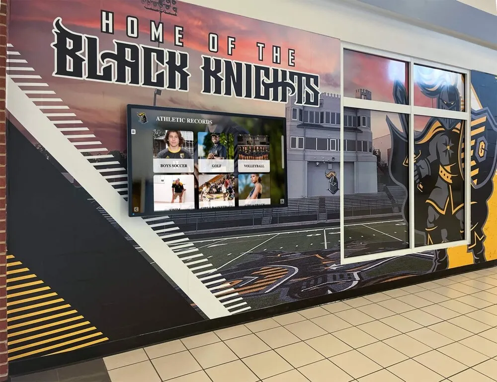
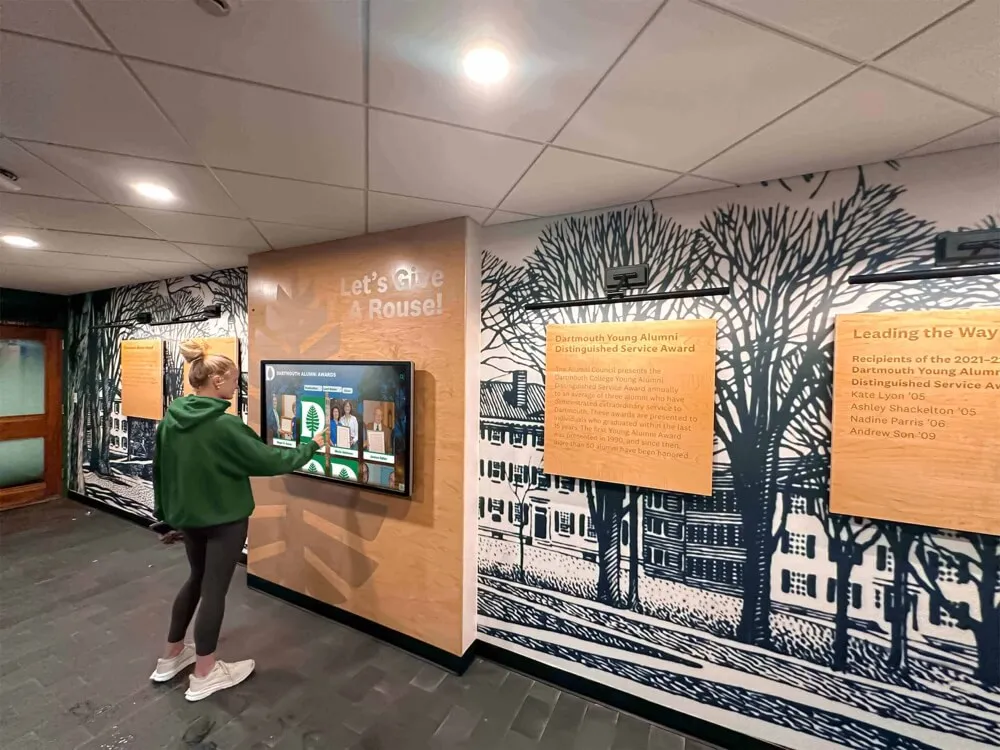
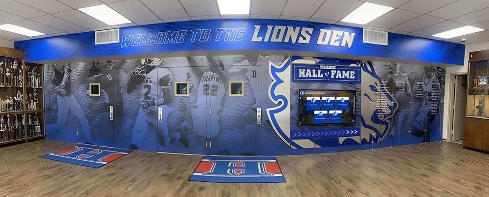
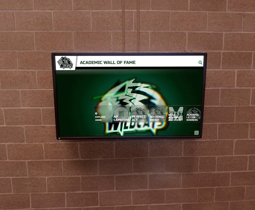
Educational Institutions
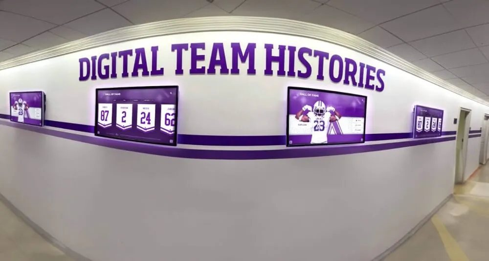
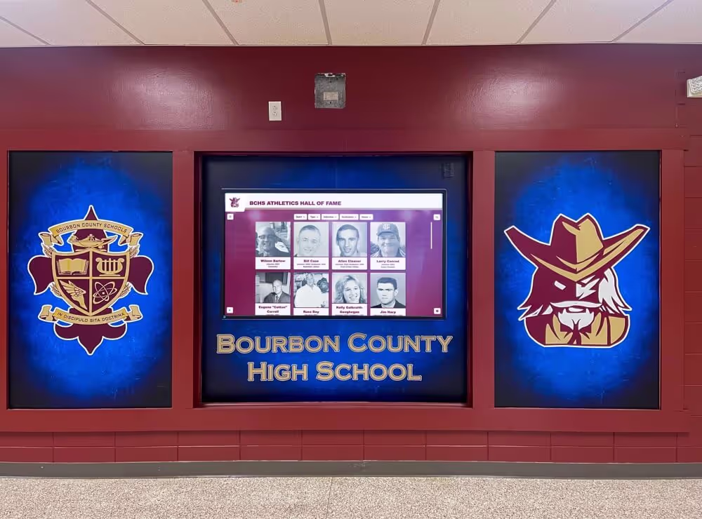
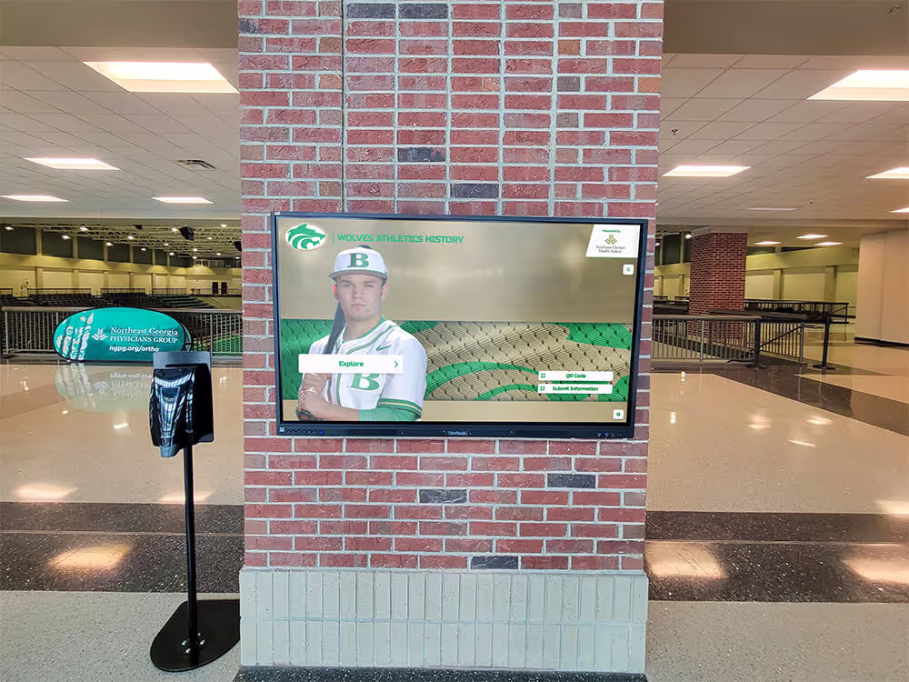
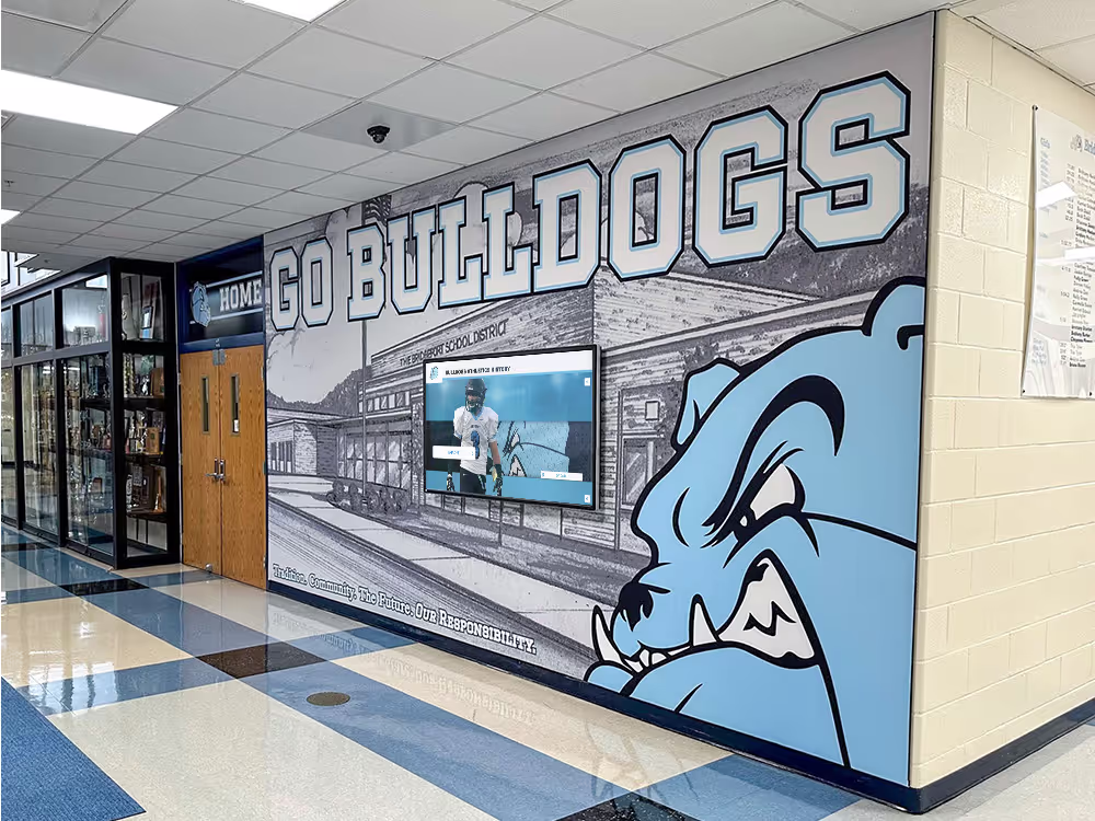
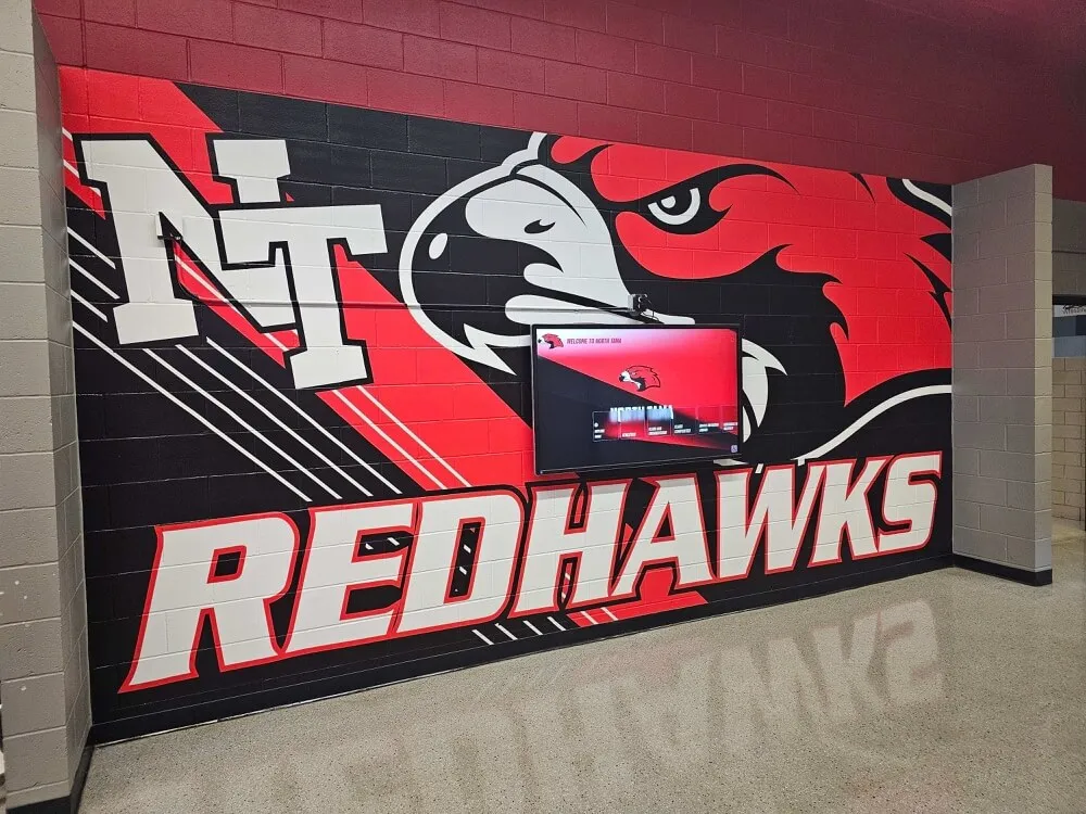
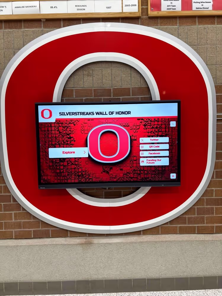
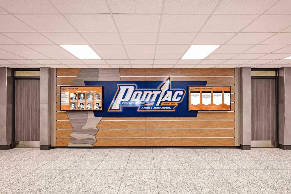
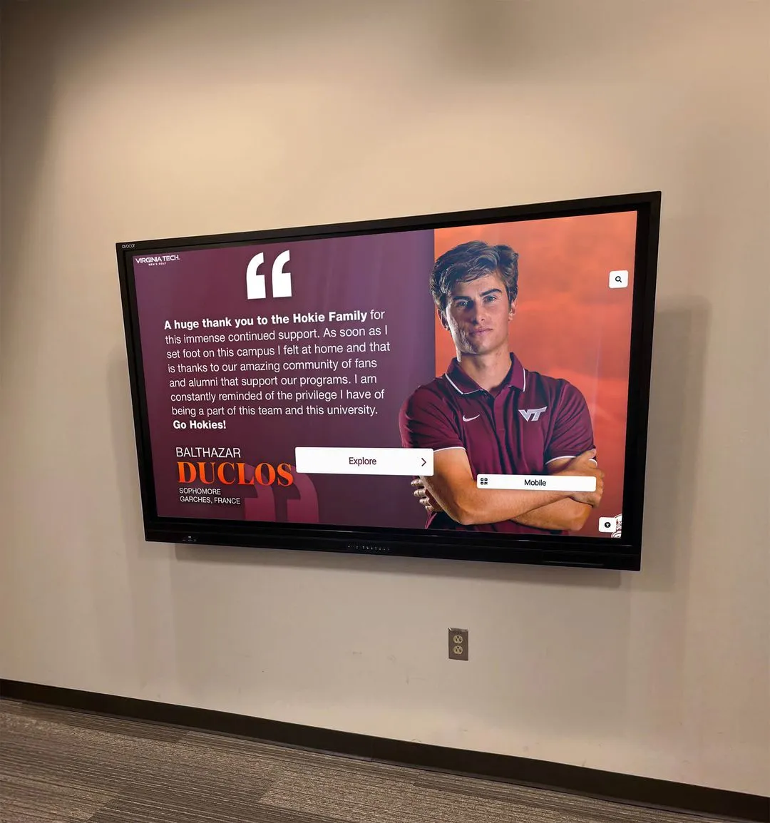
Schools and universities deploying interactive recognition displays require zoom prevention to maintain content integrity. Students interacting with digital hall of fame systems need a controlled experience that prevents accidental interface disruption.
Museums and Exhibitions
Museum touchscreen exhibits benefit from locked zoom levels to ensure visitors view content at optimal scales. Professional kiosk interactive software handles zoom prevention as part of exhibit management.
Retail and Hospitality
Point-of-sale kiosks and self-service terminals need strict zoom prevention to maintain security and usability. Combined with other lockdown features, zoom prevention ensures customers interact only with intended interface elements.
Healthcare Settings
Medical information kiosks and check-in stations require zoom prevention for HIPAA compliance and consistent user experience across patient interactions.
Sports and Recreation
Digital record boards and athletic recognition displays use zoom prevention to maintain statistical data presentation and ensure readability at designed scales.
Advanced Techniques
Dynamic Zoom Control
In some scenarios, you may want to allow zoom in specific areas while preventing it globally:
// Allow zoom in specific elements only
document.addEventListener('touchmove', function(e) {
  const zoomAllowedElement = e.target.closest('.zoom-enabled');

  if (!zoomAllowedElement && e.scale !== 1) {
    e.preventDefault();
  }
}, { passive: false });
/* Mark specific areas as zoom-enabled */
.zoom-enabled {
  touch-action: pinch-zoom;
}

/* Rest of content locked */
body {
  touch-action: pan-x pan-y;
}
Orientation Lock with Zoom Prevention
// Lock orientation and prevent zoom together
if (screen.orientation && screen.orientation.lock) {
  screen.orientation.lock('landscape').catch(err => {
    console.log('Orientation lock failed:', err);
  });
}

// Maintain zoom prevention on orientation change
window.addEventListener('orientationchange', function() {
  const viewport = document.querySelector('meta[name=viewport]');
  viewport.setAttribute('content',
    'width=device-width, initial-scale=1.0, maximum-scale=1.0, user-scalable=no');
});
Progressive Web App (PWA) Considerations
For kiosks running as PWAs, include zoom prevention in your manifest and service worker:
{
  "name": "Kiosk Display",
  "display": "fullscreen",
  "orientation": "any",
  "viewport": "width=device-width, initial-scale=1, user-scalable=no"
}
Maintenance and Updates
Keep your zoom prevention code current:
Version Control
// Track zoom prevention version
const ZOOM_PREVENTION_VERSION = '2.1.0';

console.log(`Zoom Prevention v${ZOOM_PREVENTION_VERSION} loaded`);

// Check for updates
if (window.checkForUpdates) {
  window.checkForUpdates('zoom-prevention', ZOOM_PREVENTION_VERSION);
}
Feature Detection
// Detect available features before implementing
const features = {
  touchAction: 'touchAction' in document.body.style,
  passiveEvents: (() => {
    let supported = false;
    try {
      const opts = Object.defineProperty({}, 'passive', {
        get: () => { supported = true; }
      });
      window.addEventListener('test', null, opts);
      window.removeEventListener('test', null, opts);
    } catch (e) {}
    return supported;
  })(),
  gestureEvents: 'ongesturestart' in window
};

// Apply appropriate methods based on feature support
if (features.touchAction) {
  document.body.style.touchAction = 'pan-x pan-y';
}
Best Practices Summary
- Use Multiple Methods: Combine viewport meta tags, CSS, and JavaScript for maximum compatibility
- Test Extensively: Verify across devices, browsers, and operating systems
- Consider Accessibility: Provide alternative ways to adjust viewing preferences
- Performance First: Optimize event handlers and avoid unnecessary computations
- Document Your Code: Comment zoom prevention logic for future maintenance
- Version Control: Track changes and updates to zoom prevention implementations
- Monitor Effectiveness: Use analytics to detect if zoom prevention is working
- Stay Updated: Browser behaviors change; keep code current with web standards
Choosing the Right Solution for Your Project
Consider these factors when implementing zoom prevention:
DIY vs. Professional Software
DIY Implementation Pros:
- Complete control over code
- No ongoing licensing costs
- Customizable to exact needs
- Learning opportunity
DIY Implementation Cons:
- Requires ongoing maintenance
- Browser compatibility responsibility
- Security updates needed
- Testing across devices required
Professional Kiosk Software Pros:
- Zoom prevention included
- Regular updates and security patches
- Cross-platform compatibility guaranteed
- Professional support available
- Remote management capabilities
For organizations deploying multiple kiosks, professional solutions like Rocket Alumni Solutions provide tested, maintained zoom prevention as part of comprehensive touchscreen kiosk software packages.

Future-Proofing Your Implementation
Web standards evolve continuously. Future-proof your zoom prevention:
Monitor Web Standards
- Follow W3C Touch Events specifications
- Watch for CSS touch-action updates
- Stay informed about browser vendor changes
- Participate in web standards discussions
Implement Graceful Degradation
// Fallback chain for zoom prevention
function implementZoomPrevention() {
  // Try modern CSS first
  if ('touchAction' in document.body.style) {
    document.body.style.touchAction = 'pan-x pan-y';
  }

  // Fall back to JavaScript
  else {
    document.addEventListener('touchmove', function(e) {
      if (e.scale !== 1) e.preventDefault();
    }, { passive: false });
  }

  // Always set viewport meta
  const viewport = document.querySelector('meta[name=viewport]') ||
                   document.createElement('meta');
  viewport.name = 'viewport';
  viewport.content = 'width=device-width, initial-scale=1, maximum-scale=1, user-scalable=no';

  if (!viewport.parentNode) {
    document.head.appendChild(viewport);
  }
}
Regular Testing Schedule
Establish a testing routine:
- Monthly: Test on primary deployment devices
- Quarterly: Test on all supported browsers
- Semi-annually: Comprehensive cross-device testing
- After major OS updates: Immediate testing and updates
Conclusion
Disabling pinch-to-zoom on touchscreen kiosks is essential for maintaining a professional, controlled user experience. By combining HTML viewport meta tags, CSS touch-action properties, and JavaScript event prevention, you can create robust zoom prevention that works across all modern browsers and devices.
For organizations deploying multiple kiosks or requiring enterprise-level reliability, professional touchscreen kiosk software solutions handle zoom prevention automatically while providing additional features like remote management, content scheduling, and analytics.
Whether you’re building a digital hall of fame, wayfinding kiosk, or interactive display, implementing proper zoom prevention ensures your content is experienced exactly as designed.
Additional Resources
For more information on touchscreen kiosk development:
- Kiosk Interactive Software Guide
- Best Touchscreen Software for Kiosks
- Touchscreen Kiosk Software 2025 Buying Guide
- Touchscreen Software Creation Tools
- Digital Asset Management for Schools
Ready to implement professional-grade touchscreen kiosk software with built-in zoom prevention and comprehensive management features? Contact Rocket Alumni Solutions for a demo of enterprise-ready kiosk solutions.