


Key Takeaways
Run a touch target size accessibility audit on your school's digital hall of fame. Covers WCAG requirements, a measurement table for search controls, profile cards, filters, and navigation, and step-by-step audit instructions.

Why Touch Target Size Matters on Hall of Fame Displays
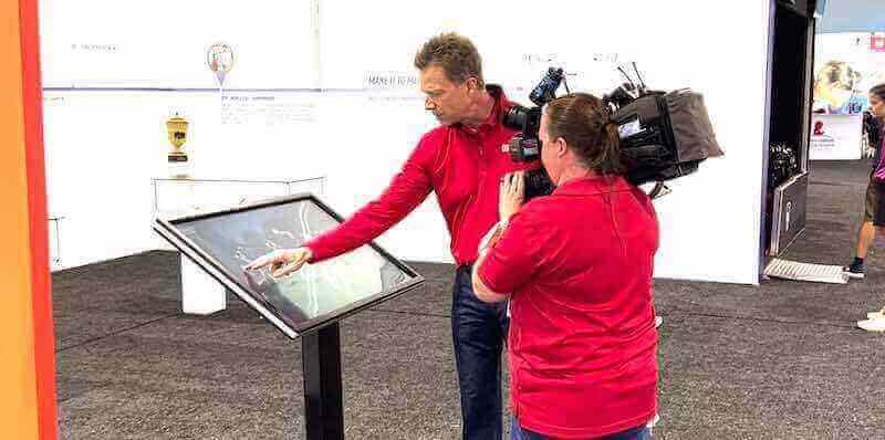
A recognition display is not a typical application. Visitors approach it briefly—during halftime, at a reunion, after a ceremony—and they are often standing, sometimes in poor lobby lighting, occasionally holding something in the other hand. The interaction window is short and the expectation is immediate success. An athlete’s family member trying to find a parent’s induction profile should not need three attempts to tap the correct filter chip.
Touch target size has been a documented usability concern since early smartphone research, and it is now addressed directly by the Web Content Accessibility Guidelines. WCAG 2.2 Success Criterion 2.5.8 (Target Size – Minimum, Level AA) requires that interactive controls be at least 24×24 CSS pixels, with the target or its offset from adjacent targets covering a 24 px area. WCAG 2.5.5 (Target Size – Enhanced, Level AAA) raises that floor to 44×44 CSS pixels. Apple’s Human Interface Guidelines cite 44×44 points as their recommended minimum touch target, and Google’s Material Design guidelines recommend a minimum touch target area of 48×48 dp with at least 8 dp of spacing between adjacent targets.
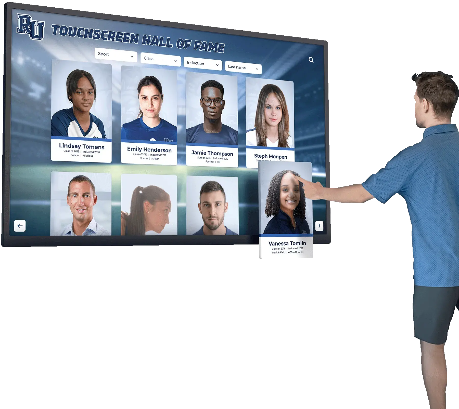
For a touchscreen hall of fame kiosk, the AAA 44×44 px guideline is the appropriate design target. Kiosk interfaces are not read-only content pages; they are task completion surfaces where every touch that misses is a failure visible to an onlooker in a public space. School programs that have invested in comprehensive hall of fame tools for athletics, donors, and the arts owe that same investment to the usability of the interface that presents the content.
The Four Control Families That Need Auditing
A digital hall of fame typically presents four distinct families of interactive controls. Each has its own failure modes.
1. Search Controls
The search bar itself is rarely undersized—it spans most of the available width. The controls around it are the problem:
- Clear button (×): Rendered as a small icon inside the input field, often 16–20 px wide
- Submit / search button: May shrink to icon-only on smaller screen breakpoints
- Autocomplete suggestion rows: Each row must be tall enough for a single tap without accidentally selecting an adjacent entry
2. Profile Cards
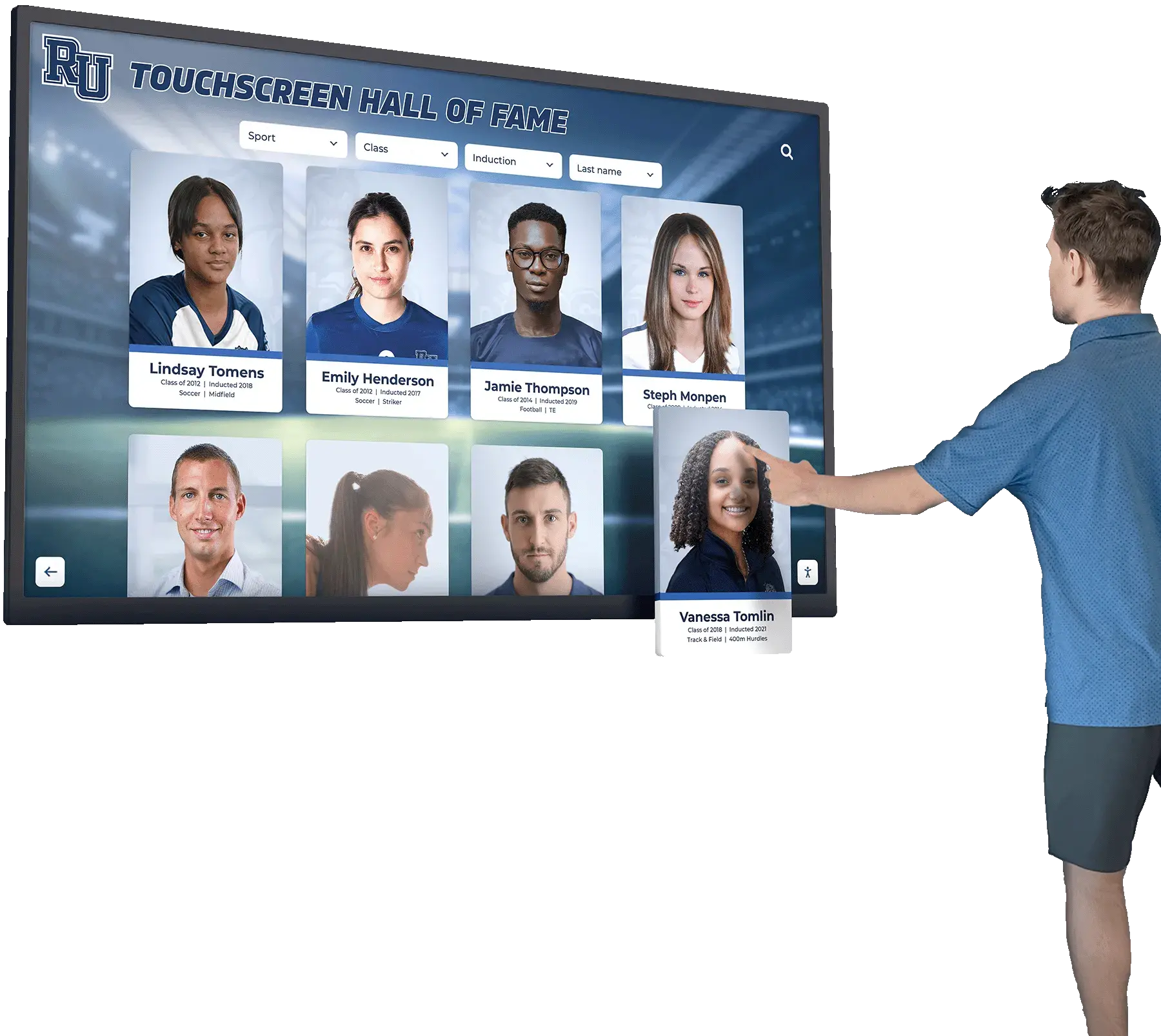

Profile cards displaying inductee portraits, names, and sport labels are the central navigation element on most hall of fame platforms. Failure modes include:
- Card tap area limited to name text only: The link wraps the name rather than the entire card, leaving the portrait and sport label outside the tappable region
- “View profile” secondary button: A small call-to-action below the card that may be 28–32 px tall
- Favorite or bookmark icons: Small action icons placed at the card corner, often 16–20 px
3. Filter Controls
Filter chips and dropdowns let visitors narrow results by sport, year, award category, or graduation class. These controls carry a high risk of being undersized because designers often treat them as secondary interface elements:
- Sport or category chips: When displayed as a row of labeled pills, chip height may fall below 32 px
- Year range slider handles: Circular drag handles as small as 12–16 px
- Clear-all filter button: Often styled as a text link without adequate padding
- Dropdown arrow icons: When filter controls use a custom select box, the tap area may not extend to the icon
4. Navigation Controls
Navigation elements frame every screen of the hall of fame:
- Back / Home button: May appear as a small icon in the corner of the screen
- Pagination arrows or page number buttons: Common failure, especially when rendered at 24–28 px in compact layouts
- Tab or section navigation items: Short-labeled tabs in a navigation bar that narrow further at smaller breakpoints
WCAG Requirement Summary and Measurement Table
The table below maps each control type to the applicable standard and a practical minimum for kiosk deployments.
| Control | WCAG 2.5.8 (AA) Minimum | WCAG 2.5.5 (AAA) Target | Kiosk Practical Floor |
|---|---|---|---|
| Search bar input field | 24 × 24 px | 44 × 44 px | 48 px height, full available width |
| Search clear (×) button | 24 × 24 px | 44 × 44 px | 44 × 44 px with padding |
| Autocomplete suggestion row | 24 × 24 px | 44 × 44 px | 48 px row height minimum |
| Profile card (full card tappable) | 24 × 24 px | 44 × 44 px | Entire card area tappable |
| “View profile” secondary button | 24 × 24 px | 44 × 44 px | 44 px height, 100 px min-width |
| Filter chip (sport, year, category) | 24 × 24 px | 44 × 44 px | 40 px height, 8 px horizontal padding |
| Year range slider handle | 24 × 24 px | 44 × 44 px | 44 × 44 px hit area over visual handle |
| Clear-all filter button | 24 × 24 px | 44 × 44 px | 44 px height, explicit padding |
| Back / Home button | 24 × 24 px | 44 × 44 px | 44 × 44 px |
| Pagination arrow | 24 × 24 px | 44 × 44 px | 44 × 44 px |
| Tab / section navigation item | 24 × 24 px | 44 × 44 px | 48 px height, full label width |
CSS pixel measurements apply to the tappable hit region, which may be larger than the visible element when padding is present. The Kiosk Practical Floor reflects the AAA enhanced standard plus a small ergonomic buffer appropriate for public environments where visitors of all ages interact with the screen.
How to Capture Actual Measurements
Before you can remediate, you need to know which controls are failing. Use this protocol to build a measurement record.
Step 1 — Open DevTools on the display device or a representative browser. For physical kiosk audits, connect a laptop to the same network and use Chrome's remote debugging feature to inspect the running kiosk page. For web-based hall of fame platforms, open DevTools directly in a desktop browser set to the kiosk resolution.
Step 2 — Select each interactive element. Use the Elements panel to select the clickable element—not just its label text. Confirm that the element includes any padding that extends the hit area beyond the visible bounds.
Step 3 — Read the computed box model. In the Computed panel, note the total width and height. In the Box Model diagram, note whether padding is included in that measurement (padding-box sizing) or extends beyond it (content-box sizing).
Step 4 — Log findings in a spreadsheet. Create one row per control with columns for: control name, screen or page where it appears, measured width in px, measured height in px, pass/fail against the 24 px minimum, pass/fail against the 44 px target, and notes on spacing from adjacent targets.
Step 5 — Repeat on a physical touch device. Testing on a touchscreen—a tablet at the same resolution as your kiosk, or the kiosk itself—surfaces failures that numerical measurement misses. Have a tester with an average adult hand size attempt each control without looking closely at the screen. Record any mis-tap or second-attempt event as a practical failure, even if the pixel dimension is technically above the minimum.
Step-by-Step Audit Process
Phase 1: Inventory All Interactive Controls
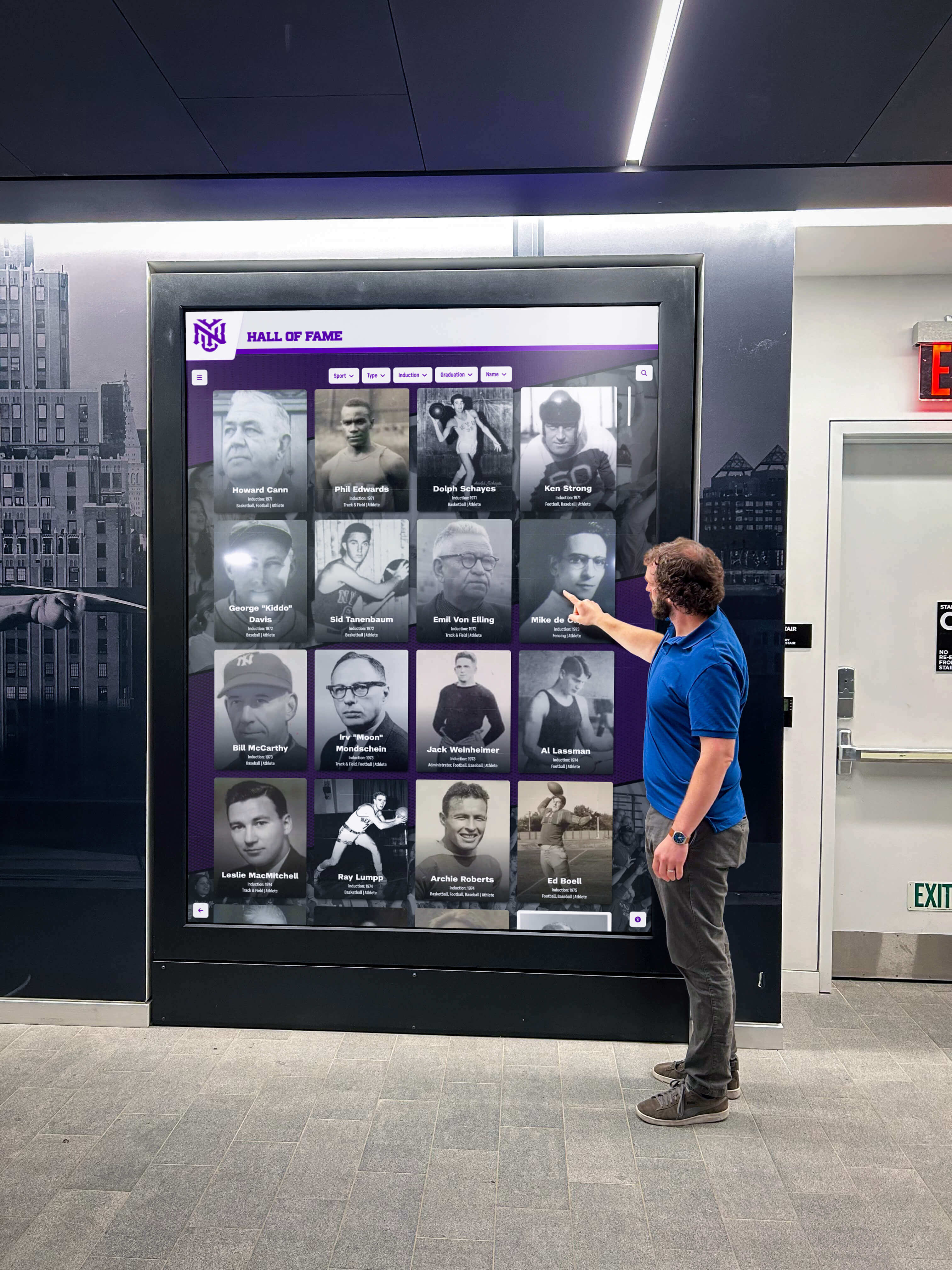
Walk through every screen state of the hall of fame:
- Home or landing screen
- Search with no query entered (search bar and any default content)
- Search with an active query (autocomplete suggestions visible)
- Search results list (profile cards, pagination, active filter chips)
- Single inductee profile view (back button, any action buttons, related records)
- Filter panel open (all filter controls visible simultaneously)
- Any secondary sections such as timelines, team histories, or award archives
For each state, identify every element a visitor could tap. Athletic recognition programs often add contextual actions—sharing a profile, viewing a related award year—that are easy to overlook. Programs that serve alumni during events like reunion programming paired with digital displays should also account for temporary overlay screens or modal windows that may appear during those events.
Phase 2: Measure and Record
Use the DevTools protocol described above to measure each control. Complete the spreadsheet before moving to remediation—auditing and fixing simultaneously makes it impossible to establish a clean baseline and verify that changes resolved every issue.
Phase 3: Assess ARIA Live Regions for Search Controls
Touch target size is the primary audit concern, but search controls have a closely related accessibility requirement: assistive technology must announce when search results change. An ARIA live region—an element with aria-live="polite"—placed in the search results container causes screen readers to announce the updated result count whenever a query is submitted or a filter is applied.
Check for this in DevTools by searching for aria-live in the Elements panel. If no live region exists on the search results container, that gap should be logged alongside undersized target findings—both affect the same visitor task. Programs building a consistent day-in-the-life workflow for school digital displays will find it useful to include ARIA live region checks in the standard QA script for any content update.
Phase 4: Prioritize Findings
Not all undersized targets carry the same consequence. Prioritize by:
- Frequency of use: The search clear button and profile card are used on nearly every session; address these first.
- Degree of failure: A 16 px target is a higher priority than a 38 px target that narrowly misses the 44 px goal.
- Audience impact: Controls on screens that alumni encounter during ceremonies or reunions—events that serve an older demographic with a wider range of motor precision—deserve higher priority than controls on screens rarely reached by visitors.
Common Failures and Remediation Patterns
Failure: Search clear button too small
The × icon inside a search input is typically a 16×16 px icon with no padding on the icon itself—the input’s height provides the only vertical space. If the input is 40 px tall, the clear icon’s effective hit area is roughly 16×40 px, which passes height but fails width.
Fix: Wrap the clear icon in a <button> element with explicit min-width: 44px and min-height: 44px. Use padding to center the icon visually without affecting the input’s own height.
Failure: Profile card link wraps only the name
When the card anchor tag wraps only the name element, the tappable area equals the text line height—typically 20–28 px. The portrait image, sport chip, and year label are outside the link.
Fix: Wrap the entire card container in the anchor tag, or use CSS position: absolute on the anchor with inset: 0 to extend it across the full card. This pattern covers the card without altering the visual layout.
Failure: Filter chips below 40 px height
Filter chips styled to match a compact design system—12 px font, 6 px vertical padding—produce a total height of 28–30 px.
Fix: Increase vertical padding so that the chip height reaches at least 40 px, aiming for 44 px. If the design system prevents direct padding changes, add a transparent ::before pseudo-element that extends the hit area without altering the chip’s visual footprint.
Failure: Year slider handle too small
Range slider handles are commonly styled as 12–16 px circles. The actual tappable area is the <input type="range"> element, whose default size varies by browser and may be much smaller than intended.
Fix: Override browser defaults with explicit dimensions on the ::-webkit-slider-thumb and ::-moz-range-thumb pseudo-elements, targeting a minimum 44×44 px hit area. Apply a clip path or negative margin to preserve the visual appearance while expanding the touch region.
Connecting the Audit to Your Recognition Program’s Governance Cycle
A one-time audit captures the state of the platform on the day it runs. Touch target regressions re-enter the codebase whenever a design update resizes a component, a CMS template changes a button’s padding, or a vendor applies a platform update that modifies default styles. Build the audit into a regular routine.
For programs that actively add inductees after each award season—covering academic achievement awards at the high school level or scholar-athlete recognition that extends well beyond the announcement—the best cadence is to include a brief touch target spot-check as part of the QA step whenever a new profile type or layout template is introduced.
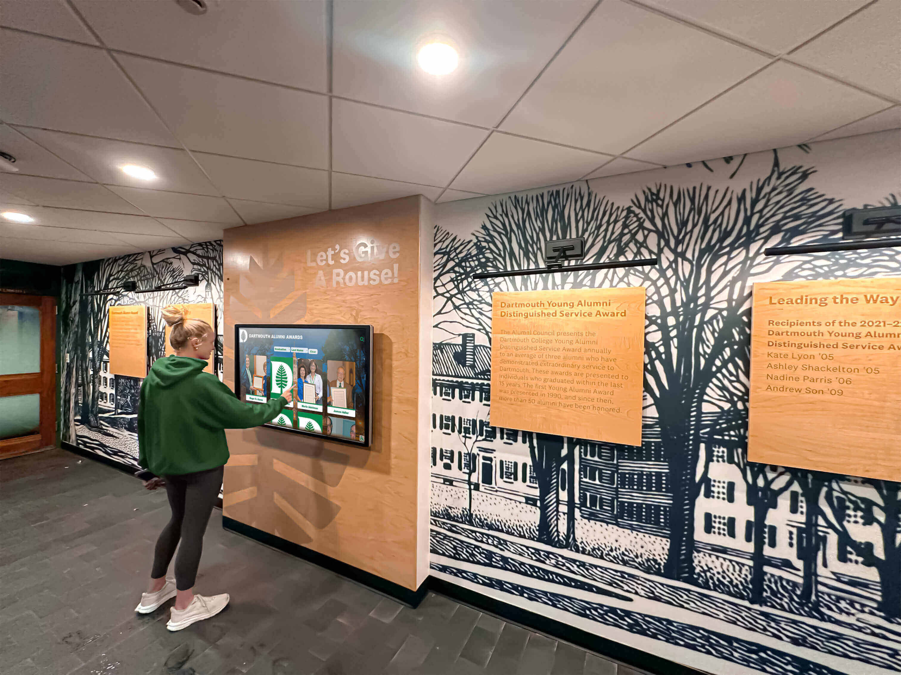
A practical governance checklist for recurring touch target reviews:
- After any CSS framework or component library update: re-measure button and chip heights across all four control families
- After introducing a new screen breakpoint: audit touch targets at the new breakpoint in DevTools and on a physical device
- After a platform vendor update: run the full audit protocol on a staging environment before updating production
- Semi-annually: conduct a full physical walkthrough on the kiosk hardware, including filter panel open and pagination active
For programs coordinating across multiple display locations—gymnasia, lobbies, and alumni centers—assign one staff member or IT contact as the audit owner. Recognition programs that serve guests during events like youth sports awards evenings or milestone high school reunion celebrations often see their highest kiosk traffic precisely when an undetected regression would be most visible.
Working With Your Platform Vendor
If your hall of fame runs on a purpose-built platform rather than custom code, the remediation pathway runs through your vendor. Before reporting findings, organize your spreadsheet by control family and include screenshots of the DevTools measurement for each failing element. Most platform vendors can address global component sizes in a single CSS update once they have a clear list.
Questions to ask your vendor:
- Does your component library define a minimum touch target size for buttons and chips? What is it?
- Are touch target sizes set globally in a design token, or configured per-component?
- Can filter chip and pagination button heights be increased without a full platform update?
- Does your search component include an
aria-liveregion on the results container, and can that be enabled or modified by administrators? - Is there a staging environment where we can verify a touch target fix before it reaches production?
Programs evaluating platforms for athletic and academic recognition programs should include touch target governance questions during the initial vendor evaluation. It is substantially easier to select a platform with strong accessibility defaults than to remediate one that was designed without them.
Quick-Reference Audit Checklist
Use this checklist at each review cycle. A pass requires the tappable hit area—not just the visible element—to meet the stated minimum.
Search Controls
- Search input field: height ≥ 44 px
- Search clear (×) button: 44 × 44 px hit area
- Search submit button: height ≥ 44 px, width ≥ 44 px
- Each autocomplete suggestion row: height ≥ 44 px
- Results container has
aria-live="polite"attribute
Profile Cards
- Entire card area is tappable (not name text only)
- “View profile” or equivalent secondary button: height ≥ 44 px
- Any action icons (bookmark, share) on the card: 44 × 44 px hit area
Filter Controls
- Sport / category filter chips: height ≥ 40 px (44 px preferred)
- Year range slider handles: 44 × 44 px hit area
- Clear-all filter button: height ≥ 44 px
- Dropdown or select controls: height ≥ 44 px
Navigation
- Back / Home button: 44 × 44 px
- Pagination previous / next arrows: 44 × 44 px
- Individual page number buttons: 44 × 44 px
- Tab or section navigation items: height ≥ 44 px, full label width tappable
Physical Device Check
- Conducted on kiosk hardware or a device at the same resolution and DPI
- Each control activated successfully on first tap by a tester using an average adult finger
- No adjacent target was accidentally activated during the walkthrough
Running this audit on a regular cadence keeps your school’s hall of fame welcoming and usable for every visitor who steps up to the screen—whether they are a first-year student discovering athletic history for the first time or an alumnus returning decades later to find a teammate’s record preserved in the display.
Ready to see how a purpose-built recognition platform handles touch target accessibility from the ground up? Book a demo with Rocket Alumni Solutions to explore accessibility-first design, ARIA-compliant search, and a content management workflow built for school staff.