

Key Takeaways
Run a digital hall of fame native popover audit to verify award citation panels use the HTML Popover API correctly—auto versus manual dismissal, top-layer clipping, invoker relationships, keyboard order, mobile support, and kiosk browser fallback.
popover and popovertarget attributes are correctly applied, that auto and manual dismissal types are chosen appropriately for each interface context, that top-layer positioning does not clip citation content behind fixed headers, that invoker relationships are correctly wired for keyboard and mobile visitors, and that citation panels degrade gracefully on the older installed browsers that power many school lobby kiosks. This guide walks athletic directors, recognition-program owners, and school IT staff through every step of that audit.
Why Award Citation Panels Need a Dedicated Audit
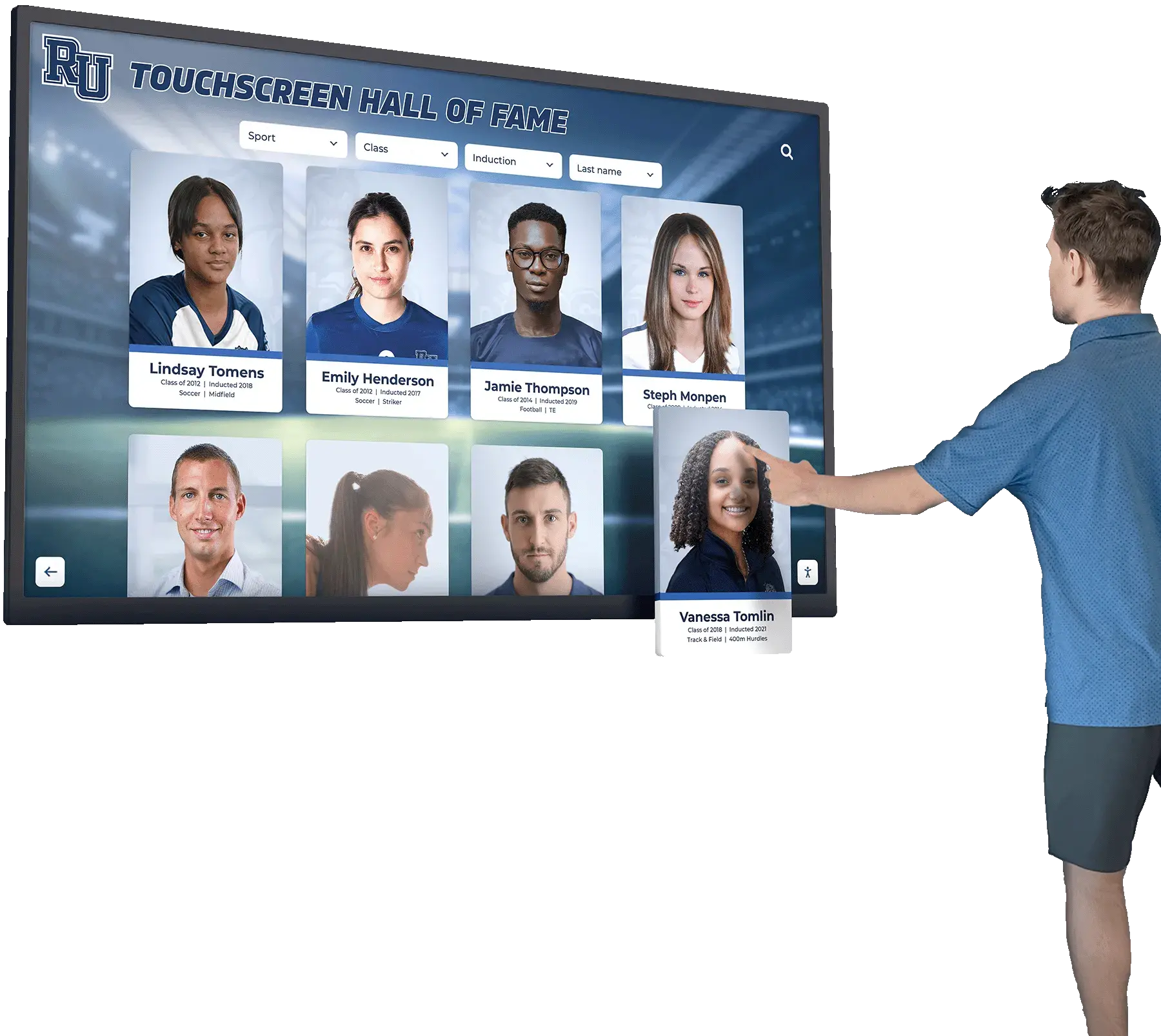
A hall of fame platform typically surfaces each inductee’s award data in two layers: a profile card showing the athlete’s name, sport, and years of recognition, and a secondary citation panel containing the full narrative — the paragraph explaining why the award was granted and what it meant to the program. The citation panel should appear only when the visitor requests it and should vanish cleanly when the visitor moves on, without disrupting the surrounding layout or scroll position.
The challenge is that “appears on demand, vanishes cleanly” was historically solved through a patchwork of third-party tooltip libraries, custom position: fixed CSS, and JavaScript z-index management that each carry accessibility gaps. The HTML Popover API replaces that patchwork with a browser-native mechanism that handles top-layer rendering, dismiss behavior, and DOM relationships declaratively — without any JavaScript for the common case.
For a recognition program that produces a new inductee announcement and formal press release each year, the citation panel is where that story lives on the digital display. Getting the popover implementation wrong means the story is either always visible (disrupting layout), never visible (broken invoker), or visible but inaccessible (keyboard users cannot reach or dismiss it). This audit closes those gaps.
The popover Attribute and Its Two Dismissal Types
The popover global attribute, which can be placed on any HTML element, designates that element as a popover. Once marked, the element is hidden by default and managed by the browser’s top-layer mechanism — a rendering context separate from the normal document stacking order and the CSS z-index system. Two values control how the popover is dismissed:
| Value | Dismissal Behavior | Responds to Escape | Responds to Outside Click | Multiple Open Simultaneously |
|---|---|---|---|---|
popover="auto" or popover="" | Light dismiss | Yes | Yes | Generally no — opening a new auto popover closes the previous one |
popover="manual" | Explicit dismiss only | No | No | Yes — multiple manual popovers can remain open at the same time |
For most hall of fame award citation panels, popover="auto" is the correct choice. A visitor who taps a pitcher’s 1996 All-State citation expects that tapping elsewhere on the kiosk, or pressing Escape, closes the citation and returns attention to the roster. Auto dismissal delivers this without any scripting for the close behavior.
popover="manual" is appropriate when the hall of fame interface supports side-by-side comparison — for example, a mode where an athletic director reviews two athletes’ citations simultaneously while planning the next induction ceremony, or a kiosk mode that pins a featured citation in the corner of the screen. Manual popovers require an explicit close mechanism, and the audit must verify that a visible close control exists inside the panel and is reachable by keyboard.
Audit Finding: auto Popover Dismissed by Adjacent Touch Regions
The most common auto popover failure on touchscreen kiosk deployments is unintended outside-click dismissal. A visitor who opens a citation panel and then tries to scroll within it — using a slow swipe gesture — may generate a touch-end event outside the popover boundary that triggers light dismiss before the scroll completes. The audit should test this scenario on a physical touch device, not only in DevTools. If it occurs, the remediation is to extend the popover element to cover comfortable scroll margins, or to switch the dismissal type to manual and add an explicit close button.
Top-Layer Behavior and Clipping in Hall of Fame Layouts
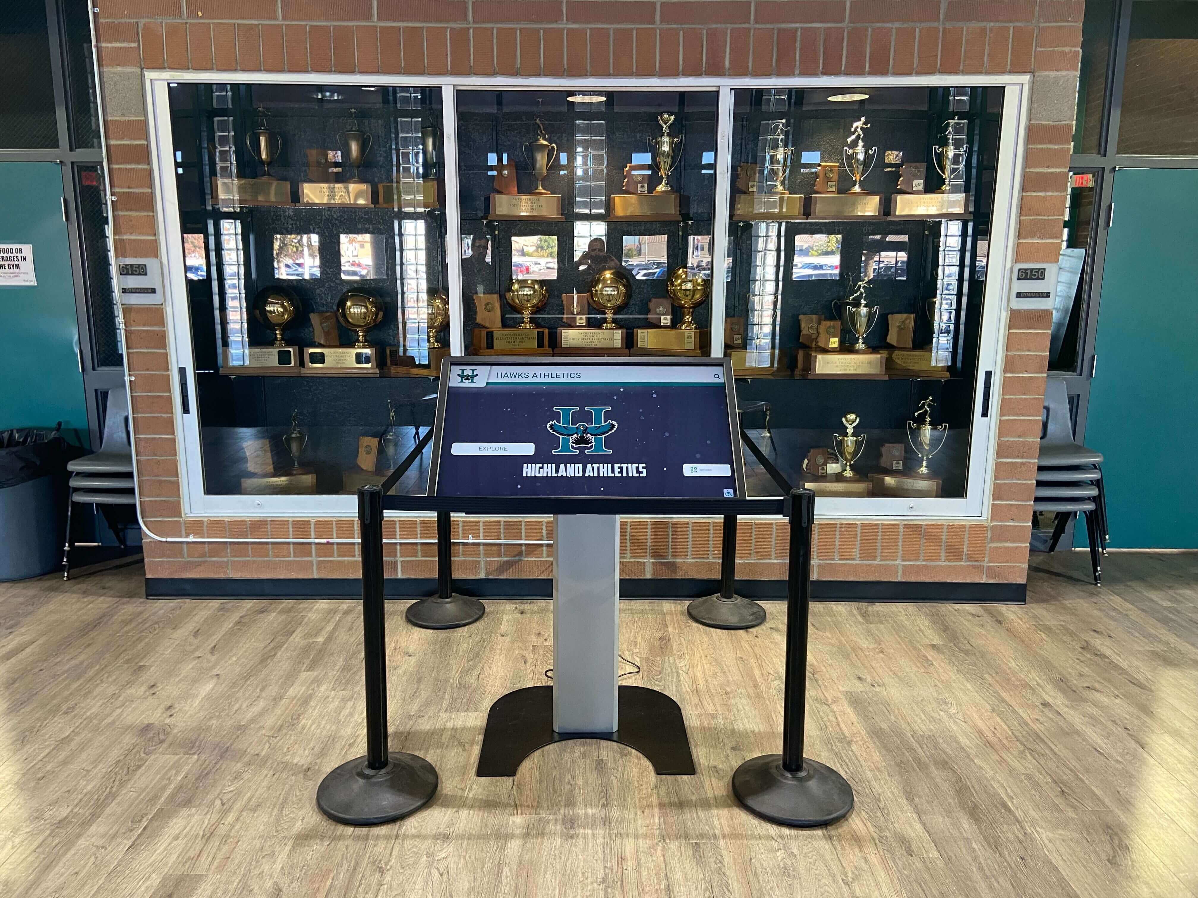
Hall of fame kiosk interfaces commonly use fixed headers for school branding, sticky navigation bars for sport-category tabs, and CSS overflow: hidden on scrollable roster containers. Third-party tooltip implementations built before the Popover API frequently render citation overlays inside these clipped containers — a citation panel that should appear above a sport-filter tab bar instead vanishes behind it because the overlay's ancestor element has overflow: hidden applied.
A popover element carrying the popover attribute renders in the browser's top layer, a stacking context that exists above all other page content — including fixed and sticky positioned elements, regardless of their z-index value. This means a citation panel built with the native attribute never clips behind a school logo header or a sport-tab navigation bar. The audit verifies this by opening every citation panel and visually confirming that no portion of the citation text or close control is obscured by any other element.
Clipping audits should cover all screen states where other layered elements are visible:
- Roster view with header visible — confirm the citation panel clears the school branding header
- Roster scrolled mid-list — confirm the citation panel renders above the sticky sport-tab row
- Filter panel open — confirm the citation panel renders above the filter dropdown overlay
- Kiosk idle-reset overlay active — some kiosks display a timeout prompt; confirm that prompt does not appear behind the citation popover
If a citation popover clips under any of these conditions, the underlying cause is almost always that the element does not carry the popover attribute and is instead being managed as a position: absolute or position: fixed overlay. The remediation is to add the popover attribute and remove the custom stacking CSS.
Invoker Relationships and the popovertarget Attribute
The popovertarget attribute on a <button> element is the declarative link between an award record’s “View Citation” control and the citation panel it opens. When a button carries popovertarget="citation-rivera-1998", the browser automatically wires that button as an invoker for the element whose id is citation-rivera-1998 and whose popover attribute marks it as a popover. No JavaScript event listener is required for this relationship.
<button type="button" popovertarget="citation-rivera-1998">
  View Award Citation
</button>

<div id="citation-rivera-1998" popover>
  <p>All-State First Team, 1998. Led the district with a 0.87 ERA across fourteen appearances and anchored the rotation through the regional championship series.</p>
</div>
The popovertargetaction attribute controls whether the invoker shows, hides, or toggles the popover. The default value is toggle, which opens the popover if closed and closes it if open — correct for a “View Citation” button that acts as both opener and closer. Values show and hide are appropriate when separate open and close controls exist: a list-item row button (show) paired with a dedicated close button inside the panel (hide).
The audit must verify three invoker conditions for every citation panel:
- The invoker element is a
<button>— not a<div>,<span>, or<a>— because only<button>and<input type="button">correctly expose the invoker semantics to assistive technology without additional ARIA scaffolding - The
popovertargetvalue matches theidof an existingpopoverelement — a mismatch leaves the button non-functional and silently broken - The
popovertargetactionvalue matches the button’s semantic role — a button labeled “Close” should carrypopovertargetaction="hide", not the defaulttoggle
Recognition programs that apply a structured athletic awards rubric to evaluate leadership, sportsmanship, and display eligibility often have dozens of distinct citation panels per induction class. The DevTools query in the FAQ below surfaces all invoker relationships in a single console run, making it practical to audit at scale.
Keyboard Order and Mobile Support
Keyboard Tab Order
A popover element is non-modal: Tab continues to cycle through the full page when a citation popover is open. This is intentional — a brief award citation that a visitor reads and dismisses should not interrupt page navigation by capturing the Tab key order. The audit must verify that:
- The “View Citation” button appears in the natural tab order of the roster card at its position in the DOM — not at the end of the page because it was absolutely positioned and removed from flow
- After a citation popover opens, pressing Tab moves focus to the next tabbable element in the document, not into the citation panel (for static-text-only panels with no interactive controls)
- If the citation panel contains a close button or a hyperlink to a detailed season record, Tab can reach that control from the invoker without cycling through the entire rest of the page
The Popover API does not move focus into the popover on opening. For a panel containing only static text, this is correct behavior. For a panel containing interactive controls, the implementation should call .focus() on the first interactive element inside the panel immediately after the popover opens, so keyboard users do not have to Tab through unrelated page content to reach the citation controls.
Mobile Touch Activation
On a mobile device or touchscreen kiosk, the <button> invoker with popovertarget activates on tap, matching the native behavior expected for a button element. The audit should verify:
- Each “View Citation” button has a touch target area of at least 44×44 CSS pixels — the enhanced WCAG 2.2 recommendation for controls in public-facing interactive environments
- The citation popover panel is large enough for comfortable reading at the kiosk’s display resolution — a popover that opens at 200×80 px on a 1920×1080 display is technically functional but practically unreadable at arm’s length
- Closing the citation by tapping outside the panel (for
autotype) works reliably near the edges of the citation boundary — accidental outside-click dismissal is most common when the panel is narrow and the visitor’s tap lands just outside its border
For school lobby kiosks where touch is the primary input and no physical keyboard is present, mobile touch testing on a device at the kiosk’s screen dimensions is more informative than DevTools touch emulation.
Step-by-Step Audit Procedure
The following procedure requires the hall of fame interface running in a supported browser (Chrome 114 or later, Firefox 125 or later, or Safari 17 or later) and a physical touchscreen device or the kiosk itself for physical verification. Write access to the platform’s source code is not required.
Step 1 — Inventory all citation panels.
Navigate through the hall of fame inductee roster and note every award record that offers a secondary citation panel. Record the athlete name, award type, and year for each entry. On platforms with pagination or virtualized grids, advance through all available pages to ensure the inventory is complete rather than limited to the first visible batch.
Step 2 — Verify the popover attribute is present and correctly valued.
Open DevTools and run the following in the Console tab:
Array.from(document.querySelectorAll('[popover]')).map(el => ({
  id: el.id,
  popoverType: el.getAttribute('popover') || '(empty string = auto)',
  tagName: el.tagName,
  hasText: el.textContent.trim().length > 0
}))
Each citation panel should appear in the results. A panel missing from the output does not carry the popover attribute and is not a native popover. A panel where popoverType is manual but should respond to Escape and outside clicks is a type mismatch finding.
Step 3 — Verify invoker relationships.
Run the following query to map every popovertarget button to its panel:
Array.from(document.querySelectorAll('[popovertarget]')).map(btn => ({
  buttonText: btn.textContent.trim(),
  tagName: btn.tagName,
  targetId: btn.getAttribute('popovertarget'),
  action: btn.getAttribute('popovertargetaction') || 'toggle (default)',
  targetExists: !!document.getElementById(btn.getAttribute('popovertarget')),
  targetHasPopover: document.getElementById(
    btn.getAttribute('popovertarget'))?.hasAttribute('popover')
}))
Any result with targetExists: false is a broken invoker relationship. Any result with targetHasPopover: false means the target exists but is not a popover. Any result with tagName other than BUTTON or INPUT requires additional keyboard and ARIA review.
Step 4 — Test auto dismissal.
For each auto citation popover: open it by clicking or tapping the invoker button, then press Escape and confirm the popover closes. Open it again and click or tap anywhere outside the popover boundary; confirm it closes. Open it a third time and open a different citation popover; confirm the first closes when the second opens.
Step 5 — Test manual dismiss controls.
For each manual citation popover: open it and confirm that Escape does not close it. Confirm that a visible close control exists inside the panel and is keyboard-reachable by Tab from the invoker button. Confirm the close control carries popovertargetaction="hide" or that JavaScript explicitly calls .hidePopover() on click.
Step 6 — Test top-layer rendering.
With each citation popover open, scroll the roster list rapidly and confirm the popover remains fully visible. Expand the sport-filter panel while a citation is open and confirm neither element clips the other. Open a citation panel anchored to a bottom-row inductee record and confirm the panel does not extend off-screen.
Step 7 — Conduct mobile and physical kiosk testing.
On a physical touch device at the kiosk’s resolution, activate each citation panel by tap, confirm the citation text is fully visible and readable at arm’s length, and dismiss by tapping outside. Note any panels where the invoker button touch target is smaller than 44×44 CSS px or where the citation panel extends partially off the display edge.
Acceptance Criteria and Evidence Table
The criteria below reflect school-program acceptance standards for citation panel behavior on hall of fame recognition displays. They are not official WCAG thresholds. Programs should confirm these criteria with their IT team and adapt them to their specific platform before using them as a formal acceptance gate.
| Citation Panel Behavior | School Acceptance Criterion | Evidence to Collect |
|---|---|---|
popover attribute present on every citation panel | All citation panels carry popover="auto" or popover="manual" | DevTools console query output, Step 2 |
popovertarget matches existing panel id | Zero panels with targetExists: false in Step 3 query | Console query results screenshot |
auto type dismisses on Escape | Popover closes on first Escape keypress, no handler required | Manual test log, keyboard |
auto type dismisses on outside click or tap | Popover closes when tapping within 20 px outside panel boundary | Manual test log, touchscreen device |
manual type does not dismiss on Escape | Popover remains open; visible close control present inside panel | Manual test log, keyboard |
| Top-layer rendering — no clipping | Citation text fully visible with sticky header and filter panel open simultaneously | Screenshot with DevTools overlay |
Invoker is a <button> element | No popovertarget found on <div>, <span>, or <a> elements | Step 3 console query tagName field |
| Touch target on invoker button | “View Citation” button hit area ≥ 44×44 CSS px on kiosk device | DevTools computed size measurement |
| Citation panel readable at arm’s length | Panel renders at minimum 300 px wide on 1080p kiosk display | Physical device screenshot |
| Kiosk browser fallback functional | Citation content accessible on Chrome below version 114 via CSS fallback | Fallback CSS test in restricted browser |
When collecting evidence for the acceptance table, take screenshots with DevTools open and citation panels in their open state — not collapsed. For kiosk deployments where a remote auditor cannot access the physical device, a screen recording showing the tester activating and dismissing each citation type is an acceptable substitute for a screenshot log.
Programs that manage long-term archives of inductee records — including those running athletic archive bit rot detection and fixity checks on digital preservation systems — should include citation panel rendering tests in periodic archive health reviews. A citation panel that stops rendering correctly after a platform update is a form of access degradation even if the underlying citation text remains intact in the database.
Fallback for Older Installed Kiosk Browsers
Many school lobby and gymnasium kiosks run a locked version of Chrome or Chromium that has not been updated since initial installation. The HTML Popover API requires Chrome 114 or later (May 2023), Firefox 125 or later (April 2024), and Safari 17 or later (September 2023). A kiosk running Chrome 110 or earlier will not recognize the popover attribute, and elements carrying it will render as standard visible block elements in document flow — disrupting the roster layout by making citation content permanently visible.
Detection using CSS @supports:
@supports not selector(:popover-open) {
  /* Fallback: hide citation panels and manage visibility with a class */
  [popover] {
    display: none;
  }
  [popover].is-visible {
    display: block;
    position: fixed;
    top: 50%;
    left: 50%;
    transform: translate(-50%, -50%);
    z-index: 9999;
    background: white;
    border: 1px solid #ccc;
    padding: 1.5rem;
    max-width: 90vw;
  }
}
JavaScript feature detection:
const supportsPopover = HTMLElement.prototype.hasOwnProperty('popover');
if (!supportsPopover) {
  document.querySelectorAll('[popovertarget]').forEach(btn => {
    btn.addEventListener('click', () => {
      const target = document.getElementById(btn.getAttribute('popovertarget'));
      if (target) target.classList.toggle('is-visible');
    });
  });
  document.addEventListener('keydown', e => {
    if (e.key === 'Escape') {
      document.querySelectorAll('[popover].is-visible')
        .forEach(el => el.classList.remove('is-visible'));
    }
  });
}
This fallback does not reproduce top-layer stacking behavior, but it does hide citation panels by default on old browsers and provides a functional show/hide toggle with Escape support. For kiosk programs evaluating whether to update their browser installation, the 10 Best Hall of Fame Tools review for athletics, donors, and the arts covers platforms that manage browser compatibility as part of their hosted service — moving that maintenance responsibility to the platform rather than the school IT team.
Common Failures and Remediation Patterns
Failure: Citation panel built with position: fixed and no popover attribute
The panel appears visually but does not render in the top layer. It clips behind sticky navigation bars and does not respond to Escape or outside-click dismissal without custom JavaScript. It also fails the DevTools querySelectorAll('[popover]') query.
Remediation: Add popover="auto" to the panel element. Remove the custom position: fixed CSS — the browser manages top-layer placement natively once the popover attribute is present. Add popovertarget to the invoker button matching the panel’s id. Test that Escape and outside-click dismissal work after the change.
Failure: Invoker is a <div> or <span> element
A non-button element with popovertarget is not keyboard-activatable without additional tabindex="0" and keydown event handlers. More critically, it does not communicate button semantics to assistive technology, so a screen reader or keyboard user navigating the roster may not discover the citation invoker at all.
Remediation: Replace the <div> or <span> invoker with <button type="button">. Apply the same visual styles to the button so the design is unchanged. Remove any onclick, onkeydown, or keydown JavaScript listeners that were compensating for the non-button element.
Failure: popover="manual" panel with no close control
A manual popover that has no visible close button and does not respond to Escape is effectively a trap for keyboard users who open the citation and cannot dismiss it without reloading the page.
Remediation: Add a <button type="button" popovertargetaction="hide" popovertarget="[panel-id]">Close citation</button> inside the manual popover panel. Position it at the top-right corner so it is the first or second Tab stop inside the panel when focus moves in. If the panel should respond to Escape in this deployment context, switch its type from manual to auto.
Failure: Citation popover extends off-screen on kiosk display
A citation panel positioned relative to its invoker button may extend beyond the kiosk display’s edge when the invoker appears in the bottom row of the roster. The popover renders in the top layer but there is no automatic viewport collision detection — the panel must be sized and positioned to fit within the display bounds.
Remediation: Use CSS margin: auto on the popover or anchor it to a fixed viewport-centered position rather than relative to the invoker. On kiosk deployments with a fixed resolution, a viewport-centered position: fixed alternative inside the fallback CSS block is reliable and easy to verify on the physical device before public deployment.
Connecting the Audit to Your Recognition Program’s Documentation Cycle
A single popover audit captures the platform’s state on the day it runs. Citation panels that pass today may fail after a platform update changes the panel component’s HTML structure or after a CMS template change removes the popover attribute from a generated element. Build a spot-check into the workflow for any batch that introduces new citation panels or updates existing award records.
For programs that add citation records at the start of each athletic season — documenting award narratives in the same production cycle as preparing induction announcements and formal press releases for new inductees — the correct cadence is to run the DevTools queries in Steps 2 and 3 immediately after each new batch is published and before the kiosk is returned to public display.
Athletic programs that maintain a physical trophy case alongside their digital display benefit from including the citation panel audit in the same periodic governance schedule as physical maintenance. Just as controlling humidity and environmental conditions around school awards, photos, jerseys, and documents requires scheduled physical checks, the digital citation layer requires scheduled rendering and interaction checks to catch regressions before a public event exposes them.
Quick-Reference Audit Checklist
Use this checklist after each new citation batch is published or after any platform update that touches the award panel component. A pass requires both the attribute check and the behavioral test to succeed.
Attribute Checks (DevTools Console)
- All citation panel elements carry
popover="auto"orpopover="manual"— no citation panel missing fromquerySelectorAll('[popover]')output - All
popovertargetvalues match an existing elementid— zerotargetExists: falseresults in Step 3 query - All invoker elements are
<button>— nopopovertargeton<div>,<span>, or<a>elements -
popovertargetactionmatches the button’s semantic role (toggle / show / hide)
Dismissal Behavior Tests (Manual)
-
autocitation panels close on first Escape keypress -
autocitation panels close on outside click or tap -
autocitation panels close when a secondautocitation panel opens -
manualcitation panels remain open after Escape -
manualcitation panels have a visible, keyboard-reachable close control inside the panel
Top-Layer Rendering Tests (Manual)
- Citation panels fully visible with sticky header active
- Citation panels fully visible with sport-filter dropdown open
- Citation panels in bottom-row positions do not extend off-screen
Keyboard and Mobile Tests (Device)
- Tab order reaches the invoker button in its natural DOM position — not relocated to end of page
- Tab after citation opens does not trap focus inside a static-text-only panel
- Touch activation reliable on physical device at kiosk resolution
- Invoker button touch target ≥ 44×44 CSS px confirmed in DevTools computed panel
Fallback Test (Legacy Browser or DevTools Override)
- Citation content accessible — as inline static text or class-toggled overlay — on Chrome below version 114
- Escape keydown listener fires correctly on legacy browser path
Running this audit after each induction cycle keeps your school’s award citations accessible to every visitor who steps up to the display — from a student discovering athletic history for the first time to an alumnus looking for the two-sentence citation that describes a teammate’s career. A citation panel built with the native popover attribute is more maintainable, more reliable, and more accessible than a custom tooltip or fixed overlay, and a completed audit is your record that it was implemented correctly.
Ready to see how a purpose-built hall of fame platform manages award citation panels, popover accessibility, and kiosk browser compatibility from the ground up?
Book a Demo with Rocket Alumni Solutions