


Key Takeaways
Run a digital hall of fame focus order audit to verify that keyboard Tab sequence through inductee search fields and filter controls follows a logical, predictable order — so every visitor can reach the athletes they came to celebrate.

What Focus Order Is — and Why Inductee Search Needs It
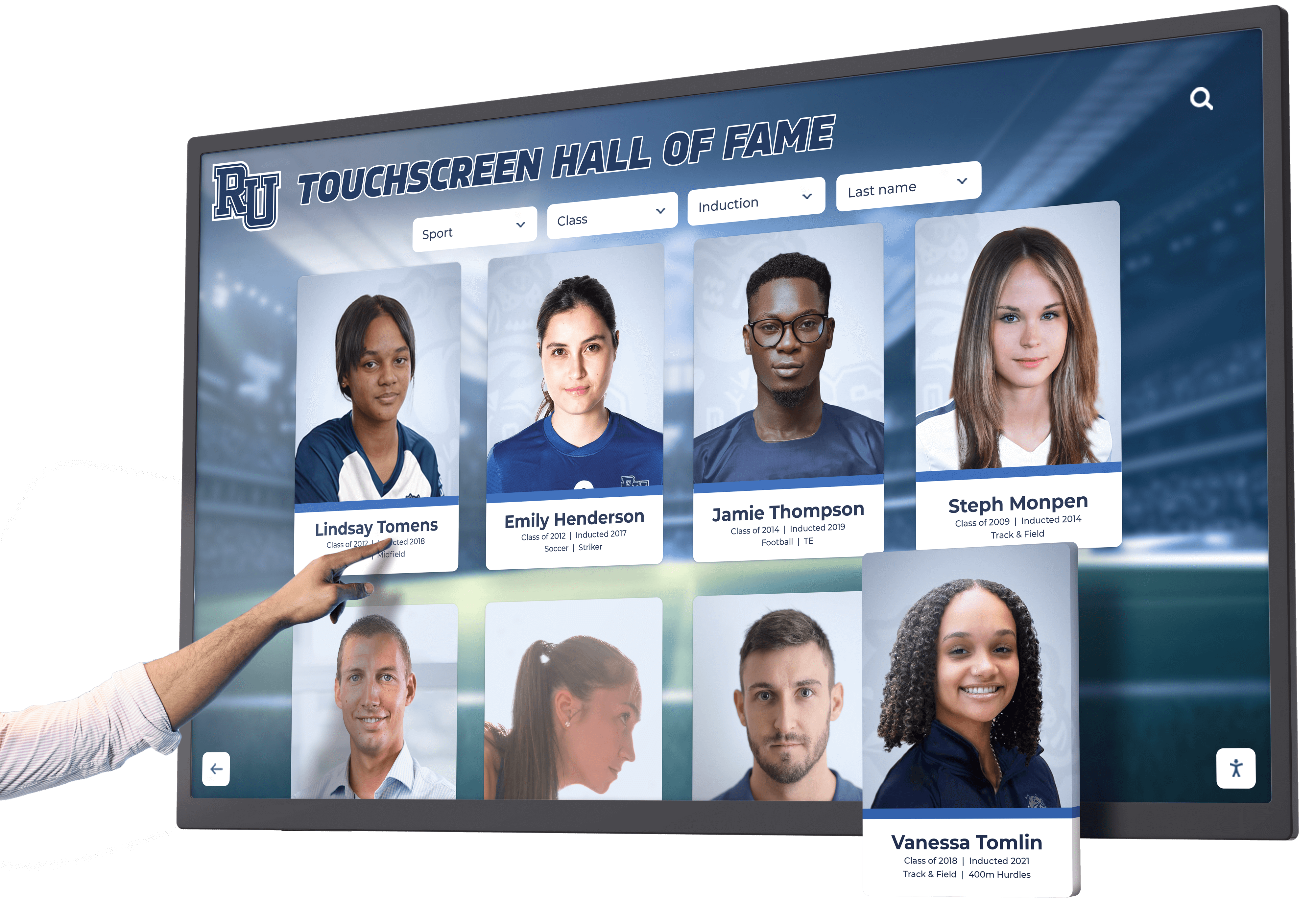
Focus order is the sequence in which keyboard focus moves through a page’s interactive elements when a visitor presses Tab. The browser determines this sequence primarily from DOM order — the order in which elements appear in the HTML source — modified by any explicit tabindex attribute values. When a hall of fame interface renders an inductee search field, a filter panel, a results roster, and pagination controls, the Tab sequence should mirror the natural reading and task flow: reach the search field first, navigate filters next, move into results, reach pagination at the end.
A predictable focus order matters for three groups of visitors:
- Keyboard-only users who navigate entirely by Tab and Shift+Tab because a mouse is unavailable, uncomfortable, or not permitted (shared kiosk deployments)
- Screen reader users who rely on focus order to build a mental map of the page without seeing the visual layout
- Switch control and voice control users whose navigation software models the Tab sequence when moving between interface elements
The compliance anchor is WCAG 2.1 SC 2.4.3 (Focus Order, Level A). This is a Level A criterion — the lowest barrier — which means any focus order failure is a foundational accessibility problem that no higher-level compliance effort can offset. A hall of fame platform that fails SC 2.4.3 on its search and filter interface fails the most basic keyboard navigation requirement.
WCAG Criteria That Apply to Focus Order in a Hall of Fame Search Context
| WCAG Criterion | Level | How It Applies to Inductee Search and Filters |
|---|---|---|
| 2.4.3 Focus Order | A | Tab sequence through search, filters, results, and pagination must preserve meaning and operability |
| 2.1.1 Keyboard | A | Every interactive element in the search and filter interface must be reachable and operable by keyboard alone |
| 2.4.7 Focus Visible | AA | The keyboard focus indicator must be visible at all times — a prerequisite for auditing Tab sequence |
| 3.2.2 On Input | A | Activating a filter must not trigger an unexpected context change such as an automatic page navigation |
| 2.4.1 Bypass Blocks | A | A skip navigation link must allow keyboard users to bypass repeated header elements and reach the search field directly |
| 4.1.3 Status Messages | AA | When filters update the result count, the count announcement must not require moving focus |
SC 2.4.3 is the focus order criterion, but SC 2.4.7 is its prerequisite: an audit tester who cannot see where focus is during the Tab sequence cannot verify the order. Before starting the audit, confirm the platform renders a visible focus ring on every focused element. A platform that suppresses outline with outline: none in its CSS without providing an equivalent visual replacement fails SC 2.4.7 independently, and makes the focus order audit impossible to conduct by observation.
How to Run a Digital Hall of Fame Focus Order Audit
Step 1 — Map the Expected Focus Sequence
Before opening the browser, draft the logical Tab sequence for the hall of fame search interface based on its visual layout:
- Skip navigation link (if present)
- Site header / logo
- Primary navigation links
- Search field
- Filter panel (sport checkboxes, decade selectors, award type)
- Apply filters or clear filters button
- Inductee result cards (each card’s primary link or “View Profile” button)
- Pagination controls (Previous, page numbers, Next)
- Footer links
This expected sequence becomes the baseline against which the actual Tab sequence is compared. The audit does not require that every interface matches this exact structure — a platform that places filters before the search field and documents that decision may be acceptable if the order is consistent and predictable. What the audit flags is a sequence that does not match any logical reading order.
Step 2 — Run the Focusable Elements Query
Open the hall of fame interface in Chrome or Edge and navigate to the inductee search view. Open DevTools (F12) and run the following query in the Console tab:
Array.from(document.querySelectorAll(
  'a, button, input, select, textarea, [tabindex]'
)).filter(el => !el.disabled && el.tabIndex >= 0)
  .map((el, i) => ({
    index: i + 1,
    tag: el.tagName,
    text: (
      el.textContent ||
      el.value ||
      el.getAttribute('aria-label') ||
      el.getAttribute('placeholder') ||
      ''
    ).trim().slice(0, 60),
    role: el.getAttribute('role') || '(native)',
    tabindex: el.getAttribute('tabindex') || '(default)'
  }))
Record the full output. Flag any element where tabindex is a positive integer — '1', '2', '3', or higher. Positive tabindex values remove elements from normal DOM order and promote them to the front of the Tab sequence, which almost always produces jumps that break the logical flow. The pattern tabindex="0" is acceptable and keeps the element in its natural DOM position; positive integers are the failure pattern to identify.
Step 3 — Tab Through the Interface Manually
Move keyboard focus to the browser address bar. Press Tab once to move focus into the page. Continue pressing Tab and record the actual sequence of elements receiving focus. As you tab:
- Verify the search field is reachable before the filter panel
- Confirm every filter control in the panel is reachable in a consistent left-to-right, top-to-bottom sequence
- Confirm no interactive element is bypassed — every filter checkbox, every result card link, every pagination button should receive focus
- Confirm no non-interactive element receives focus — a decorative image or layout div with an accidental
tabindex="0"in the Tab sequence is an extraneous stop that disorients keyboard users
Use Shift+Tab to reverse direction. Verify that reversing produces the same sequence in reverse order without unexpected jumps.
Step 4 — Test Post-Filter Focus Behavior
Tab to the first sport filter checkbox and press Space to activate it. Observe where focus is immediately after activation:
- Pass: Focus remains on the activated filter checkbox, confirming the selection without moving the visitor elsewhere. The result count updates via a live region (
role="status"oraria-live="polite") without focus moving to the count element. - Fail: Focus jumps to the result count element, the top of the page, or an unrelated element in the DOM. The visitor loses their position in the filter panel and must Tab back to continue selecting filters.
Activate a second filter and observe again. Apply filters covering sport, decade, and award type. Each activation should leave focus on the activated control. Activating one filter while another is active should not reset focus to the first filter in the panel.
Step 5 — Test Search-to-Results Focus Flow
Tab to the inductee search field. Type a partial inductee name. If the platform offers an autocomplete suggestion list, press ArrowDown to navigate into the suggestion list and Enter to select a suggestion. Observe focus position:
- Pass: Focus moves to the selected inductee’s result card, the inductee’s profile view, or returns to the search field with the selected name populated — depending on the platform’s designed behavior.
- Fail: Focus remains in the search field while the result panel updates visually, leaving the visitor to Tab forward to discover the results.
If the platform does not use a suggestion list and requires pressing Enter to submit the search, observe whether focus moves forward into the results roster or remains on the search field after results load.
Step 6 — Test Modal Dialog Focus Trapping
If the platform opens a modal dialog when a visitor activates an inductee’s “View Profile” control, test focus trapping:
- Tab to a result card’s “View Profile” button and press Enter.
- Verify that focus moves immediately into the dialog — not to a page element behind the dialog overlay.
- With focus inside the dialog, press Tab repeatedly. Verify that Tab cycles only among elements within the dialog: the close button, the inductee’s profile sections, and any links within the profile.
- Verify that Tab does not escape the dialog to reach the page header, filter panel, or result cards behind the overlay.
- Press Escape. Verify that the dialog closes and focus returns to the “View Profile” button that opened it — not to the page header, the search field, or the first link in the page.
A dialog that does not trap focus is a SC 2.4.3 failure: focus reaching elements behind the overlay makes the dialog content unreachable by keyboard before other page elements, disrupting the sequence. A dialog that returns focus to the wrong element after Escape is equally a failure — the visitor’s position in the result roster is lost.
Step 7 — Test the Escape Key Through the Filter Panel
If the filter panel opens in a disclosure widget or a floating panel (rather than being persistently visible), test focus when the panel closes:
- Tab to the filter panel’s toggle button and press Enter to open the panel.
- Tab into the panel and activate one filter.
- Press Escape. Verify that the panel closes and focus returns to the filter panel toggle button, not to the page header or search field.
Escape closing the panel and returning focus to the toggle is the ARIA disclosure pattern’s expected behavior. Escape moving focus to an unrelated element is a SC 2.4.3 failure.
Step 8 — Run the Kiosk Template Independently
If the platform provides a kiosk-specific template, load that URL and repeat Steps 1 through 7. Kiosk layouts frequently differ from web layouts in CSS grid placement, flexbox order, and element visibility. A focus order that passes on the web template may fail on the kiosk template if the kiosk layout repositions the filter panel visually without changing its DOM order.
Pay particular attention to “Clear Filters” and “Reset” controls on kiosk deployments: these are often placed visually at the top of the filter area for touch convenience, but placed last in the DOM — requiring a keyboard user to Tab through every filter option before reaching them.
Step 9 — Screen Reader Verification
Install NVDA (Windows, free) or use VoiceOver (macOS, built-in). Tab through the search interface and listen to the full announcement sequence. Verify:
- The search field is announced with its accessible name before the filter controls
- Each filter control announces its label, role, and checked state in the order that matches the visual left-to-right sequence
- Activating a filter produces a live region announcement of the updated result count without breaking focus position
- Selecting an inductee and opening a profile dialog produces a dialog announcement immediately, without the visitor needing to Tab forward to discover that a dialog opened
Decision Table: Expected Focus Destination After Each Interaction
| Interaction | Expected Focus Destination | Common Failure Destination |
|---|---|---|
| Activate a sport filter checkbox | Same filter checkbox (focus stays) | Result count element or page top |
| Activate “Clear All Filters” button | “Clear All Filters” button or first filter checkbox | Page header or search field |
| Press Enter in search field (no autocomplete) | First result card in roster | Search field (focus stays, no announcement) |
| Select a suggestion from autocomplete list | Search field with selected name populated | Top of page or filter panel |
| Activate “View Profile” on a result card | First focusable element inside the profile dialog | Page header or result card (outside dialog) |
| Press Escape inside a profile dialog | “View Profile” button that opened the dialog | Page header, search field, or body element |
| Press Escape inside a suggestion dropdown | Search field with typed text preserved | Top of page or filter panel |
| Navigate to next page of results | First result card on the new page, or pagination control | Top of page with no announcement |
| Open filter panel via toggle | First filter control inside the panel | Panel toggle button (not entering the panel) |
| Press Escape to close filter panel | Filter panel toggle button | Page header or search field |
Common Failure Patterns on Hall of Fame Platforms
Pattern 1: Positive tabindex values creating sequence jumps. A developer assigns tabindex="1" to the search field to ensure it receives focus early. This promotes the search field to the absolute front of the Tab sequence — before the skip navigation link, before the site logo, before the header navigation. A keyboard user pressing Tab once from the address bar lands on the search field, but pressing Shift+Tab immediately does not return to the address bar — it moves to the last element in the positive-tabindex group, producing a disorienting backwards jump. Removing positive tabindex values and relying on DOM order to produce the logical sequence is the correct remedy.
Pattern 2: CSS visual order differing from DOM order. The filter panel appears to the left of the search field in the visual layout, but the search field’s HTML element appears before the filter panel’s HTML in the source. Tab visits the search field first, then jumps right-to-left across the screen to the filter panel. A visitor using a screen reader — who builds their understanding of the page from the announcement sequence rather than the visual layout — encounters the search field, then hears filter controls, then hears results — a sequence that does not match the visual experience a sighted keyboard user would recognize. The fix is to ensure DOM order matches visual reading order, or to document a specific alternative that is defensible and consistent.
Pattern 3: Focus not moving into a profile dialog. The visitor presses Enter on a result card’s “View Profile” button. The dialog opens visually — an overlay appears with the inductee’s full profile. But focus remains on the “View Profile” button behind the overlay. The visitor cannot Tab into the dialog content without pressing Tab once and observing whether the next focus position is inside or outside the dialog. In some implementations, Tab from the “View Profile” button moves focus to the next result card — still outside the dialog — leaving the visitor unable to reach the dialog content by keyboard at all. The fix requires the JavaScript opening the dialog to call focus() on the dialog’s first focusable element immediately after it is rendered.
Pattern 4: Filter activation moving focus to the result count. When a visitor activates a sport filter checkbox, JavaScript updates the visible result count from “124 inductees” to “43 inductees.” The JavaScript also programmatically moves focus to the result count container to announce the update — because the developer intended the visitor to hear the new count. Moving focus to deliver an announcement is the wrong pattern: it removes the visitor from their position in the filter panel and requires them to Tab back to continue selecting filters. The correct pattern is a live region (role="status" or aria-live="polite") that announces the count update without any focus movement.
Pattern 5: Escape key clearing filter state or resetting to page top. The visitor opens an autocomplete suggestion dropdown by typing in the search field. The visitor presses Escape to dismiss the dropdown without selecting a suggestion, intending to refine the typed name. The platform treats Escape as a full search reset, clearing the typed text and moving focus to the page top. The visitor’s typed name is gone; they must retype from the beginning. The WAI-ARIA pattern for an autocomplete combobox defines Escape as “close the popup, return focus to the input, preserve the typed text.” Implementing a broader Escape handler that clears the search is a departure from the expected pattern.
Pattern 6: Pagination navigation discarding filter state and returning focus to page top. The visitor has applied Sport: Basketball and Decade: 1990s, reviewed the first twelve results, and presses the Next Page button to view results 13–24. After the page loads, focus returns to the browser address bar or the page’s skip navigation link — not to the first result on page two. The visitor must Tab through the header, search field, and filter panel again to reach the new results. This pattern is common on hall of fame platforms that reload the full page on pagination rather than updating only the results container. If full-page pagination is used, the page should include a skip link that jumps directly to the results region, and focus should land on that skip link or the first result.
Platforms that include icon-only filter buttons — such as sport-specific icons without visible text labels — introduce accessible name failures that compound focus order issues. A button that receives focus but has no accessible name provides no orientation to a screen reader user even when the focus order itself is correct. The digital hall of fame accessible name audit for icon buttons and search filters covers the accessible name requirement as a companion check to the focus order audit.
Specific Considerations for Touchscreen Kiosk Deployments
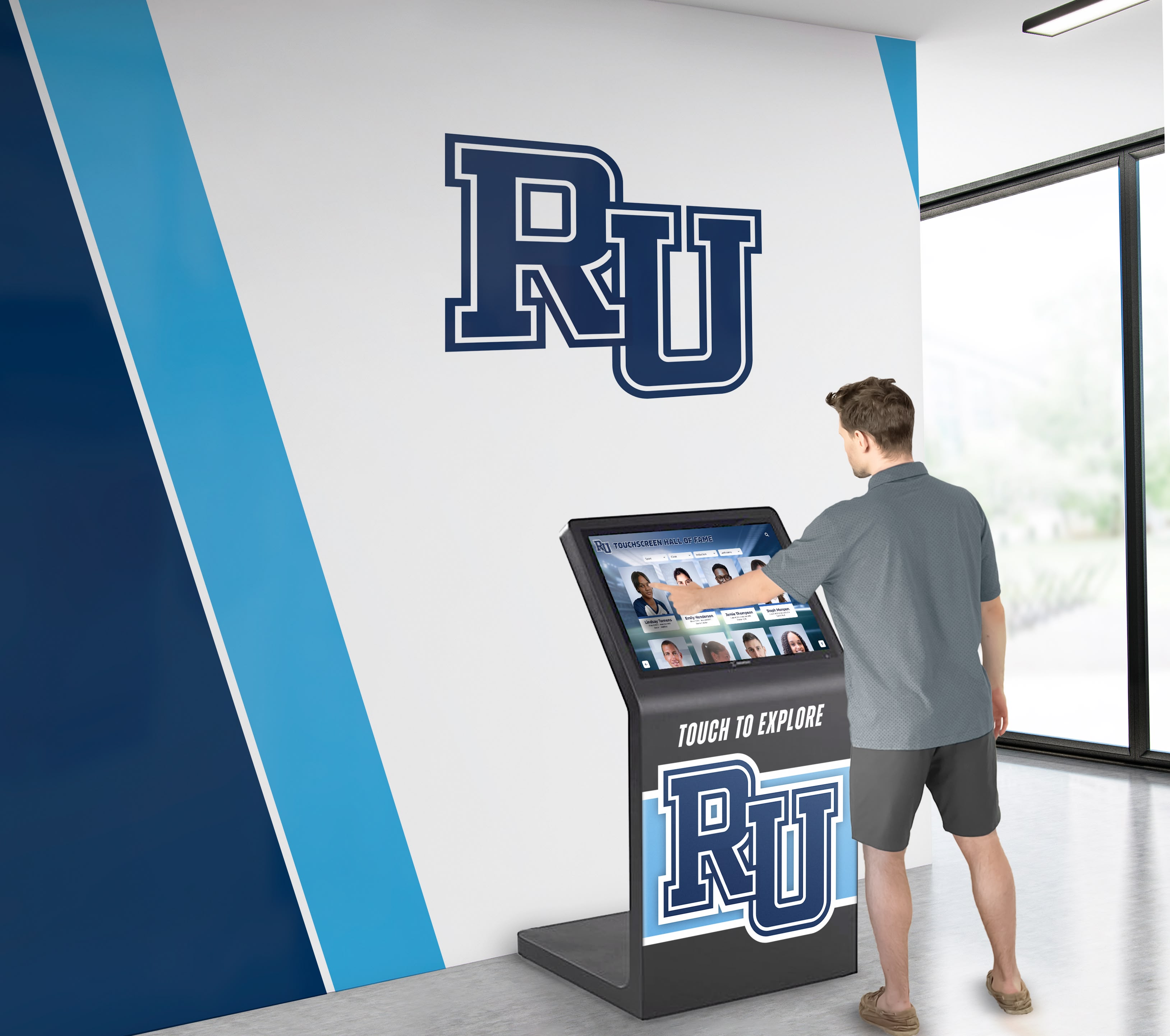
A touchscreen kiosk in a school hallway is accessed by visitors using Bluetooth keyboards, switch controls, and voice-control software alongside touch. Each of those input methods navigates the interface using Tab or a sequential navigation equivalent. A kiosk layout designed for touch-first interaction often places controls in positions optimized for large tap targets and reach distance — which may not correspond to the DOM order the developer used when building the source HTML.
A common kiosk-specific finding is that the "Clear All Filters" or "Reset" button is placed visually at the top of the filter panel for one-tap access, but the HTML element appears at the end of the filter panel's DOM structure. A touch user taps it directly without navigating sequentially; a keyboard user must Tab through every sport, decade, and award checkbox before the Tab sequence reaches the Clear button. Schools evaluating recognition kiosk platforms — including searchable digital trophy case kiosks — should ask vendors whether their kiosk template is tested for focus order independently from the web template, and whether CSS visual order is ever used to reposition elements relative to DOM order.
A second kiosk consideration is the inactivity timeout. If the kiosk resets while a visitor is navigating the filter panel by keyboard, the reset must return focus to the beginning of the page — not leave focus on a now-empty DOM position. A reset that fires while a dialog is open and does not close the dialog and restore focus to the page start can leave the next visitor's session in a broken focus state: focus trapped inside an empty dialog element from the previous visitor's interaction.
Connecting This Audit to Broader Accessibility Work
A digital hall of fame focus order audit belongs alongside the companion audits that address the full keyboard navigation experience on a school recognition platform.
Pair with an aria-labelledby audit. Correct focus order confirms that every interactive element is reachable in a logical sequence, but a screen reader user also needs to hear a meaningful announcement when focus arrives. If the search field lacks an accessible name — because a <label> element is absent and aria-labelledby is not set — the visitor reaches the field in the correct Tab position but hears only “edit” or “text field” with no indication of purpose. The digital hall of fame aria-labelledby audit for inductee search controls confirms that every search field carries a programmatically associated name, which is the companion requirement to correct focus sequence.
Pair with an aria-checked audit. Focus order determines that keyboard focus reaches filter checkboxes; aria-checked determines what the visitor hears when focus arrives. A filter that is in the correct Tab position but does not update its aria-checked state after activation leaves the visitor with correct position but no confirmation of their interaction.
Pair with an aria-hidden audit. The focusable-child failure in an aria-hidden audit — where an element is hidden from the accessibility tree but contains keyboard-reachable descendants — produces a focus order anomaly: keyboard users can Tab to a button that screen reader users cannot perceive. Running both audits surfaces this failure from two directions.
Schools that evaluate hall of fame platforms during a procurement review should include focus order as a scored criterion. Platforms built with accessibility as a foundational concern implement DOM order that matches visual reading order by design, avoid positive tabindex values entirely, and manage post-interaction focus programmatically for all dialog, panel, and filter interactions. Platforms that require post-purchase remediation to address focus order failures often require that remediation on every template update — because the root cause (CSS-driven visual reordering without DOM adjustment, or positive tabindex shortcuts) is embedded in the component architecture rather than isolated to a single page. A comparison of platform architectures — including how boutique and enterprise vendors approach accessibility and algorithmic decisions in digital hall of fame platforms — can inform which vendors are most likely to pass a focus order audit without custom remediation.
Recognition programs that maintain award records alongside their public-facing hall of fame — including athletic award data and records used in year-end ceremonies and alumni programs — benefit from the same keyboard navigation reliability in their administrative interfaces, where staff filter and search inductee records as part of routine content management.
Remediation Priority Framework
When bringing focus order findings to a platform vendor, organize requests in three tiers:
Tier 1 — Positive tabindex values. Any use of tabindex="1" or higher on search fields, filter controls, or result cards is a highest-priority finding. Positive tabindex values break the Tab sequence globally — not just at the specific element, but for every element that would have appeared before it in DOM order. Remove all positive tabindex values and rely on DOM order. If DOM order does not produce the desired sequence, restructure the HTML rather than using tabindex shortcuts.
Tier 2 — Focus not moving into dialogs or returning on dismiss. Any profile dialog or filter panel that opens without capturing focus, or that closes without returning focus to the trigger element, is a Level A failure under SC 2.4.3. These failures disconnect the visitor from the content they activated — the profile they requested, the filter panel they opened — and require them to re-navigate from an unexpected position. Remediation requires a JavaScript fix: dialog.querySelector('[data-initial-focus], button, a, input').focus() when the dialog opens, and triggerElement.focus() when it closes.
Tier 3 — Filter activation moving focus rather than using a live region. Moving focus to a result count element to announce a filter update is a functional workaround that breaks the visitor’s filter panel position. Remediation is a live region implementation: a <div role="status" aria-live="polite"> that receives the updated count string from JavaScript without any focus movement. This is a lower-severity finding because the visitor can still complete the search — they just lose their filter panel position — but it is a consistent annoyance that disproportionately affects visitors applying multiple filters in sequence.
Schools comparing recognition platforms as part of a procurement review should treat Tier 1 and Tier 2 findings as decision factors. A platform whose search and filter interface has embedded positive tabindex values or does not manage dialog focus will require custom JavaScript remediation after every template update that modifies the search component. Evaluating focus order before purchasing — not after installation — avoids that remediation cycle entirely. When assessing enterprise versus boutique platforms for a school’s recognition display, focus order implementation depth is one of the clearest indicators of whether accessibility was addressed at the component level or as an afterthought. The digital hall of fame evaluation considerations for schools covers how to structure vendor questions around accessibility implementation depth during procurement.
Verification Table
| Check | Expected Result | Pass / Fail Indicator |
|---|---|---|
| No positive tabindex values on search or filter elements | All tabindex values are absent or 0 | DevTools query shows tabindex: '(default)' or '0' for all search/filter elements |
| Search field appears before filter panel in Tab sequence | Search field index lower than first filter index | Console query index numbers confirm order |
| All filter controls reachable by Tab | Every filter checkbox index in the query output | No filter control absent from the focusable elements list |
| No non-interactive elements receive focus | Only a, button, input, select, textarea, and [tabindex="0"] controls in sequence | No div, span, or img with tabindex="0" in query output |
| Filter activation leaves focus on activated control | Focus position unchanged after Space activates a checkbox | Manual Tab-and-Space test; focus indicator stays on activated control |
| Live region announces result count after filter | Count announced without focus movement | NVDA or VoiceOver announces count; focus indicator does not move |
| Profile dialog captures focus on open | Focus inside dialog immediately after open | Tab sequence enters dialog on first Tab after activation |
| Tab stays inside open dialog | Tab does not reach page elements behind overlay | Ten Tab presses from inside dialog all stay within dialog |
| Escape closes dialog, returns focus to trigger | Dialog closes, focus lands on “View Profile” button | Manual Escape test; focus indicator on correct button |
| Escape closes suggestion dropdown, preserves input text | Dropdown closes, typed text remains in field | Manual Escape test; input value unchanged |
| Kiosk template Tab sequence matches web template logical order | Both templates produce search-before-filter sequence | Independent DevTools query on kiosk URL confirms order |
| Screen reader announces filter state on focus arrival | “Basketball, checkbox, checked” when filter is active | NVDA or VoiceOver active; Tab to activated filter; announcement confirmed |
Quick-Reference Audit Checklist
Discovery
- DevTools Console query run on main search view
- Focusable elements list recorded with index, tag, text, and tabindex values
- All positive tabindex values identified and flagged as Tier 1 findings
- DOM order compared against visual reading order for search field and filter panel
Manual Tab Test
- Tab pressed from browser address bar through entire page; sequence recorded
- Search field confirmed before filter panel in sequence
- All filter controls confirmed reachable in consistent order
- No non-interactive elements receiving focus
- Shift+Tab reversal confirmed to produce logical backwards sequence
Post-Interaction Focus
- Sport filter activated via Space; focus confirmed to remain on activated control
- Live region confirmed to announce result count without focus movement
- “View Profile” activated; focus confirmed to move into profile dialog
- Tab inside dialog confirmed to stay within dialog on ten consecutive presses
- Escape inside dialog confirmed to close dialog and return focus to trigger
Search and Suggestion Flow
- Two characters typed in search field; suggestion list opened
- ArrowDown confirmed to navigate suggestion list without moving page focus
- Enter on suggestion confirmed to move focus to appropriate next element
- Escape inside suggestion list confirmed to close list and preserve typed text
Kiosk Deployment
- Kiosk template URL loaded; complete Tab sequence query repeated
- “Clear Filters” button position in DOM order confirmed relative to filter controls
- Inactivity timeout tested; focus position after timeout reset confirmed
Screen Reader Test
- NVDA or VoiceOver active; Tab sequence through search and filters recorded
- Each filter announced with name, role, and checked state in visual order
- Dialog open confirmed to produce dialog role announcement
- Dialog close confirmed to return screen reader focus to trigger
Documentation
- Each finding categorized as Tier 1 (positive tabindex), Tier 2 (focus not managed on dialog open/close), or Tier 3 (focus moved for announcement)
- Remediation request structured with current behavior, expected behavior, and reproduction steps
- Re-test scheduled for 30 days after vendor remediation delivery
Rocket Alumni Solutions builds focus order into the hall of fame search and filter interface at the component level — DOM order matches the visual reading sequence without positive tabindex shortcuts, dialogs capture and return focus programmatically, filter activations use live regions rather than focus movement, and the kiosk template is tested independently from the web template. Schools confirming that their current display handles keyboard navigation correctly — or evaluating platforms for a new hall of fame installation — can walk through the accessible search and filter experience during a personalized demo.