


Key Takeaways
Run a digital hall of fame ARIA-haspopup audit to verify that every menu trigger, sport filter dropdown, and filter dialog button exposes the correct popup type to assistive technology—so screen reader users know what to expect before activating a control.
aria-haspopup is the attribute that communicates that distinction. A digital hall of fame ARIA-haspopup audit checks every menu trigger, filter dropdown button, and filter dialog opener on the interface to confirm that the declared popup type matches the widget that actually appears. A mismatch — a button labeled as a menu opener that produces a dialog, or a filter trigger that declares nothing — leaves screen reader users navigating with the wrong keyboard model and no reliable signal that a popup appeared at all. This guide walks school IT staff, athletic directors, and accessibility coordinators through every step of that audit without requiring access to the platform's source code.
What aria-haspopup Does — and Why the Value Matters
aria-haspopup is an HTML attribute applied to an interactive element that signals to assistive technology that activating the element will produce a specific type of popup widget. The attribute does not open the popup. It tells a screen reader, before the visitor acts, what kind of interface will appear so the visitor can prepare the appropriate interaction strategy.
The ARIA specification defines six valid values for aria-haspopup:
| Value | Popup Type | Keyboard Model Inside Popup |
|---|---|---|
true (or menu) | role="menu" widget | Arrow keys navigate items; Escape closes and returns focus to trigger |
listbox | role="listbox" widget | Arrow keys select options; Enter confirms; Escape closes |
tree | role="tree" widget | Arrow keys traverse tree nodes; Right/Left expand/collapse |
grid | role="grid" widget | Arrow keys navigate cells; Enter activates |
dialog | role="dialog" or role="alertdialog" | Tab navigates controls; focus is trapped; Escape or explicit close button exits |
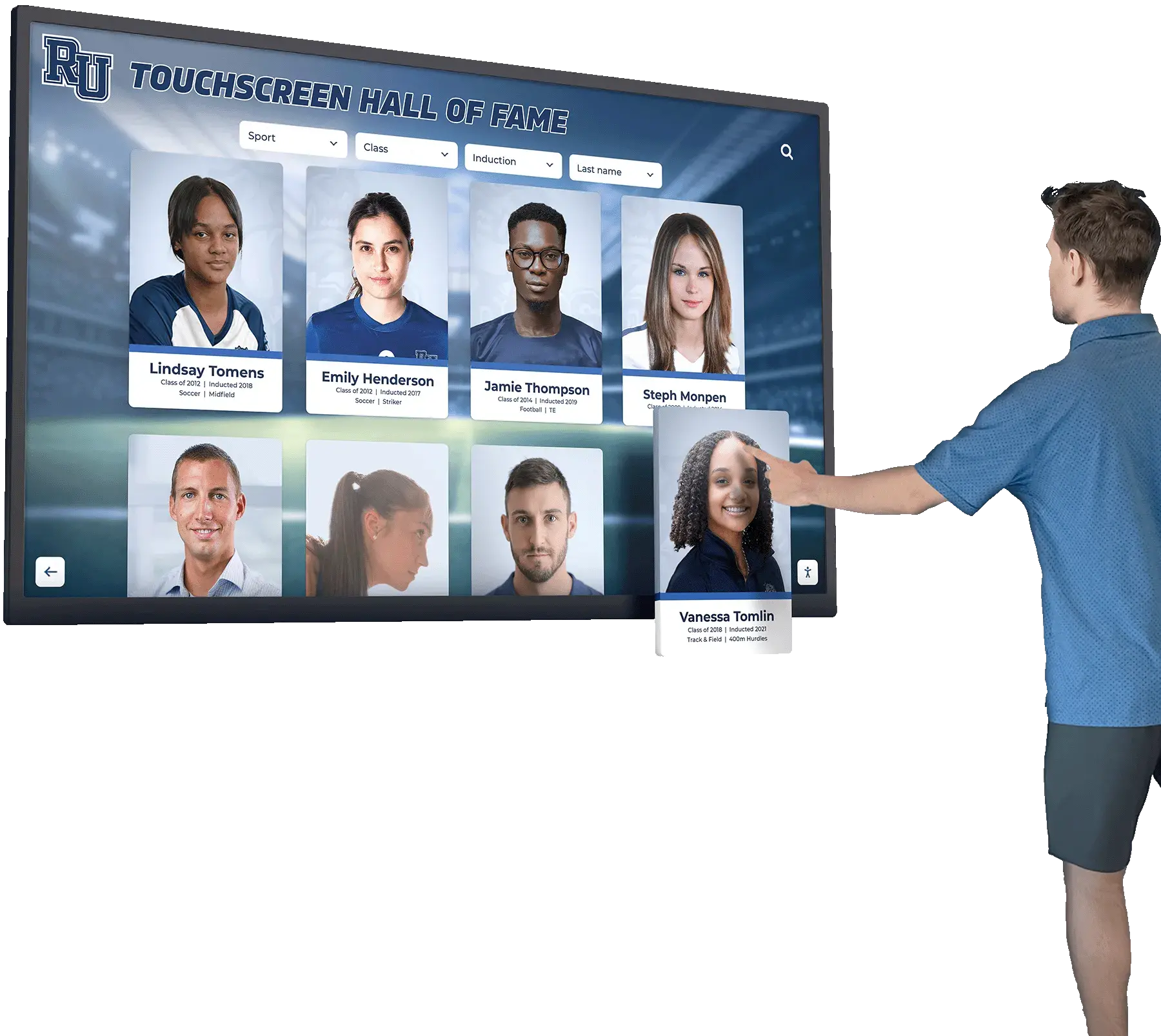
On a digital hall of fame interface, the values used in practice are nearly always menu, listbox, or dialog. A navigation dropdown that presents sport categories as command-like links is a menu. A filter control that presents sport options as selectable items is a listbox. A filter panel containing multiple checkboxes, a decade range slider, and a submit button is a dialog.
The failure that this audit catches is not just the absence of aria-haspopup — it is also a declared value that does not match the widget rendered. A screen reader user who hears “has popup menu” uses arrow keys inside the popup. If the popup is a dialog with checkboxes, arrow key navigation either does nothing or moves through unrelated interface elements, and the user may close what they believe is a misbehaving menu without ever successfully applying a filter.
WCAG Criteria That Apply to aria-haspopup in a Hall of Fame Context
| WCAG Criterion | Level | How It Applies to Hall of Fame aria-haspopup |
|---|---|---|
| 4.1.2 Name, Role, Value | AA | Buttons that open popup widgets must expose the popup type as a programmatically determinable property |
| 1.3.1 Info and Relationships | A | The structural distinction between a menu, a listbox, and a dialog must be expressed in markup, not only in visual appearance |
| 2.1.1 Keyboard | A | Keyboard interaction inside a popup must match the model implied by aria-haspopup; a mismatch makes the popup functionally inaccessible to keyboard users |
| 4.1.3 Status Messages | AA | If activating a filter control triggers a result count update, the status message announcing the new count must be programmatically determinable — aria-haspopup does not cover this but the audit should flag when it is absent alongside a missing status message |
| 2.4.3 Focus Order | A | Focus must move into the popup after activation; aria-haspopup alone does not manage focus, but its presence signals that focus management is expected |
SC 4.1.2 is the governing criterion. It requires that every user interface component exposes its name, role, and applicable states, values, and properties. aria-haspopup is a property — the popup type the button controls — and its correct value is part of what SC 4.1.2 mandates be programmatically determinable. A missing attribute is a Level AA failure. An incorrect value — menu on a button that opens a dialog — is equally a failure, because the property is determinable but inaccurate.
SC 2.1.1 surfaces the practical consequence. A screen reader user relying on the keyboard model implied by aria-haspopup will navigate incorrectly into a widget that uses a different model. This is not a display issue; it is a functional failure that prevents the user from operating the filter at all.
Where aria-haspopup Appears on a Hall of Fame Interface
A school recognition platform typically renders three categories of controls that require aria-haspopup:
Navigation menus — dropdowns in the site header or sidebar that expand into a list of navigation links. A “Browse by Sport” navigation trigger that opens a flat list of sport links with no selection mechanism is a menu. Each link inside is a navigation command, not a selectable filter option.
Filter dropdowns (listboxes) — controls that open a single-dimension selection widget. A “Sport” filter button that reveals a scrollable list of sport options — Basketball, Soccer, Track, Swimming — where the visitor selects one option and the roster updates is a listbox. The correct value is aria-haspopup="listbox".
Filter dialogs — buttons that open a multi-control filter panel. A “Refine Results” button that opens a panel containing checkboxes for multiple sports, a decade selector, an award type filter, and an “Apply Filters” button is a dialog. The correct value is aria-haspopup="dialog".
The table below maps common hall of fame UI patterns to their correct aria-haspopup values:
| Control Description | Correct aria-haspopup Value | Common Incorrect Value |
|---|---|---|
| Navigation dropdown: sport category links | menu | absent |
| Navigation dropdown: decade range links | menu | absent |
| Single-select sport filter revealing scrollable options | listbox | menu or absent |
| Single-select decade filter | listbox | menu or absent |
| Multi-control filter panel (checkboxes + submit) | dialog | menu or absent |
| Search suggestions dropdown | listbox | menu or absent |
| Sort order selector revealing sort options | listbox | menu or absent |
| Share or export action menu | menu | absent |
| Profile quick-view modal trigger | dialog | absent |

How to Run a Digital Hall of Fame ARIA-Haspopup Audit
Step 1 — Inventory All aria-haspopup Instances with DevTools
Open the hall of fame interface in Chrome or Edge and open DevTools (F12). In the Console tab, run the following query on the main browse view:
Array.from(document.querySelectorAll('[aria-haspopup]')).map(el => ({
  tag: el.tagName,
  id: el.id || '(none)',
  text: el.textContent.trim().slice(0, 60),
  haspopup: el.getAttribute('aria-haspopup'),
  expanded: el.getAttribute('aria-expanded'),
  controls: el.getAttribute('aria-controls')
}))
Record every result. Repeat the query on the search results view and on any page that renders a filter panel, because different route templates may instantiate different popup triggers with different aria-haspopup values. Note each trigger’s declared popup type, its current aria-expanded value, and whether it carries an aria-controls attribute pointing to the popup element’s ID.
Step 2 — Identify Controls That Should Carry aria-haspopup but Do Not
The query in Step 1 only returns elements that already have the attribute. A separate query identifies interactive elements that visually open a popup but lack the attribute entirely:
Array.from(document.querySelectorAll('button, [role="button"], a[data-toggle], [data-dropdown]'))
  .filter(el => !el.hasAttribute('aria-haspopup'))
  .map(el => ({
    tag: el.tagName,
    text: el.textContent.trim().slice(0, 60),
    classes: el.className.toString().slice(0, 80),
    expanded: el.getAttribute('aria-expanded')
  }))
Any result where a button’s class name or aria-expanded attribute suggests it controls a popup — class names containing “dropdown,” “toggle,” “filter,” or “menu”; or the presence of aria-expanded — is a candidate for a missing aria-haspopup attribute. Inspect each candidate visually in the interface to confirm what it opens, then assign the appropriate value.
Step 3 — Verify the Declared Popup Type Matches the Actual Widget
For each aria-haspopup instance found in Step 1, identify the actual popup element it controls. If the trigger carries aria-controls="sport-filter-panel", inspect the element with ID sport-filter-panel in the Elements panel. Check its role attribute:
- If
role="menu"or it contains[role="menuitem"]elements —aria-haspopup="menu"is correct - If
role="listbox"or it contains[role="option"]elements —aria-haspopup="listbox"is correct - If
role="dialog"and it contains multiple form controls —aria-haspopup="dialog"is correct - If the element has no role and contains
<a>links — the popup is likely functioning as a menu; check whetheraria-haspopup="menu"is declared
Any mismatch between the declared aria-haspopup value and the popup’s actual ARIA role is a failure. Flag it with the trigger’s text content, its declared value, and the actual role of the popup element.
Step 4 — Check aria-expanded Pairing on Every Trigger
aria-haspopup communicates what will appear. aria-expanded communicates whether it is currently visible. Both attributes must be present on every popup trigger. A trigger that carries aria-haspopup but omits aria-expanded announces the popup type but gives the visitor no way to know whether the popup is currently open or closed.
From the Step 1 results, flag every entry where expanded is null. For each flagged trigger, confirm in the interface that the popup opens and closes in response to activation — if it does, aria-expanded must toggle between "true" and "false" as the state changes. If the JavaScript that manages the popup does not update aria-expanded, the trigger fails SC 4.1.2 because the current state of the popup (open or closed) is not programmatically determinable.
Step 5 — Verify aria-controls Linkage to the Popup Element
aria-controls provides an explicit programmatic relationship between the trigger and its popup. From the Step 1 results, flag every entry where controls is null. Then verify whether the popup element carries a matching id attribute. If the trigger has aria-controls="sport-dropdown" but no element in the DOM has id="sport-dropdown", the reference is broken — the programmatic relationship is declared but not satisfied.
Run the following query to check for broken aria-controls references:
Array.from(document.querySelectorAll('[aria-controls]')).map(el => ({
  trigger: el.textContent.trim().slice(0, 50),
  controls: el.getAttribute('aria-controls'),
  targetExists: document.getElementById(el.getAttribute('aria-controls')) !== null
})).filter(r => !r.targetExists)
Any result where targetExists is false is a broken reference. The popup element either has no id attribute, or its id does not match the aria-controls value — likely because the platform’s JavaScript generates dynamic IDs that differ between page loads.
Step 6 — Test Keyboard Behavior Against the Declared Popup Type
For each popup trigger, activate it using the keyboard (press Enter or Space) and verify that the keyboard interaction model inside the popup matches the declared aria-haspopup value:
aria-haspopup="menu"— after activation, arrow keys must navigate between menu items; Escape must close the menu and return focus to the triggeraria-haspopup="listbox"— after activation, arrow keys must navigate between listbox options; Enter or Space must select the focused option; Escape must close the listbox and return focus to the triggeraria-haspopup="dialog"— after activation, focus must move into the dialog; Tab must cycle through all focusable controls within the dialog; Escape or an explicit close button must close the dialog and return focus to the trigger
Any popup where the actual keyboard behavior contradicts the declared type is a combined aria-haspopup and keyboard interaction failure. Report it as both a SC 4.1.2 and a SC 2.1.1 finding.
Step 7 — Test with a Screen Reader Active
Install NVDA (free, Windows) or use VoiceOver (macOS, built-in). Navigate to the hall of fame browse view. Tab to each filter and navigation control without activating it and listen to the full announcement. For each control, verify:
- The popup type is announced — “has popup menu,” “has popup listbox,” or “has popup dialog”
- The current expanded state is announced — “collapsed” or “expanded”
- After activation, focus moves into the popup and the popup content is immediately readable
If a control is announced as a plain “button” with no popup type, it is missing aria-haspopup. If a control announces the correct popup type but focus does not move into the popup after activation, the platform’s focus management is absent or broken — a separate but related failure.
Common Failure Patterns on Hall of Fame Platforms
Pattern 1: Listbox announced as menu. A sport filter dropdown that renders a listbox — with radio-button-like single selection — carries aria-haspopup="menu" or aria-haspopup="true". A screen reader user who hears “has popup menu” navigates with arrow keys expecting menu command behavior; when they press Enter on “Basketball,” the menu may close correctly (because Enter also works in some menu contexts), but the screen reader does not announce that “Basketball” has been selected as a filter value. The filter applies visually but the selection feedback is missing from the accessibility tree.
Pattern 2: Dialog announced as menu. A filter panel containing checkboxes for multiple sports, a decade range control, and an “Apply Filters” button carries aria-haspopup="menu". A screen reader user who hears “has popup menu” presses the down arrow key expecting to navigate between menu items. The arrow key either does nothing (dialogs do not use arrow navigation) or moves focus to an unrelated element, leaving the visitor unable to operate any of the filter controls.
Pattern 3: aria-haspopup present but aria-expanded absent. A navigation dropdown declares aria-haspopup="menu" but does not toggle aria-expanded when activated. The screen reader announces the popup type correctly but never tells the visitor whether the menu is open or closed. A visitor who presses Enter and hears no state change may press Enter again, toggling the menu closed, and assume the menu did not open — or may navigate into an open menu without knowing it is open.
Pattern 4: Missing aria-haspopup on search suggestion dropdowns. The search field on a hall of fame interface often produces a suggestion dropdown as the visitor types — showing matching inductee names in a listbox below the field. The search input itself, or a visually adjacent search button, may control this listbox. If neither the input nor the button carries aria-haspopup="listbox", the appearance of suggestions is not pre-announced. Screen readers announce suggestion list items when focus moves into them, but the visitor has no forewarning that suggestions will appear while typing.
Pattern 5: Correct aria-haspopup but broken aria-controls reference. A filter dialog trigger declares aria-haspopup="dialog" and aria-controls="filter-dialog" correctly, but the platform generates a different id on each page load — “filter-dialog-3f7a” instead of “filter-dialog.” The aria-controls reference is broken. Some screen readers use aria-controls to navigate directly to the popup after activation; when the reference is broken, those screen readers treat the popup as disconnected from its trigger.
Touchscreen Kiosk Considerations
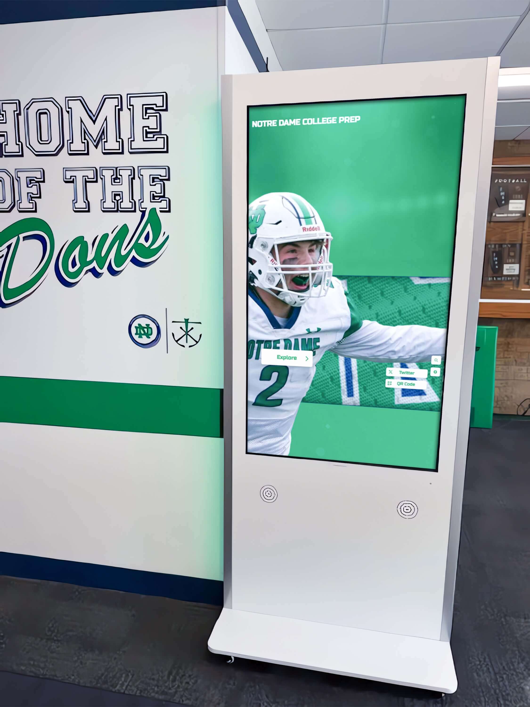
A touchscreen kiosk in a school lobby or hallway typically renders the same hall of fame platform as the web-accessible version but may present a different layout — fewer filter controls, icon-only navigation buttons, or a simplified filter panel instead of a multi-control dialog. These layout differences affect which aria-haspopup values are correct for the kiosk deployment specifically.
A common scenario: the web version renders a "Refine Results" button that opens a full filter dialog with multiple checkboxes, correctly carrying aria-haspopup="dialog". The kiosk version renders a simplified sport picker — a single dropdown list of sport options — using the same button label and the same template. The kiosk popup is a listbox, not a dialog, but the shared template retains aria-haspopup="dialog". The kiosk deployment now has a declared popup type that does not match the actual widget.
Schools evaluating how their current display handles navigation and filtering can review campus touchscreen display implementation patterns to understand how kiosk deployments differ from web deployments in practice — and what configuration controls the vendor provides for managing those differences.
The audit must be run separately on the kiosk deployment. Load the kiosk URL or template, run the Step 1 DevTools query, and compare the aria-haspopup values against the kiosk-specific popup widgets. Do not assume the kiosk audit results match the web audit results. When the kiosk layout differs from the web layout, the correct aria-haspopup values may differ as well.
How aria-haspopup Interacts with aria-expanded and aria-controls
These three attributes form a complete popup relationship pattern. Individually, each communicates part of the picture; together, they give a screen reader user full context about a popup trigger:
| Attribute | What It Communicates | Failure When Missing |
|---|---|---|
aria-haspopup | The type of popup that will appear | Visitor does not know what kind of widget to expect |
aria-expanded | Whether the popup is currently open | Visitor does not know whether the popup is visible |
aria-controls | The ID of the popup element | Screen reader cannot programmatically locate the popup |
The pattern for a sport filter listbox trigger should look like:
<button
  aria-haspopup="listbox"
  aria-expanded="false"
  aria-controls="sport-listbox"
>
  Filter by Sport
</button>

<ul role="listbox" id="sport-listbox" hidden>
  <li role="option" aria-selected="false">Basketball</li>
  <li role="option" aria-selected="false">Soccer</li>
  <li role="option" aria-selected="false">Track</li>
</ul>
When the visitor activates the button, JavaScript must:
- Remove
hiddenfrom the listbox element (or setdisplay: block) - Update
aria-expandedon the trigger from"false"to"true" - Move focus to the first
[role="option"]inside the listbox
When the visitor selects an option or presses Escape:
- Add
hiddenback to the listbox - Update
aria-expandedfrom"true"to"false" - Return focus to the trigger button
If the platform’s JavaScript handles only the visual show/hide and omits the aria-expanded update and focus management, the popup is visually functional but inaccessible. The aria-haspopup audit should flag these omissions alongside any incorrect popup type declarations.
Schools that maintain athletic award records and historical recognition archives on the same platform as their hall of fame display should confirm that filter controls operating on both data types — inductee records and award-specific entries — carry the correct aria-haspopup value for each popup pattern, since the two content types may render different filter UI components.
Popup Type Quick-Reference Table
Use this table during the audit to assign the correct aria-haspopup value to each trigger type found on the platform:
| Control Observed in Interface | Widget That Appears | Correct aria-haspopup | aria-expanded Required | Focus Moves Into Popup? |
|---|---|---|---|---|
| “Browse by Sport” header link | Dropdown with navigation links | menu | Yes | Yes — to first menuitem |
| “Sport” filter button — single option select | Scrollable option list | listbox | Yes | Yes — to first option |
| “Decade” filter button — single select | Scrollable option list | listbox | Yes | Yes — to first option |
| “Refine Results” — multi-control panel | Panel with checkboxes and submit | dialog | Yes | Yes — to first focusable control |
| Search input — typing produces suggestions | Option suggestion list | listbox on input | Yes | No — focus stays in input; options are read via AT |
| “Sort by” button — sort order selection | Sort option list | listbox | Yes | Yes — to selected option |
| “Share” or “Export” action trigger | Action command list | menu | Yes | Yes — to first menuitem |
| “View Profile” card button | Inductee detail modal | dialog | Yes | Yes — to modal heading or close button |
Connecting This Audit to Broader Accessibility Work
A digital hall of fame ARIA-haspopup audit for menus and filter dialogs belongs alongside companion audits that address the full interactive experience.
Pair with an aria-expanded audit. Every aria-haspopup trigger requires a paired aria-expanded attribute that toggles state. Auditing aria-haspopup values without verifying aria-expanded completeness leaves half the popup relationship unvalidated.
Pair with a keyboard navigation audit. The aria-haspopup value implies a keyboard model. An audit that verifies the declared popup type without testing whether the actual keyboard behavior matches it confirms the markup without confirming the interaction. Both must be correct for SC 4.1.2 and SC 2.1.1 to be satisfied.
Pair with a focus management audit. aria-haspopup pre-announces a popup; focus management delivers the visitor into it. A trigger that correctly declares aria-haspopup="dialog" but fails to move focus into the dialog on activation is a focus management failure that the aria-haspopup audit will surface during Step 6 screen reader testing.
Recognition platforms that showcase athletic achievements across digital display formats — including wall-mounted kiosks, web portals, and mobile-accessible directories — often deploy different filter UI patterns across those formats. Scheduling the aria-haspopup audit to cover each deployment format independently, rather than assuming the web audit covers all formats, prevents format-specific popup type mismatches from persisting undetected.
Schools that maintain athletic archives extending into historical yearbook and record documentation alongside a hall of fame display will find that filter controls spanning both content types — inductee records and historical document archives — may render different popup widgets for each. Confirm that each filter trigger carries the popup type appropriate to its specific popup, not a single generic value applied to all filter buttons on the page.
Recognition programs that share announcement and recognition content across social platforms can pair accessibility remediation work with graphic asset preparation for school recognition events so that visual promotion of the hall of fame display matches the accessibility quality of the display itself.
Remediation Priority Framework
When bringing aria-haspopup findings to a platform vendor, organize requests in three tiers:
Tier 1 — Missing aria-haspopup on primary filter controls. Any button that opens a menu, listbox, or dialog and carries no aria-haspopup attribute is a Level AA failure under SC 4.1.2. These controls are inaccessible to screen reader users who cannot determine from the trigger alone what type of interaction is about to begin. Prioritize remediation of filter controls — sport, decade, and award type — over secondary controls like sort order or export menus, because filter controls are the primary way visitors navigate an inductee roster.
Tier 2 — Incorrect popup type declared. A trigger that carries aria-haspopup but declares the wrong type — a dialog announced as a menu, or a listbox announced as a menu — leads screen reader users into a popup with the wrong keyboard model. These failures are harder for the visitor to recover from than a missing attribute, because the visitor has been actively misled rather than given no information. Remediation requires identifying the correct popup type for each trigger and updating the attribute value.
Tier 3 — Missing aria-expanded or broken aria-controls. Triggers that carry the correct aria-haspopup value but omit aria-expanded or carry a broken aria-controls reference are lower-severity in that the popup type is correctly communicated, but the current state and programmatic link to the popup are absent. Remediation is a JavaScript state management task for aria-expanded and an ID consistency fix for aria-controls.
Schools evaluating recognition platforms as part of a procurement review should treat Tier 1 and Tier 2 failures as disqualifying criteria. A platform that does not correctly communicate popup type on its primary filter controls will require ongoing custom remediation after every template update that modifies the filter UI. Platforms designed with accessible popup semantics from the markup layer — rather than added retroactively — maintain correct aria-haspopup values through content updates without requiring custom developer intervention.
Visitor accessibility on digital recognition displays is also relevant in other institutional contexts: facilities teams evaluating digital displays for mixed visitor populations including accessibility-device users will find that the same aria-haspopup audit methodology applies to any web-based interactive display regardless of setting.

Quick-Reference Audit Checklist
Discovery
- DevTools Console query run on browse view, search results view, and any filter-panel view
- Every
aria-haspopupinstance recorded with declared type,aria-expandedvalue, andaria-controlstarget - Complementary query run to identify popup-bearing buttons that lack
aria-haspopupentirely
Type Verification
- Each declared popup type confirmed against the actual ARIA role of the popup element
- Listbox-type popups confirmed to contain
[role="option"]elements - Dialog-type popups confirmed to contain multiple form controls (not a flat option list)
- Menu-type popups confirmed to contain
[role="menuitem"]or navigation links — not selectable filter options
State and Linkage
- Every
aria-haspopuptrigger confirmed to carryaria-expandedthat toggles between"true"and"false" - Every
aria-controlsreference confirmed to resolve to an existing DOM element ID - Broken
aria-controlsreferences flagged with trigger text and broken ID value
Keyboard Behavior
- Each popup activated via keyboard (Enter/Space) and keyboard model inside verified against declared type
- Menu popups: arrow key navigation between items confirmed; Escape closes and returns focus
- Listbox popups: arrow key selection confirmed; Enter or Space selects; Escape closes and returns focus
- Dialog popups: focus moves into dialog on open; Tab cycles controls; Escape or close button exits and returns focus
Screen Reader Test
- NVDA or VoiceOver active; every filter and navigation trigger tabbed to and full announcement recorded
- Popup type announced for every trigger (menu, listbox, or dialog)
- Expanded/collapsed state announced for every trigger
- Post-activation popup content announced without additional navigation action by visitor
Kiosk Deployment
- Kiosk template loaded independently and Step 1 query repeated
- Kiosk popup types compared against web popup types for each equivalent trigger
- Mismatches between kiosk and web
aria-haspopupvalues flagged for separate remediation
Documentation
- Each finding categorized as Tier 1 (missing), Tier 2 (incorrect type), or Tier 3 (missing state/linkage)
- Remediation request structured by tier with trigger text, current value, correct value, and popup role
- Re-test plan scheduled for 30 days after vendor remediation delivery
Rocket Alumni Solutions builds correct popup semantics into every filter and navigation control at the component level — sport dropdowns carry aria-haspopup="listbox", multi-control filter panels carry aria-haspopup="dialog", and navigation dropdowns carry aria-haspopup="menu" — with aria-expanded toggling on every open and close action and focus management moving visitors into each popup on activation. The platform maintains separate popup configurations for web and kiosk deployments so that a simplified kiosk filter panel carries the correct popup type for the kiosk widget rather than inheriting a web-context value that does not match. Schools that want to confirm their current display handles popup type semantics correctly — or that are evaluating platforms for a new installation — can walk through the accessibility implementation during a personalized demo.