


Key Takeaways
Run a digital hall of fame ARIA-checked audit to verify that every sport, decade, and award-type filter checkbox correctly announces its checked or unchecked state to screen reader users without changing the visual touchscreen experience.
aria-checked is the state attribute that communicates that confirmation. A digital hall of fame ARIA-checked audit examines every custom filter checkbox on the interface to confirm the attribute is present, that it carries the correct value — true, false, or mixed — and that the value updates accurately after every visitor interaction. This guide walks school IT staff, athletic directors, and accessibility coordinators through every step of that audit, explains how it differs from prior selected, pressed, and invalid-state audits, and provides a practical remediation framework.
What aria-checked Does — and Why Inductee Filters Need It
aria-checked is a state attribute defined in the WAI-ARIA 1.2 specification that tells assistive technology whether a control is currently checked, unchecked, or in a mixed state. It applies to any element that models the behavior of a checkbox or radio button but is built from non-native HTML elements — typically <div>, <span>, <li>, or <button> elements assigned a checkbox-type role.
The three valid values are:
| Value | Meaning | When to Use on a Hall of Fame Filter |
|---|---|---|
true | The control is checked | Sport, decade, or award filter is active — roster is being filtered by this option |
false | The control is unchecked | Filter option is available but not currently active |
mixed | Partially checked — some subordinate options checked, some unchecked | “All Sports” or “All Decades” parent checkbox when only some children are checked |
A screen reader that encounters <div role="checkbox" aria-checked="true">Basketball</div> announces it as “Basketball, checkbox, checked.” One that encounters the same element without any aria-checked attribute — or with a stale value that was not updated after the visitor checked it — announces it as “Basketball, checkbox” with no state, or misreports the state entirely.
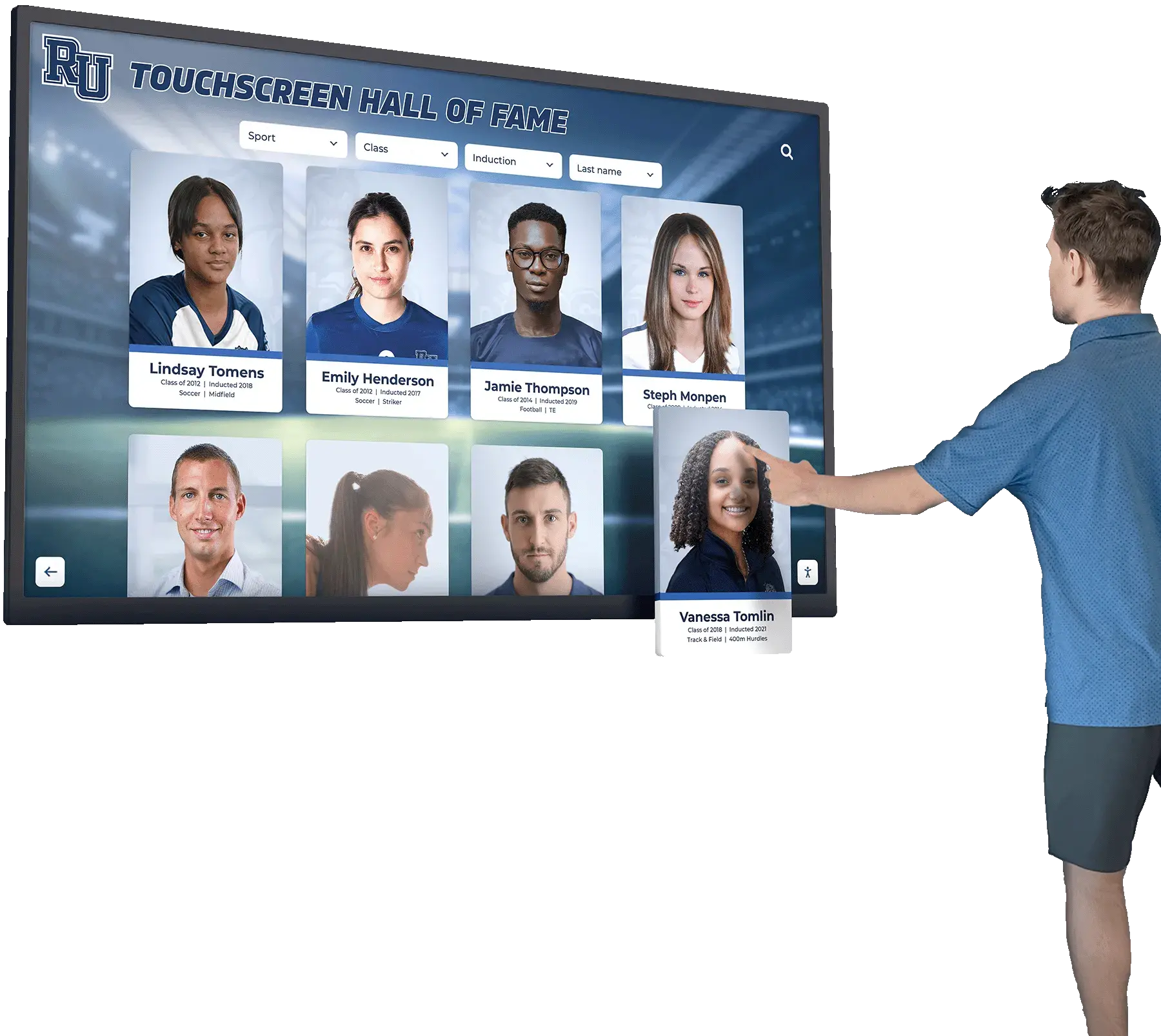
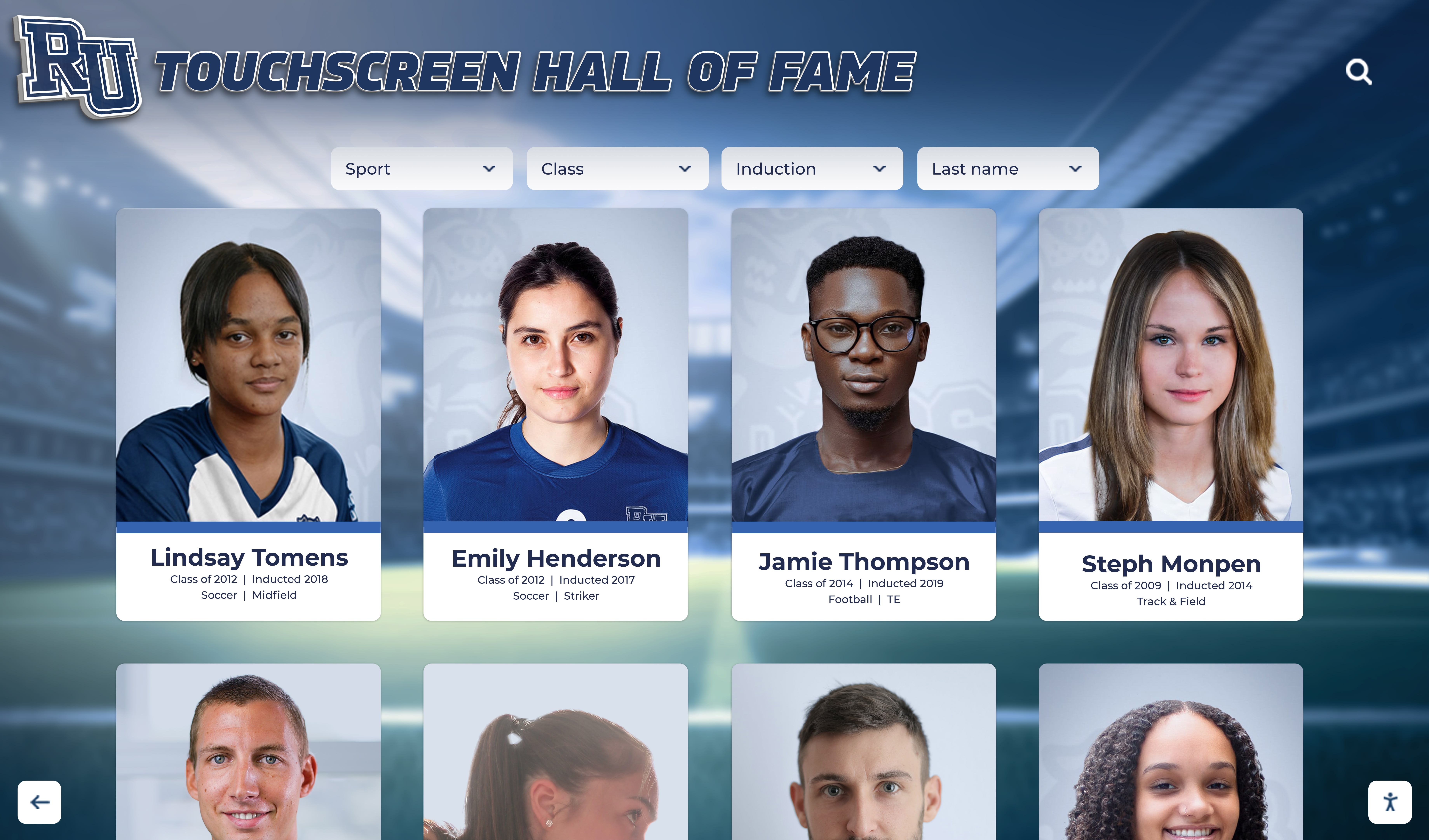
This matters in practice because a school’s hall of fame filter panel commonly presents eight to fifteen sport checkboxes, multiple decade options, and one or more award category controls. A visitor using a screen reader who activates “Track & Field” to filter the inductee roster has no confirmation that the filter is applied unless the platform updates aria-checked from false to true in response to the interaction. Without that update, the visitor may activate the control repeatedly — toggling an applied filter off and on — while receiving no feedback that anything changed.
The compliance anchor is WCAG 2.1 SC 4.1.2 (Name, Role, Value, Level AA): the checked state of an interactive filter control is a programmatically determinable property, and failing to expose it or keep it current is a Level AA failure on every filter control that is implemented as a custom element.
aria-checked vs. aria-selected, aria-pressed, and aria-invalid
A complete digital hall of fame ARIA-checked audit begins with confirming which state attribute each filter control should actually carry. The four state attributes that govern similar-looking controls are not interchangeable, and using the wrong one is itself a failure.
aria-checked belongs on controls modeled after checkboxes, radio buttons, or menu item checkboxes. A sport filter chip with role="checkbox" uses aria-checked. A decade selector built as a group of role="radio" buttons uses aria-checked on each option. A toggle switch with role="switch" uses aria-checked to communicate its on/off position.
aria-selected belongs on options inside a listbox, grid, tab list, or tree — elements where the ARIA role implies selection from a collection. If the filter interface presents sports inside a role="listbox" with each sport as a role="option", the correct attribute is aria-selected, not aria-checked. Using aria-selected on a role="checkbox" element is a role-state mismatch: the WAI-ARIA specification requires that aria-selected apply only to roles that inherit it (option, tab, gridcell, treeitem, row, columnheader, rowheader). For a companion audit of filter lists built with this listbox pattern, see the digital hall of fame ARIA-multiselectable audit for filter lists.
aria-pressed belongs on toggle buttons — elements with role="button" that remain in an activated state after a click. If a filter control is implemented as a button rather than a checkbox — <button aria-pressed="true">Basketball</button> — the correct attribute is aria-pressed. Buttons and checkboxes are different interaction models: a button announces “Basketball, button, pressed”; a checkbox announces “Basketball, checkbox, checked.” Both are valid implementations for a filter control, but each requires its matching state attribute, and they must not be mixed within the same filter group.
aria-invalid belongs on text input, select, or textarea elements where the current value fails a validation constraint. It is not a filter-state attribute and is irrelevant to inductee filter checkboxes unless the filter form enforces a minimum-selection rule and flags the submission as invalid when no options are selected.
The table below maps common hall of fame filter implementations to the correct attribute:
| Filter Control Pattern | Element Type | Role | Correct State Attribute |
|---|---|---|---|
| Sport filter chip, custom built | <div> or <span> | role="checkbox" | aria-checked |
| Decade filter, custom built | <div> group + items | role="radio" | aria-checked |
| Toggle switch for “Active inductees only” | <button> or <div> | role="switch" | aria-checked |
| Sport option in a listbox | <li> | role="option" | aria-selected |
| Filter toolbar button (latched) | <button> | role="button" | aria-pressed |
| Native HTML checkbox | <input type="checkbox"> | (native, no role) | No aria-checked needed |
| Native HTML radio button | <input type="radio"> | (native, no role) | No aria-checked needed |
WCAG Criteria That Apply to aria-checked in a Hall of Fame Filter Context
| WCAG Criterion | Level | How It Applies to Hall of Fame Filter Checkboxes |
|---|---|---|
| 4.1.2 Name, Role, Value | AA | Checked state must be programmatically determinable on every custom filter control and must update after every interaction |
| 1.3.1 Info and Relationships | A | Active filter state cannot be communicated only by a visual color change or icon; the relationship must be expressed in markup |
| 2.1.1 Keyboard | A | Custom filter checkboxes must be keyboard reachable (tabindex=“0”) and activatable by Space, with aria-checked updating on keyboard activation |
| 4.1.3 Status Messages | AA | Dynamic result count updates triggered by filter activation must be announced via a live region — not covered by aria-checked itself but part of the same filter interaction audit |
| 1.4.1 Use of Color | A | If checked state is communicated only by a color change on the filter chip, that is a separate 1.4.1 failure; aria-checked addresses the programmatic exposure, not the visual presentation |
SC 4.1.2 is the governing criterion. It requires that every user interface component expose its name, role, and applicable states so that assistive technology can present and operate it. On a custom filter checkbox, the name is the filter label (“Basketball”), the role is checkbox, and the required state is the checked condition. All three must be correct at all times, including immediately after the visitor changes the checked state.
SC 1.3.1 highlights the visual-only failure mode. Hall of fame platforms commonly indicate an active filter by changing a chip’s background color, adding a checkmark icon, or applying a border. These visual indicators are meaningless to a screen reader user if aria-checked is not updated alongside them. The programmatic relationship between “chip is highlighted” and “chip is an active filter” must be expressed in markup.
How to Run a Digital Hall of Fame ARIA-Checked Audit
Step 1 — Identify All Filter Controls and Their Role
Open the hall of fame interface in Chrome or Edge and navigate to a view with the filter panel visible. Open DevTools (F12) and in the Console tab run:
Array.from(document.querySelectorAll(
  '[role="checkbox"], [role="radio"], [role="switch"], ' +
  '[role="menuitemcheckbox"], [role="menuitemradio"]'
)).map(el => ({
  tag: el.tagName,
  text: el.textContent.trim().slice(0, 60),
  role: el.getAttribute('role'),
  checked: el.getAttribute('aria-checked') || '(absent)',
  tabindex: el.getAttribute('tabindex'),
  label: el.getAttribute('aria-label') || '(none)',
  labelledby: el.getAttribute('aria-labelledby') || '(none)'
}))
Also run a complementary query to find any native <input type="checkbox"> or <input type="radio"> that may be visually hidden but still functioning:
Array.from(document.querySelectorAll('input[type="checkbox"], input[type="radio"]')).map(el => ({
  id: el.id,
  name: el.name,
  checked: el.checked,
  visible: !el.closest('[aria-hidden="true"]') && el.offsetParent !== null,
  labelText: document.querySelector('[for="' + el.id + '"]')?.textContent.trim() || '(none)'
}))
Record both outputs. The first identifies custom controls that require explicit aria-checked management. The second identifies native controls that do not — and flags any native control that has been accidentally hidden from the accessibility tree.
Step 2 — Flag Missing aria-checked on Custom Controls
From the first query, isolate every entry where checked is '(absent)' and role is checkbox, radio, switch, menuitemcheckbox, or menuitemradio. Any of these is a Tier 1 failure: a custom control that requires aria-checked has none. The control may visually appear checked or unchecked, but that state is invisible to assistive technology.
Also note any control where label and labelledby are both '(none)' and the text field is empty — this is an unlabeled control, which is a separate SC 4.1.2 failure (missing accessible name). For context on accessible names for filter controls, see the digital hall of fame accessible name audit for icon buttons and search filters.
Step 3 — Test the Checked State Update on Interaction
For each custom filter control identified in Step 1, activate it (click or keyboard Space). After activation, re-run the first query and confirm:
- The activated control’s
checkedvalue has changed fromfalsetotrue(ortruetofalseon a second activation) - The
checkedvalue is not still'(absent)'— some implementations addaria-checkedonly after the first click, meaning the unchecked state before the first interaction has no attribute
Flag every control where checked does not toggle correctly after activation.
Step 4 — Test the Mixed State on Parent “Select All” Controls
If the filter panel includes a “Select All Sports,” “All Decades,” or similar parent checkbox that controls a group of subordinate checkboxes:
- Activate the parent to check all children. Confirm
aria-checked="true"on the parent andaria-checked="true"on all children. - Deactivate one child. Confirm the parent updates to
aria-checked="mixed". - Deactivate all remaining children. Confirm the parent updates to
aria-checked="false". - Reactivate one child. Confirm the parent returns to
aria-checked="mixed".
Flag any parent control that does not carry aria-checked="mixed" when the children are in a partially-selected state. The mixed value is the most commonly absent state in tri-state checkbox implementations.
Step 5 — Test Keyboard Activation
Focus each custom filter control using Tab. Verify that:
- The control is reachable by Tab (
tabindex="0"in the DevTools output, or the control is in the natural tab order) - Pressing Space activates the control and the
aria-checkedvalue updates (re-run the query after each Space press) - Pressing Enter does not activate the control — Enter is the keyboard equivalent for links and buttons, not checkboxes; a custom checkbox that activates on Enter but not Space has the wrong keyboard handler
Any custom checkbox that cannot be reached by Tab or that does not respond to Space is a SC 2.1.1 keyboard failure independent of the aria-checked state.
Step 6 — Run a Screen Reader Verification
Install NVDA (Windows, free) or use VoiceOver (macOS, built-in). Navigate to the filter panel using Tab. For each filter control, listen to the full announcement:
- An unchecked sport filter should announce: “[Sport Name], checkbox, unchecked” or “not checked”
- A checked sport filter should announce: “[Sport Name], checkbox, checked”
- A mixed-state parent should announce: “[Label], checkbox, mixed” or “partially checked”
If any control announces as a plain control with no checked state, the aria-checked attribute is either absent or is not being recognized because the element’s role is mismatched with the state attribute.
Step 7 — Audit Each Distinct Filter View
If the hall of fame platform renders filter controls on more than one route — a main browse view, a filtered sport-specific page, and a search results view — repeat the full audit on each. Different templates may implement filter controls with different code, and a passing implementation on the main browse view does not guarantee the search results page uses the same pattern. The digital hall of fame ARIA-busy audit addresses the loading-state announcements that accompany each filter activation — a companion concern that warrants its own review pass.
Common Failure Patterns on Hall of Fame Platforms
Pattern 1: aria-checked set once at page load and never updated. The filter chip renders with aria-checked="false" in the initial HTML. When a visitor activates the chip, the JavaScript correctly applies visual styling (background color change, checkmark icon) but does not call setAttribute('aria-checked', 'true'). The DOM attribute remains false while the filter is active. A screen reader user hears “Basketball, checkbox, unchecked” after activating the filter — the opposite of the actual state. This is the most common dynamic state failure in custom checkbox implementations on hall of fame platforms.
Pattern 2: aria-checked absent only in the unchecked state. The JavaScript adds aria-checked="true" when a visitor activates a filter chip, but removes the attribute entirely via removeAttribute('aria-checked') when the visitor deactivates it — rather than setting setAttribute('aria-checked', 'false'). This means the unchecked state carries no aria-checked attribute. A screen reader user navigating the filter panel before making any selections hears only “Basketball, checkbox” — no state information — and cannot determine whether the control is unchecked or simply broken. The correct behavior is for the attribute to always be present, alternating between true and false.
Pattern 3: aria-pressed used on a control with role=“checkbox”. A developer assigns role="checkbox" to a filter chip for semantic correctness but adds aria-pressed instead of aria-checked for the state — perhaps because similar-looking toggle buttons elsewhere in the interface use aria-pressed. The WAI-ARIA specification does not permit aria-pressed on role="checkbox". Some screen readers accept it; others ignore it or produce inconsistent announcements. The audit should flag any role="checkbox" element carrying aria-pressed rather than aria-checked as a specification mismatch, even if it incidentally works in one screen reader.
Pattern 4: aria-selected used on role=“checkbox” filter chips. A developer uses aria-selected on filter chips to mirror the pattern used on tab elements or list options elsewhere in the interface. The WAI-ARIA specification does not allow aria-selected on role="checkbox". NVDA and VoiceOver may ignore the attribute on that role, leaving the filter state entirely invisible to screen reader users. The audit should treat any role="checkbox" element carrying aria-selected as a role-state mismatch requiring remediation — the attribute must be replaced with aria-checked.
Pattern 5: Mixed state never implemented on parent checkboxes. The “Select All” parent checkbox toggles between aria-checked="true" and aria-checked="false" but skips the mixed value entirely. When some children are checked and others are not, the parent carries aria-checked="false" (because not all are checked) rather than aria-checked="mixed". A screen reader user hears “All Sports, checkbox, unchecked” even while three sport filters are active — a state that contradicts the visible filter panel and gives the user no accurate summary of how many sports are currently filtering the inductee roster.
Pattern 6: Keyboard activation updates aria-checked but mouse click does not, or vice versa. The JavaScript event handler for a custom filter checkbox uses separate code paths for mouse events and keyboard events. The keyboard Space handler correctly calls setAttribute('aria-checked', ...), but the mouse click handler only updates CSS classes and data attributes. Touch events — which trigger mouse event handlers — behave the same as mouse clicks and also fail to update aria-checked. A touchscreen kiosk visitor activating a filter by touch receives no aria-checked update, while a keyboard user testing the same control in a lab session sees correct behavior. This failure mode is difficult to catch without testing on the actual kiosk hardware.
Correct HTML Patterns for Hall of Fame Filter Checkboxes
Native Checkbox (Recommended Where Possible)
The simplest implementation avoids aria-checked entirely by using native HTML:
<fieldset>
<legend>Filter by Sport</legend>
<label><input type="checkbox" name="sport" value="basketball"> Basketball</label>
<label><input type="checkbox" name="sport" value="soccer"> Soccer</label>
<label><input type="checkbox" name="sport" value="track"> Track & Field</label>
</fieldset>
A native <input type="checkbox"> exposes its checked state automatically. No JavaScript is needed to update aria-checked because the browser handles it. Styling constraints are the most common reason platforms use custom elements instead — native checkboxes are harder to style consistently across browsers — but CSS custom properties and modern styling approaches have narrowed this gap significantly.
Custom Checkbox with Correct aria-checked Management
When a custom implementation is required, the following pattern illustrates correct aria-checked usage:
<div role="group" aria-labelledby="sport-filter-label">
<span id="sport-filter-label">Filter by Sport</span>
<div role="checkbox" aria-checked="false" tabindex="0" class="filter-chip">Basketball</div>
<div role="checkbox" aria-checked="false" tabindex="0" class="filter-chip">Soccer</div>
<div role="checkbox" aria-checked="false" tabindex="0" class="filter-chip">Track & Field</div>
</div>
The JavaScript event handler for each chip must cover all activation paths:
function toggleFilterChip(chip) {
  const currentState = chip.getAttribute('aria-checked') === 'true';
  chip.setAttribute('aria-checked', currentState ? 'false' : 'true');
  // Apply filter logic here
}

chip.addEventListener('click', () => toggleFilterChip(chip));
chip.addEventListener('keydown', (e) => {
  if (e.key === ' ') {
    e.preventDefault(); // Prevent page scroll on Space
    toggleFilterChip(chip);
  }
});
The e.preventDefault() call on Space is required to prevent the browser from scrolling the page when a visitor presses Space on a focused custom checkbox. Without it, the filter activates but the page scrolls simultaneously, disrupting the visitor’s position in the roster.
Parent Checkbox with Mixed State
function updateParentCheckbox(parentChip, childChips) {
  const checkedCount = Array.from(childChips)
    .filter(c => c.getAttribute('aria-checked') === 'true').length;
  if (checkedCount === 0) {
    parentChip.setAttribute('aria-checked', 'false');
  } else if (checkedCount === childChips.length) {
    parentChip.setAttribute('aria-checked', 'true');
  } else {
    parentChip.setAttribute('aria-checked', 'mixed');
  }
}
This three-branch logic must run after every individual child checkbox toggle. Platforms that calculate parent state only on a “Select All” click — and not after individual child toggles — will miss the mixed state on the most common interaction path.
Touchscreen Kiosk Considerations
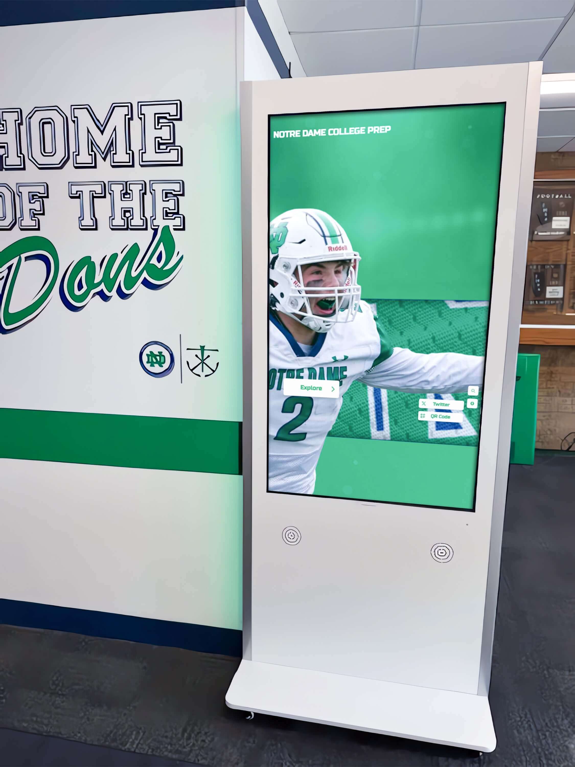
A touchscreen kiosk presents a specific aria-checked risk that web-only audits miss: touch events. A touch interaction fires a sequence of events (touchstart, touchend, then synthetic mousedown, mouseup, click). If the custom checkbox JavaScript only binds to a click event listener, touch interactions may work or may not, depending on the browser’s touch-to-click synthesis. Keyboards use keydown and keyup events with the Space key.
The audit must verify that aria-checked updates on all three activation paths — mouse click, keyboard Space, and touch — on the kiosk hardware itself, not only in a desktop DevTools emulation. A recognition display that passes a desktop keyboard test but fails on a touchscreen because the touch handler is not updating aria-checked is still failing in the deployment environment where most visitors interact.
Additionally, kiosk deployments often suppress or customize the keyboard entirely. If the kiosk locks out Tab navigation and keyboard input, the SC 2.1.1 keyboard accessibility question changes: the kiosk must still support assistive input devices (switch controls, eye trackers, Bluetooth keyboards) even if a physical keyboard is not mounted at the kiosk. aria-checked must update for any input mechanism that can activate a control, regardless of the primary interaction model.
Schools evaluating the full range of accessibility requirements for recognition displays alongside digital content quality can reference the athletic award data quality audit guide for context on how data integrity and accessibility requirements intersect in the same platform audit cycle.
Connecting This Audit to Broader Accessibility Work
A digital hall of fame ARIA-checked audit for inductee filters belongs in a sequence of accessibility reviews that covers the full filter interaction from trigger to result.
Pair with an accessible name audit. Before aria-checked can be useful, the filter control must have an accessible name. A custom checkbox with no aria-label, no aria-labelledby, and no visible text content is unnamed — the screen reader announces “checkbox, unchecked” with no filter label. The digital hall of fame accessible name audit for icon buttons and search filters addresses the naming layer before the state layer this audit covers.
Pair with an ARIA-multiselectable audit. If the filter interface uses a listbox pattern rather than individual checkboxes, the relevant attribute is aria-multiselectable on the role="listbox" parent and aria-selected on each role="option" child. The digital hall of fame ARIA-multiselectable audit for filter lists addresses that pattern. Some platforms use both patterns — checkboxes for sport filters and a listbox for decade selection — requiring both audits.
Pair with an ARIA-busy audit. Every time a filter checkbox is activated, the roster typically reloads or re-renders. During that reload, the inductee list is in a transitional state — it should carry aria-busy="true" on the live region wrapping the roster, and aria-busy="false" when the reload completes. The digital hall of fame ARIA-busy audit covers that loading-state announcement, which is a direct consequence of the filter activation that this audit’s aria-checked state triggers.
Schools evaluating which platforms to consider for a new recognition display can review the top hall of fame tools comparison for context on how accessibility implementation quality varies across vendors — a factor worth confirming with a structured audit rather than relying on vendor self-reporting.
Remediation Priority Framework
Tier 1 — aria-checked absent on custom filter controls. Any role="checkbox", role="radio", role="switch", or role="menuitemcheckbox" element with no aria-checked attribute is a Level AA failure under SC 4.1.2. Prioritize sport and decade filters because these are the controls most frequently activated during a recognition display browsing session. Remediation is adding aria-checked="false" to the initial HTML and ensuring the JavaScript event handler updates it on every activation.
Tier 2 — aria-checked not updating after interaction. A filter control that carries aria-checked="false" initially but does not update to aria-checked="true" after activation — or vice versa — actively misrepresents the filter state to screen reader users. This failure is worse than absence in one respect: it provides information that is confidently wrong. Remediation requires identifying and fixing the event handler responsible for the state update, and testing the fix on all three activation paths (mouse, keyboard, touch).
Tier 3 — Mixed state absent on parent checkboxes. A parent “Select All” checkbox that skips aria-checked="mixed" and toggles only between true and false is incomplete. Screen reader users cannot determine from the parent checkbox how many sport or decade filters are currently active. Remediation is a three-branch state calculation in the JavaScript that updates the parent after every child toggle.
Tier 4 — Wrong state attribute used (aria-selected or aria-pressed on role=“checkbox”). A role-state mismatch is a specification violation that may or may not cause a screen reader to misreport the state, depending on the assistive technology and version. The audit should flag these as correctness issues to resolve in a scheduled template update rather than emergency remediation, unless the mismatch causes confirmed functional failures in testing.
Schools building or refreshing a recognition display and evaluating vendor platforms on accessibility criteria should treat Tier 1 and Tier 2 failures as procurement decision factors. A platform that does not maintain accurate aria-checked state on its primary sport and decade filter checkboxes will require custom JavaScript remediation after every template update that modifies those filter components.

Quick-Reference Audit Checklist
Discovery
- DevTools Console query run on main roster view, search results view, and any filtered sub-page
- Every
role="checkbox",role="radio",role="switch",role="menuitemcheckbox", androle="menuitemradio"element recorded with itsaria-checkedvalue - Native
<input type="checkbox">and<input type="radio">elements identified; confirmed not hidden from accessibility tree - All custom controls confirmed to have an accessible name (aria-label, aria-labelledby, or visible text)
Initial State Check
- Every custom filter control carries
aria-checked="false"(not absent) in the initial unfiltered state - No filter control carries
aria-checked="true"on page load unless a filter is pre-applied by the platform
Checked State Update Test
- Each custom control activated once;
aria-checkedconfirmed to update fromfalsetotrue - Each custom control deactivated;
aria-checkedconfirmed to update fromtruetofalse(not removed from DOM) - State update confirmed on mouse click, keyboard Space, and touch activation
Mixed State Test
- Parent “Select All” control present if applicable; mixed state tested with partial child selection
-
aria-checked="mixed"confirmed when some children checked, some unchecked -
aria-checked="true"confirmed when all children checked -
aria-checked="false"confirmed when no children checked
Role-State Match Check
- No
role="checkbox"element carryingaria-pressedoraria-selected - No
role="option"element inside a listbox carryingaria-checked(should bearia-selected) - No
role="button"toggle filter carryingaria-checked(should bearia-pressed)
Keyboard Operability
- All custom filter controls reachable by Tab (
tabindex="0") - Space activates each control and updates
aria-checked - Page does not scroll on Space press (preventDefault called in keyboard handler)
Screen Reader Test
- NVDA or VoiceOver active; each filter control tabbed to and full announcement recorded
- Unchecked controls announce “[Label], checkbox, not checked” or equivalent
- Checked controls announce “[Label], checkbox, checked”
- Mixed-state parent announces “[Label], checkbox, mixed” or “partially checked”
- State announcement updates immediately after interaction without focus loss
Kiosk Deployment
- Kiosk template loaded and audited independently of web template
- Touch-event activation confirmed to update
aria-checkedon kiosk hardware - Assistive input devices (switch, eye tracker, Bluetooth keyboard) tested if available
Documentation
- Each finding categorized as Tier 1 (absent), Tier 2 (not updating), Tier 3 (mixed state missing), or Tier 4 (wrong attribute)
- Remediation request structured with control label, current aria-checked value, expected value, and activation path that fails
- Re-test plan scheduled for 30 days after vendor remediation delivery
Rocket Alumni Solutions builds aria-checked state management into every custom filter control at the component level — sport chips, decade toggles, and award-category checkboxes all carry aria-checked in the initial page render and update the attribute on every activation path, including touch, mouse, and keyboard. The mixed state on parent “Select All” controls updates automatically as individual child checkboxes are toggled. Schools confirming their current recognition display handles filter checkbox accessibility correctly — or evaluating platforms before a new installation — can verify the implementation firsthand during a personalized demo.