



Key Takeaways
Run a digital hall of fame aria-autocomplete audit to verify that every inductee search field correctly announces its suggestion behavior — inline, list, or both — to screen reader users without changing the visual touchscreen experience.
aria-autocomplete is the single property attribute that communicates this announcement. A digital hall of fame ARIA-autocomplete audit checks every inductee search field on the platform to confirm the attribute is present, carries the value that matches the platform's actual suggestion behavior — none, inline, list, or both — and that the companion attributes aria-expanded, aria-controls, and aria-activedescendant update correctly as suggestions appear and the visitor navigates among them. This guide walks school IT staff, athletic directors, and accessibility coordinators through every step of that audit: the technical foundation, a practical numbered procedure, a verification table, and the most common failure patterns found on school recognition platforms.
What aria-autocomplete Does — and Why Inductee Search Needs It
aria-autocomplete is a property attribute defined in the WAI-ARIA 1.2 specification that tells assistive technology what kind of automatic completion a text input offers as the visitor types. It applies to elements with role="combobox" or role="searchbox", which are the roles most appropriate for a hall of fame inductee search field that offers suggestion popups.
The WAI-ARIA specification defines four valid values:
| Value | Meaning | When to Use on a Hall of Fame Search Field |
|---|---|---|
none | No automatic suggestion or completion | A plain text search field that submits on Enter with no dropdown suggestions |
inline | The platform inserts a completion directly into the input text after the cursor | The input auto-fills with a best-guess inductee name as the visitor types |
list | A popup list of matching inductee names appears below the input without modifying input text | The most common hall of fame search pattern — visitor types, dropdown shows matching names |
both | Both inline auto-fill and a suggestion list popup appear simultaneously | Input auto-fills with a best match while a list also shows additional matches |
For a typical school hall of fame inductee search — where a visitor types a partial name and a dropdown appears showing matching inductee records — the correct value is aria-autocomplete="list". The input text itself does not change; only a suggestion popup appears below. If the platform also inserts an inline completion (the rest of the name appears highlighted in the input field), the correct value is aria-autocomplete="both".
Without aria-autocomplete, a screen reader user typing into the search field receives no advance notice that suggestions will appear. They may type the inductee’s full name and press Enter to search — bypassing the suggestion list entirely and receiving a filtered results page — while a sighted visitor would have clicked the matching suggestion in two keystrokes. This interaction gap is what the attribute closes: it signals to assistive technology that a popup is coming, so the user knows to press ArrowDown after typing to navigate the suggestions rather than completing the input manually.
The compliance anchor is WCAG 2.1 SC 4.1.2 (Name, Role, Value, Level AA): aria-autocomplete is a required property of the combobox role, and failing to expose it is a Level AA failure on every search field that offers visible suggestion behavior.
The Four Companion Attributes That Complete the Combobox Pattern
aria-autocomplete does not operate alone. A fully accessible inductee search combobox requires four attributes working together. The audit must verify all four — a correct aria-autocomplete value is not sufficient if the companion attributes are missing or stale.
aria-expanded communicates whether the suggestion popup is currently open. Its value must be false when no suggestions are displayed and true while the suggestion list is visible. A screen reader announces the combobox as “collapsed” or “expanded” based on this attribute. An aria-expanded that never changes from false — even when the suggestion list is visibly open — leaves the user unsure whether their typing triggered any results.
aria-controls points to the id of the suggestion list popup element — typically a <ul> with role="listbox". When correctly set, assistive technology can navigate directly from the input to the suggestion list. Without it, the suggestion list is visually connected to the input by screen position, but there is no programmatic relationship — a screen reader user must hunt through surrounding DOM elements to find the list.
aria-activedescendant identifies which suggestion option in the popup is currently highlighted as the visitor presses ArrowDown or ArrowUp to move through results. Its value must be the id of the currently highlighted <li> with role="option" inside the suggestion list. As the visitor moves through suggestions, aria-activedescendant must update on every arrow key press so the screen reader announces the newly highlighted inductee name. An aria-activedescendant that stays on the first option regardless of keyboard movement causes a screen reader user to hear “Rivera, Miguel” on every ArrowDown press, obscuring the fact that focus has moved.
aria-autocomplete itself declares the type of completion behavior, as described above.
The table below maps each attribute to its expected state before, during, and after suggestion interaction:
| Attribute | Before Typing | Suggestion List Open | Suggestion Selected | List Closed |
|---|---|---|---|---|
aria-autocomplete | list (static, does not change) | list | list | list |
aria-expanded | false | true | false | false |
aria-controls | [listbox-id] (static, does not change) | [listbox-id] | [listbox-id] | [listbox-id] |
aria-activedescendant | absent or empty | [option-id of highlighted item] | absent or empty | absent or empty |
Recognition programs that connect inductee search to a detail panel that opens on selection should pair this audit with a review of how aria-controls links the search widget to the panel that displays the selected inductee’s full profile — the digital hall of fame aria-controls audit for search and detail panels covers that relationship in detail.
WCAG Criteria That Apply to aria-autocomplete in a Hall of Fame Search Context
| WCAG Criterion | Level | How It Applies to Inductee Search |
|---|---|---|
| 4.1.2 Name, Role, Value | AA | aria-autocomplete, aria-expanded, and aria-activedescendant are required properties of the combobox role and must be programmatically determinable at all times |
| 1.3.1 Info and Relationships | A | The relationship between the search input and its suggestion list must be in markup via aria-controls, not communicated only through visual proximity |
| 4.1.3 Status Messages | AA | A suggestion count announcement (“5 results available”) must use a live region so screen reader users know results have appeared without moving focus |
| 1.4.13 Content on Hover or Focus | AA | The suggestion popup must persist long enough for pointer users to move into it; it must not dismiss while the user’s pointer is hovering over it |
| 2.1.1 Keyboard | A | The combobox and all suggestion options must be fully operable by keyboard — ArrowDown to enter the list, ArrowUp to move back, Enter to select, Escape to dismiss |
| 2.4.3 Focus Order | A | When Escape dismisses the suggestion list, focus must return to the search input, not jump unpredictably elsewhere on the page |
How to Run a Digital Hall of Fame ARIA-Autocomplete Audit
Step 1 — Inventory All Search Fields and Their Initial ARIA State
Open the hall of fame interface in Chrome or Edge and navigate to any view that renders an inductee search field. Open DevTools (F12) and run the following query in the Console tab:
Array.from(document.querySelectorAll(
  'input[type="search"], input[type="text"], [role="combobox"], [role="searchbox"]'
)).map(el => ({
  tag: el.tagName,
  type: el.getAttribute('type'),
  role: el.getAttribute('role'),
  autocomplete: el.getAttribute('aria-autocomplete') || '(absent)',
  expanded: el.getAttribute('aria-expanded') || '(absent)',
  controls: el.getAttribute('aria-controls') || '(absent)',
  activedescendant: el.getAttribute('aria-activedescendant') || '(absent)',
  label: el.getAttribute('aria-label') ||
         el.getAttribute('aria-labelledby') ||
         '(check associated <label> element)'
}))
Record the full output. Any search field where autocomplete is '(absent)' is a missing-attribute finding under SC 4.1.2. Any field where expanded is '(absent)' is missing a required combobox state. Any field where controls is '(absent)' lacks the programmatic link to its suggestion list. Flag each missing attribute as a separate finding.
Step 2 — Observe the Suggestion List Opening
Type at least two characters into the search field — enough to trigger suggestions. Immediately re-run the Step 1 query. Verify:
aria-expandedhas changed from'false'to'true'aria-autocompletehas not changed (it is a static property, not a dynamic state)aria-activedescendantis still absent or empty (no option is highlighted yet before ArrowDown)
If aria-expanded remains 'false' while the suggestion list is visually open, the dynamic state is not updating — a SC 4.1.2 failure.
Step 3 — Navigate the Suggestion List with Arrow Keys
With the suggestion list open, press ArrowDown once to highlight the first suggestion. Re-run the Step 1 query. Verify:
aria-activedescendantnow equals theidof the first suggestion option in the listaria-expandedremains'true'
Press ArrowDown again to move to the second suggestion. Re-run the query. Verify:
aria-activedescendanthas updated to theidof the second suggestion option- The previous value of
aria-activedescendantis no longer present
Any aria-activedescendant that does not update on each arrow key press is a dynamic state failure.
Step 4 — Verify the Suggestion List Markup
Run the following query to inspect the suggestion list and its options:
(() => {
  const controlsId = document.querySelector('[role="combobox"], input[aria-controls]')
    ?.getAttribute('aria-controls');
  const list = controlsId ? document.getElementById(controlsId) : null;
  return {
    listId: controlsId || '(aria-controls not set)',
    listRole: list?.getAttribute('role') || '(list not found)',
    optionCount: list?.querySelectorAll('[role="option"]').length ?? 0,
    firstOptionId: list?.querySelector('[role="option"]')?.id || '(no id on first option)'
  };
})()
Expected output: listRole should be 'listbox', optionCount should match the visible suggestion count, and firstOptionId should be a non-empty string that matches the value aria-activedescendant takes when the first option is highlighted. If listId is '(aria-controls not set)', the combobox has no programmatic link to its suggestion list — a SC 1.3.1 and SC 4.1.2 failure.
Step 5 — Test Selection and Dismissal
Selection: Press Enter or click a suggestion. Verify:
aria-expandedreturns to'false'aria-activedescendantis absent or empty- Focus is on the search input or moves to the selected inductee’s profile, depending on the platform’s intended behavior
- The selected inductee’s name appears in the input field (or the profile opens)
Dismissal: Open the suggestion list again by typing. Press Escape. Verify:
- The suggestion list closes visually
aria-expandedreturns to'false'- Focus returns to the search input
- The text the visitor typed remains in the input — pressing Escape should not clear the field
Step 6 — Run the Audit on Every View That Renders a Search Field
If the hall of fame platform renders a search field on more than one route — the main roster view, a sport-specific landing page, and a mobile-optimized kiosk view — run the complete audit separately in each view. Different templates may implement the combobox pattern differently. A search field that is correctly implemented on the main roster may be missing aria-autocomplete entirely on the sport-specific page if that page uses a different input component.
Step 7 — Verify Screen Reader Announcement
Install NVDA (Windows, free) or use VoiceOver (macOS, built-in). Tab to the search field and listen to the full announcement. It should include:
- The field’s accessible name (e.g., “Search inductees”)
- The role (e.g., “combobox” or “edit combo”)
- The expansion state (e.g., “collapsed”)
- The autocomplete behavior (NVDA typically announces “has autocomplete” or reads the
aria-autocompletevalue)
After typing two characters, listen for an announcement that a suggestion list has opened or that results are available. After pressing ArrowDown, listen for the name of the highlighted inductee option. If the screen reader announces nothing when the list opens, and announces nothing when ArrowDown is pressed, the combobox attributes are not correctly wired.
Common Failure Patterns on Hall of Fame Platforms
Pattern 1: aria-autocomplete absent entirely. The search field is implemented as a plain <input type="text"> with a JavaScript library rendering a suggestion dropdown. The developer did not add role="combobox" or aria-autocomplete to the input. The input has no role indicating it is part of a combobox widget, and no property indicating suggestions will appear. A screen reader announces it as “Search inductees, edit” — a plain text field with no suggestion behavior declared. This is the most common finding on hall of fame platforms that use third-party search widget libraries that handle visual behavior but ship without accessible ARIA attributes.
Pattern 2: aria-expanded never updates. aria-expanded="false" is hard-coded in the input’s HTML template. When the JavaScript renders the suggestion list, it does not update aria-expanded on the input element. The suggestion list is visually open — matching inductee names are visible in a dropdown — but the combobox still announces “collapsed.” A screen reader user types, hears no state change, and presses Tab to leave the field, never discovering the suggestion list.
Pattern 3: aria-activedescendant points to a non-existent id. The suggestion option elements in the list are rendered without id attributes, or with dynamically generated IDs that change on every render. aria-activedescendant is set to a static placeholder ID that does not match any actual option element. A screen reader reads aria-activedescendant but cannot find the referenced element in the accessibility tree, producing a silent failure — the user presses ArrowDown and hears only the input element’s announcement, not the name of the highlighted inductee.
Pattern 4: aria-autocomplete value does not match actual behavior. The platform ships with aria-autocomplete="inline" on the input, but the actual implementation shows only a suggestion list popup without inserting any inline completion into the input text. A screen reader user expects the input text to update as they type, but it does not — because the attribute describes a behavior the platform does not implement. The user may delete text they have typed, assuming the platform auto-filled beyond what they intended.
Pattern 5: Escape key clears the search field. Pressing Escape to dismiss the suggestion list also clears the typed text in the input. The platform treats Escape as a full field reset rather than a popup dismissal. A keyboard user who pressed Escape expecting to close the suggestions and then refine the typed name finds their input gone and must retype from scratch. This is a usability failure that disproportionately affects keyboard and screen reader users because the same Escape key press that closes a modal or panel also triggers the field clear.
Pattern 6: Live region missing from the suggestion count. As the visitor types and the suggestion list populates, a visual counter shows “4 results.” This counter is not inside a live region (aria-live="polite" or role="status"). A screen reader user receives no announcement that four results have appeared — they must press ArrowDown blindly, not knowing whether any results exist before navigating into the list.
Platforms that fetch suggestions asynchronously from a server add a loading state between typing and results appearing. During that window, the suggestion container should carry aria-busy="true" to signal that its content is being updated. The digital hall of fame aria-busy audit covers the loading-state attribute in detail, including how to transition from aria-busy="true" to aria-busy="false" once suggestion results have rendered.
Correct HTML Pattern for an Inductee Search Combobox
The following markup illustrates a correctly implemented inductee search combobox at the moment the suggestion list is open and the second suggestion is highlighted:
<!-- Search input with combobox role -->
<label for="inductee-search">Search Inductees</label>
<input
id="inductee-search"
type="text"
role="combobox"
aria-autocomplete="list"
aria-expanded="true"
aria-controls="inductee-suggestions"
aria-activedescendant="suggestion-2"
autocomplete="off"
/>
<!-- Suggestion list popup -->
<ul
id="inductee-suggestions"
role="listbox"
aria-label="Inductee suggestions"
>
<li id="suggestion-1" role="option" aria-selected="false">Rivera, Miguel — Baseball, 2019</li>
<li id="suggestion-2" role="option" aria-selected="true">Rivers, Anna — Track & Field, 2021</li>
<li id="suggestion-3" role="option" aria-selected="false">Riveros, Carlos — Soccer, 2023</li>
</ul>
The JavaScript managing the combobox must:
// When the suggestion list opens
searchInput.setAttribute('aria-expanded', 'true');

// When the visitor presses ArrowDown to highlight an option
function highlightOption(optionElement) {
  // Clear previous selection
  document.querySelectorAll('#inductee-suggestions [role="option"]')
    .forEach(opt => opt.setAttribute('aria-selected', 'false'));

  // Set new selection
  optionElement.setAttribute('aria-selected', 'true');
  searchInput.setAttribute('aria-activedescendant', optionElement.id);
}

// When the suggestion list closes (selection or Escape)
searchInput.setAttribute('aria-expanded', 'false');
searchInput.removeAttribute('aria-activedescendant');
Note that autocomplete="off" on the native <input> suppresses the browser’s built-in autocomplete behavior — which would show the browser’s own suggestion popup alongside the platform’s custom suggestion list, creating two overlapping dropdowns. The platform’s aria-autocomplete attribute targets the accessibility tree, while the native autocomplete attribute controls the browser’s default UI behavior; both can and should be set independently.
Touchscreen Kiosk Considerations
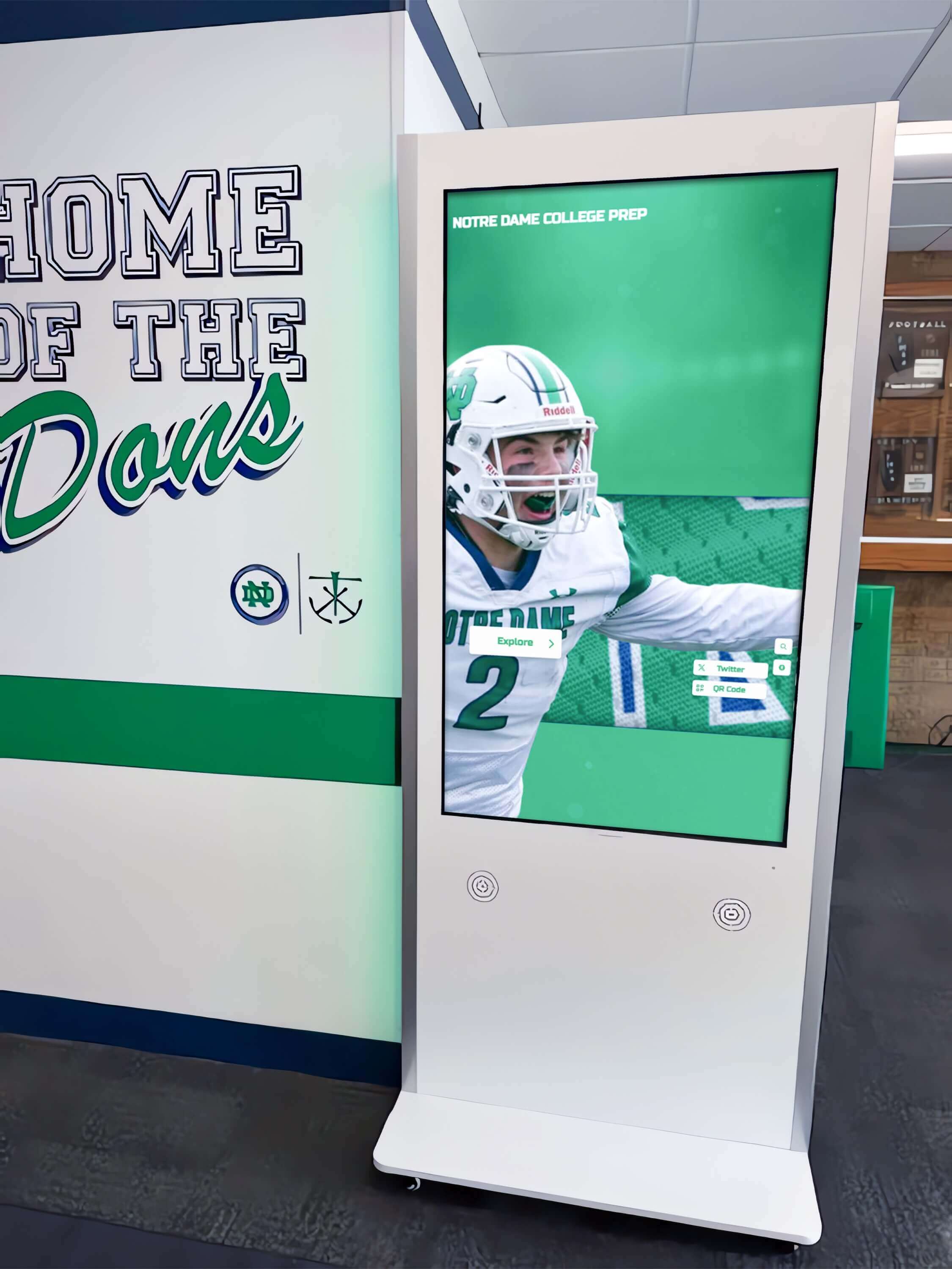
A touchscreen kiosk in a school lobby renders the same hall of fame platform as the web-accessible version but may present the search field in a different layout — larger touch targets, a full-screen keyboard overlay, or a simplified input without a visible label. These differences affect the aria-autocomplete audit in three ways.
Keyboard overlay interaction. Many kiosk deployments present a custom on-screen keyboard rather than relying on the device’s system keyboard. When the visitor taps the search field and the on-screen keyboard appears, the field should still carry aria-expanded="false" until actual suggestion results are ready — not aria-expanded="true" in response to the keyboard appearing. Some implementations incorrectly set aria-expanded="true" when the keyboard opens, which causes a screen reader to announce the combobox as “expanded” before any suggestions exist.
Inactivity timeout and suggestion list state. If the kiosk resets after a period of inactivity and the suggestion list is open at reset time, the reset must close the list and set aria-expanded="false". A kiosk that resets the DOM without updating ARIA states may leave the combobox in an aria-expanded="true" state on the next visitor’s session, causing the first announcement the new visitor hears to be “combobox, expanded” even though no suggestions are showing.
No persistent keyboard shortcut. Web users can press a keyboard shortcut (often / or Ctrl+K) to jump focus to the search field. Kiosk users typically do not have this option. The kiosk audit should verify that the search field is reachable by Tab from any other focusable element on the screen without requiring a shortcut.
The kiosk audit must be run independently from the web audit. Load the kiosk URL or template, run the Step 1 DevTools query, and compare the aria-autocomplete results against the kiosk’s actual suggestion behavior before, during, and after typing.
Connecting This Audit to Broader Accessibility Work
A digital hall of fame ARIA-autocomplete audit for inductee search belongs alongside companion audits that address the full search-and-discovery experience on a school recognition platform.
Pair with an aria-controls audit. The aria-controls attribute on the search combobox points to the suggestion list, but the same attribute also links search controls to the result detail panel that opens when a visitor selects an inductee. The digital hall of fame aria-controls audit for search and detail panels addresses how to verify the full chain from search input to result list to detail panel using the same DevTools approach.
Pair with an aria-busy audit. When suggestions are fetched asynchronously and a loading state is shown between typing and results appearing, aria-busy="true" on the suggestion container signals to assistive technology that content is being updated. Without it, a screen reader user may press ArrowDown during the loading window and hear silence — the suggestion list is visually showing a spinner, but assistive technology has no signal to wait for results.
Pair with a virtualized results audit. On large school rosters with hundreds of inductees, search results may be virtualized — only a subset of matching options is rendered in the DOM at any time, with more loaded as the visitor scrolls. Virtualized suggestion lists require additional ARIA management so that aria-activedescendant correctly references rendered option IDs. The digital hall of fame aria-rowcount and aria-rowindex audit for virtualized inductee tables covers the ARIA attributes required to communicate total result counts and current position in virtualized data sets.
Pair with a keyboard shortcuts audit. Search fields on hall of fame platforms often support keyboard shortcuts that jump focus directly to the input. If those shortcuts are documented anywhere in the interface, they must be accessible to screen reader users through aria-keyshortcuts on the search input element.
Recognition programs that include toggle controls — such as a “Filter by sport” toggle that narrows which inductees appear in search suggestions — can verify those controls are correctly announced as the digital hall of fame aria-pressed audit for toggle controls describes.
Remediation Priority Framework
When bringing aria-autocomplete findings to a platform vendor, organize requests in three tiers:
Tier 1 — Missing aria-autocomplete and missing combobox role. Any search field that offers visible suggestion popups but carries no role="combobox" and no aria-autocomplete attribute is a Level AA failure under SC 4.1.2. This is the highest-priority finding because the field is entirely opaque to assistive technology — the suggestion behavior is undeclared, and screen reader users have no indication it exists. Remediation requires adding role="combobox" and aria-autocomplete="list" (or the correct value for the platform’s behavior) to the input element.
Tier 2 — Static aria-expanded that never updates. A search field that carries aria-autocomplete="list" correctly but maintains a static aria-expanded="false" regardless of suggestion list state actively misrepresents the interface. The attribute is present but does not reflect the current state — a SC 4.1.2 dynamic state failure. This requires a JavaScript fix: the sort handler must call setAttribute('aria-expanded', 'true') when the suggestion list opens and setAttribute('aria-expanded', 'false') when it closes.
Tier 3 — Missing aria-activedescendant update on arrow key navigation. A combobox that correctly opens with aria-expanded="true" but does not update aria-activedescendant when the visitor presses ArrowDown leaves the visitor unable to identify which suggestion is currently highlighted. The suggestion list is accessible in principle — the visitor can navigate it — but each navigation step is silent. Remediation requires updating aria-activedescendant on the input element to the id of the newly highlighted option on each keydown event for ArrowDown and ArrowUp.
Schools evaluating recognition platforms as part of an accessibility-first procurement review should treat Tier 1 and Tier 2 findings as decision factors. A platform whose inductee search field neither declares its suggestion behavior nor updates its expansion state will require custom JavaScript remediation on every template update that modifies the search component.

Verification Table
| Check | Expected Result | Pass / Fail Indicator |
|---|---|---|
aria-autocomplete present on search input | Attribute is not absent | autocomplete !== '(absent)' in DevTools query |
aria-autocomplete value matches platform behavior | 'list' if dropdown only; 'both' if inline fill + dropdown | Confirmed by observing actual suggestion UX |
aria-expanded before typing | 'false' | DevTools query shows expanded: 'false' |
aria-expanded after typing (list open) | 'true' | DevTools query shows expanded: 'true' |
aria-controls points to suggestion list id | Listbox id exists in DOM | document.getElementById(controlsId) returns an element |
Suggestion list has role="listbox" | List element carries role="listbox" | DevTools query shows listRole: 'listbox' |
Each suggestion has role="option" and a unique id | All options have non-empty, unique id attributes | firstOptionId !== '(no id on first option)' |
aria-activedescendant updates on ArrowDown | Value matches id of currently highlighted option | Attribute changes on each key press |
aria-activedescendant cleared on list close | Attribute absent or empty after selection or Escape | Attribute not present in closed state |
aria-expanded returns to 'false' on close | 'false' after selection or Escape | DevTools query confirms state |
| Screen reader announces expansion | “Expanded” announced when list opens | Confirmed with NVDA or VoiceOver |
| Screen reader announces highlighted option | Inductee name read on ArrowDown | Confirmed with screen reader |
| Escape dismisses list without clearing input | List closes, typed text remains | Manual keyboard test |
| Suggestion count announced by live region | Result count announced without moving focus | Live region or role="status" container present |
| Kiosk template carries same ARIA attributes | Independent DevTools query on kiosk URL passes | Kiosk audit run separately from web audit |
Quick-Reference Audit Checklist
Discovery
- DevTools Console query run on main roster view, sport-specific pages, and kiosk template
- Every
input[type="search"],input[type="text"],[role="combobox"], and[role="searchbox"]recorded with itsaria-autocomplete,aria-expanded,aria-controls, andaria-activedescendantvalues - Search fields where
aria-autocompleteis absent identified and flagged as Tier 1 findings
Static Attribute Accuracy
-
aria-autocompletevalue confirmed to match actual platform behavior (list vs. both vs. inline) -
aria-controlsconfirmed to point to an existing element in the DOM - Suggestion list element confirmed to carry
role="listbox" - Each suggestion option confirmed to carry
role="option"and a unique non-emptyid
Dynamic State Test
- Two or more characters typed;
aria-expandedconfirmed to change from'false'to'true' - ArrowDown pressed once;
aria-activedescendantconfirmed to update to first option’sid - ArrowDown pressed again;
aria-activedescendantconfirmed to update to second option’sid - Enter pressed to select;
aria-expandedconfirmed to return to'false';aria-activedescendantconfirmed to clear - Escape pressed while list open; list closes;
aria-expandedreturns to'false'; typed text remains
Screen Reader Test
- NVDA or VoiceOver active; Tab to search field; full announcement recorded including autocomplete behavior
- Two characters typed; announcement of expanded state or suggestion availability confirmed
- ArrowDown pressed; highlighted suggestion option name announced
- Escape pressed; field announcement returned to collapsed state
Kiosk Deployment
- Kiosk template loaded independently and Step 1 query repeated
- On-screen keyboard interaction tested;
aria-expandedconfirmed not to change on keyboard open before suggestions load - Inactivity timeout behavior verified; ARIA states confirmed to reset correctly on timeout
Documentation
- Each finding categorized as Tier 1 (missing attributes), Tier 2 (static expanded state), or Tier 3 (missing activedescendant update)
- Remediation request structured with current attribute value, expected value, and reproduction steps
- Re-test plan scheduled for 30 days after vendor remediation delivery
Rocket Alumni Solutions builds aria-autocomplete, aria-expanded, aria-controls, and aria-activedescendant into every inductee search combobox at the component level — the correct values are present on initial load, update accurately on every keystroke and navigation event, and are verified against the platform’s actual suggestion behavior before deployment. Schools confirming that their current display handles search accessibility correctly — or evaluating platforms for a new hall of fame installation — can see the complete accessible search pattern in action during a personalized demo.